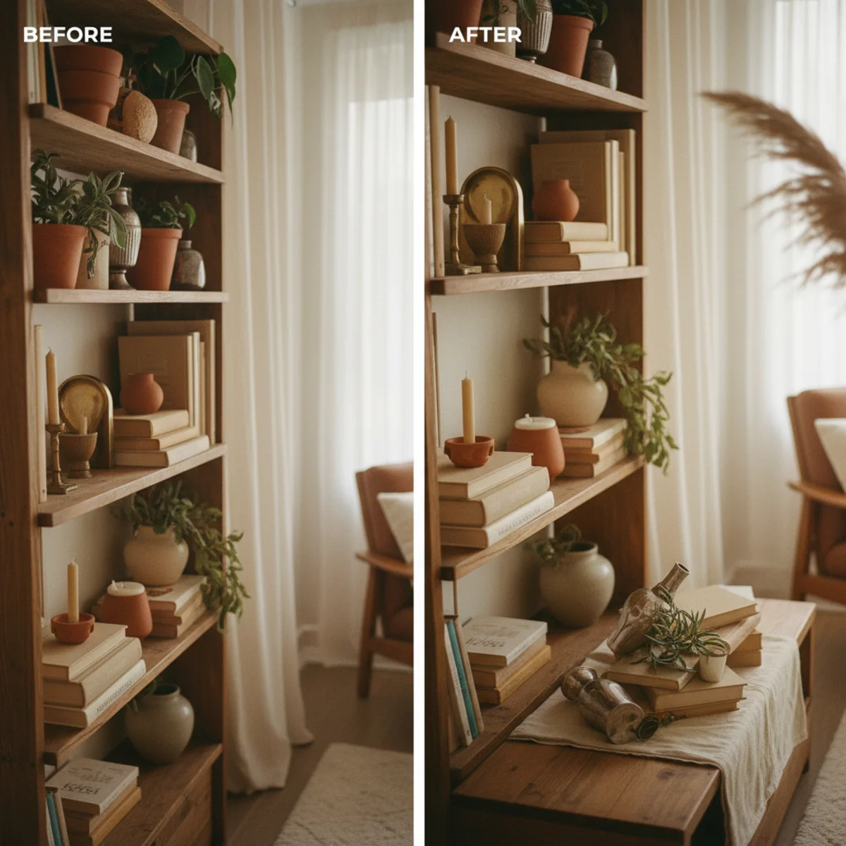
These twelve shelf styling ideas are tested in actual living-room and bedroom builds — not stylist's studios with infinite props. Each principle includes the exact spacing, object types, and visual rules that determine whether a shelf reads as styled and intentional or just busy. None require buying new decor; the principles work with the books, ceramics, and small objects you already own. Edit first, then arrange.
Every shelf principle below was developed by looking at what working professional stylists do that amateurs skip. The biggest gaps are negative space (rule 2), tonal repetition (rule 8), and one personal object (rule 12). Master those three, and the rest layer naturally on top.
By the end of this guide, you'll know exactly how to layer front to back, how much shelf to leave empty (a third), why everything works better in groups of three or five, and the one personal object that turns a styled shelf from generic to specifically yours.
WHAT'S INSIDE
- The third-empty rule that prevents 90% of shelf-clutter problems
- Why front-to-back layering matters more than left-to-right arrangement
- Groups of 3 and 5 — and why never groups of 4 or 6
- The single personal object that transforms a styled shelf from showroom to home
A styled shelf is about three things: layering, varied height, and the courage to leave empty space. Most people fail on the last one.
— Studio McGee blog [citation needed — verify before publish]
What makes a well-styled shelf?
A well-styled shelf balances layered objects, varied heights, grouped vignettes, and deliberate negative space into a display that reads considered rather than cluttered or bare. The reliable moves are layering taller items behind shorter ones, grouping objects in odd numbers, mixing books stacked and standing with sculptural objects, and — crucially — leaving empty space so the eye can rest.
Negative space is where most people fail. The instinct is to fill every inch, which reads as clutter; the pro move is to leave roughly a third of each shelf empty, so the things you do display have room to breathe and read as intentional. The other half is mixing categories — books, a sculptural object, a small plant, a framed piece — and varying their height and texture. Get the layering, grouping, and empty space right, and a shelf becomes a warm, collected focal point.
More in Styling you may love
See allWhy shelf styling matters in 2026
Open shelving and styled bookshelves became central to the warm, collected home, and 'how to style a shelf' is one of the most-searched decorating questions — Pinterest's shelf styling and bookshelf decor searches climb every year.
The honest reason people keep asking is that shelves are genuinely hard, and the instinct (fill them up) is exactly wrong. As the warm-home aesthetic prized collected, breathing, considered displays over crammed or bare ones, the skill of shelf styling — layering, grouping, negative space — became essential. A well-styled shelf shows off the personal objects and books that make a home warm, while a badly styled one undermines an otherwise lovely room.
12 shelf styling rules and ideas
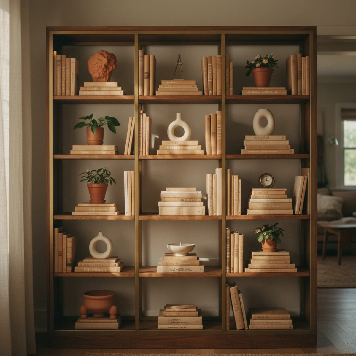
01Layer Objects Front to Back, Not Just Side to Side
The single skill that separates professionally styled shelves from amateur ones is depth layering — objects placed in front of larger objects, partially overlapping. Books standing in the back, a small framed photograph leaning against them, a small ceramic in front, a tiny object in the very front. Three planes of depth per vignette. Most amateur shelf styling treats the shelf like a flat row; pro styling treats it like a small staged composition with foreground, midground, and background.
Build vignettes in three depth planes: BACK (12 to 16 inches from the front edge) holds the tallest items — leaning art, stacked books vertically, tall vase. MIDDLE (6 to 10 inches from front) holds medium items — short stacks, smaller ceramics, picture frames leaning. FRONT (1 to 3 inches from front) holds smallest items — small objects, candles, single short books on their side. Each vignette occupies roughly 12 by 12 inches of shelf real estate, with overlap between planes for visual depth. Avoid lining everything up at the front edge — flat rows read as catalogs.
AFFILIATE SLOTPRINCIPLEThree depth planes per vignette: back, middle, front with overlapAdd affiliate URL when configuredWhy it works
Because three-dimensional layering creates the same compositional depth that good photographs have — foreground, midground, background. The eye reads layered objects as a deliberate composition, while objects in a single front-edge row read as inventory. The same objects styled flat versus layered look entirely different even though the components are identical. Depth is one of the highest-impact, lowest-effort shelf styling moves.
Pro tip — When testing depth, photograph each vignette from the angle people will actually view it from (standing in the room, looking across) — not from directly in front of the shelf. The everyday viewing angle reveals depth far better than head-on photos, and many flat-styled shelves look fine head-on but read as a row from across the room.
Three depth planes per vignette — back, middle, front — the move that separates pro styling from flat rows. See also: leaning art
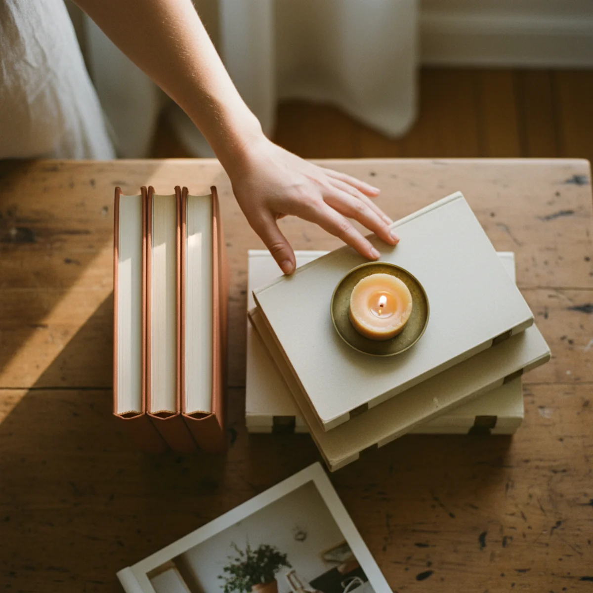
02Leave a Third of Each Shelf Empty
The single most-violated shelf-styling rule: leaving roughly 30 to 40 percent of every shelf intentionally empty. Empty space is what makes the styled objects read as deliberate; without it, the same objects read as clutter. The instinct is to fill every inch; the discipline is to resist. Step back, photograph the shelf, and remove objects until at least one-third of the visible shelf surface is empty. The shelf almost always looks better with less.
Aim for one continuous empty zone per shelf, not many small gaps. A 36-inch shelf should have roughly 12 inches of continuous empty space — usually at one end, allowing the styled vignettes to anchor the opposite end. Measure if needed: photograph the shelf, count how much of the visible surface is bare, target 30 to 40 percent. If under 30 percent, remove objects until the math works. The empty zone is not waste; it's the negative space that lets the styled objects breathe.
AFFILIATE SLOTPRINCIPLE30-40% of every shelf surface left intentionally emptyAdd affiliate URL when configuredWhy it works
Because the human eye reads dense surfaces as cluttered and sparse surfaces as deliberate, regardless of the quality of the individual objects. A shelf with five beautiful objects on a third-empty surface reads more intentional than the same shelf with eight beautiful objects packed in. The empty space is not the absence of decoration; it's the framing that makes the decoration register. Most styled shelves get worse the more is added.
Pro tip — Place a small light object (a candle, a tiny ceramic, a single small leaf in a bud vase) in the empty zone if it feels too bare — the small accent creates the illusion of empty space without breaking the styling rhythm. The trick is the object has to be substantially smaller than the surrounding vignettes, or it counts as a fourth vignette and ruins the rule.
Two vignettes, one empty third — the negative space that makes the styling read as intentional. See also: negative space
03Group Objects in Odd Numbers (3 or 5, Never 4 or 6)
Every vignette on a styled shelf should consist of three or five objects, never four or six. Even-numbered groups read as too organized; odd-numbered groups read as collected naturally over time. This is the single most consistent rule across professional shelf styling, and the cheapest fix when a vignette feels slightly off — count the objects and remove or add one to hit three or five.
Three is the workhorse vignette count — three books stacked horizontally with one ceramic and one small object, three height levels of objects clustered together, three picture frames leaning at three different angles. Five works in larger vignettes — five small objects arranged in a triangle composition, or two large objects with three smaller ones around them. Avoid: four objects in a row (reads as planned), six objects clustered (reads as mass). Two-object vignettes can work but are tricky; one-object vignettes are isolated focal points and work differently. Three and five are the safest defaults.
AFFILIATE SLOTRULEThree objects per vignette (workhorse), five per larger vignette (rare)Add affiliate URL when configuredWhy it works
Because even-numbered groups create implicit symmetry (the eye finds the center between them) which reads as deliberately ordered. Odd-numbered groups have no central pair, so the eye reads them as informally arranged — closer to how a real home collection accumulates over time. The principle is ancient (used in classical floral arrangement and even Roman wall painting); the human visual system simply prefers the asymmetric balance of odd groupings.
Pro tip — When stuck with four objects you want to use, separate one of them into its own vignette on a different part of the shelf. The split creates one group of three plus one isolated object — both work, where four together don't.
Three objects in triangle composition — odd numbers read naturally collected, even numbers don't. See also: triangle composition
04Mix Books Stacked Horizontally and Standing Vertically
Books are the workhorses of shelf styling, but rows of vertical books read as bookshelves rather than styled shelves. The fix is mixing horizontal stacks and vertical rows on the same shelf — vertical bookends supporting a few standing books, a horizontal stack of three to five books beside them with a small object on top of the stack. The mix breaks the bookshelf monotony and creates platforms for other objects.
Aim for roughly half vertical, half horizontal books per shelf — six books standing in two clusters of three with bookends between them, four books stacked horizontally beside the vertical clusters. Use the horizontal stacks as platforms for small objects (ceramic vessels, framed photographs leaning, small sculptures). The stack should be 3 to 6 books tall — taller reads precarious, shorter doesn't function as a platform. Strip dust jackets from hardcover books to expose cloth bindings; the slightly faded varied colors read more collected than glossy printed covers.
AFFILIATE SLOTBOOKS50% vertical books, 50% horizontal stacks, mixed across shelvesAdd affiliate URL when configuredWhy it works
Because uniform vertical book rows read as bookshelves (functional, expected), while mixed orientations read as styled vignettes (deliberate, layered). The horizontal stacks also create platforms at varied heights, which is essential for the depth layering rule above — a small ceramic on a 4-book stack sits at a different height than the same ceramic placed flat on the shelf, and the elevation creates visual interest the flat placement can't.
Pro tip — Cover the book spine labels with a small object on the front of the stack — a tiny ceramic, a single small flower in a bud vase, a small framed photograph. This both adds depth (the small object hides what's behind) and softens the visual presence of printed book spines, which can fight a warm-home aesthetic.
Half horizontal stacks, half vertical rows — books as platforms, not just books. See also: cloth bindings
05Vary the Height of Objects Within Each Vignette
Within a single vignette, objects should sit at three or four different heights — the tallest about double the height of the shortest. Flat-height vignettes (everything at the same approximate height) read as displays; varied-height vignettes read as collections. Use book stacks, small risers, and naturally tall objects (vases, candle holders) to create the height variation without adding more objects.
Aim for three height tiers per vignette: TALLEST (10 to 16 inches) — a vase, leaning art, tall ceramic, candle holder. MID (5 to 9 inches) — short stacks of books, picture frames, small sculptural objects. SHORTEST (1 to 4 inches) — small ceramics, candles, tiny boxes or trays. The tallest object should be roughly double the height of the shortest in the same vignette. Use horizontal book stacks as risers when needed to elevate smaller objects to mid-height. Avoid using all objects in the same height range — even beautiful objects in uniform height read flat.
AFFILIATE SLOTPRINCIPLEThree height tiers per vignette; tallest roughly double the shortestAdd affiliate URL when configuredWhy it works
Because varied height creates visual rhythm and depth — the eye moves up and down across the heights, registering the vignette as a composition rather than a row. Flat-height arrangements give the eye nothing to follow; the styled objects collapse visually into a single line. The height variation is also what creates the front-to-back depth illusion (rule 1) and the platform effect (rule 4) — they all reinforce each other.
Pro tip — If your vignette feels flat after assembly, look for a small object you can stack underneath one of the existing pieces — a single book under a ceramic, a small box under a frame. The stack-up move adds height without adding objects, keeping the odd-number rule intact while creating the height variation.
Tall, medium, short — three heights in one vignette, the rhythm that makes styling read as composition. See also: small risers
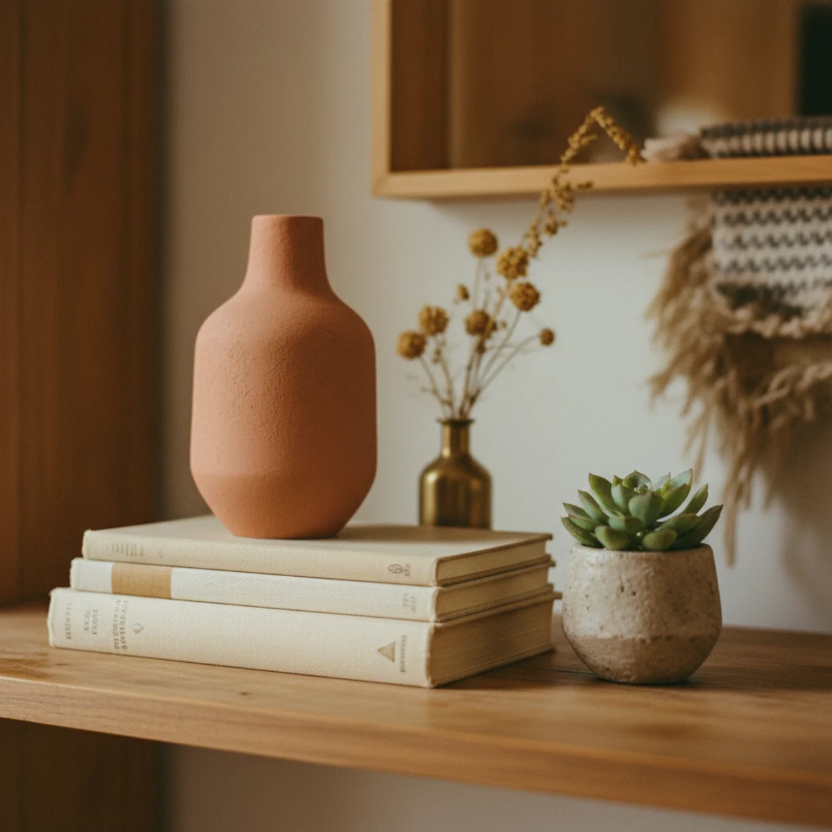
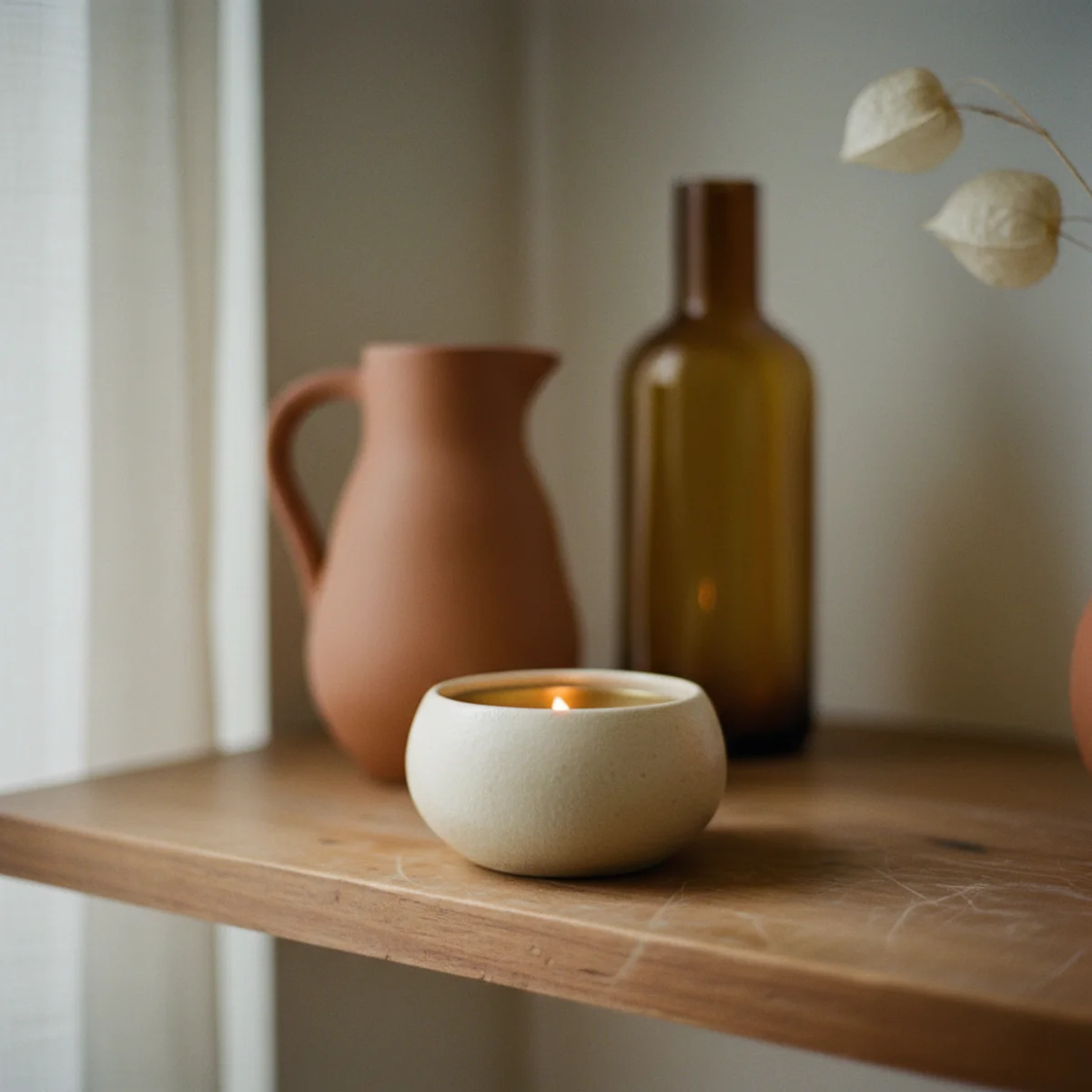
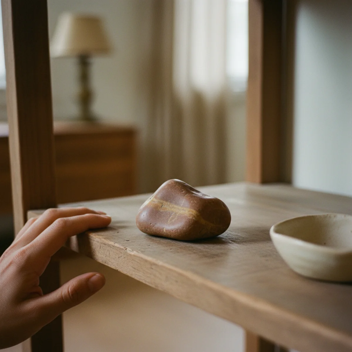
06Add One Sculptural Object Per Vignette
Within each vignette, one object should be sculptural — meaning it has a distinct shape, weight, or surface that reads as small art rather than ordinary decor. A hand-thrown stoneware vessel, a worn carved wooden bowl, a piece of weathered driftwood, a small ceramic sculpture. The sculptural object becomes the anchor of the vignette; books and frames support it. Without one, vignettes can feel utilitarian even when well-arranged.
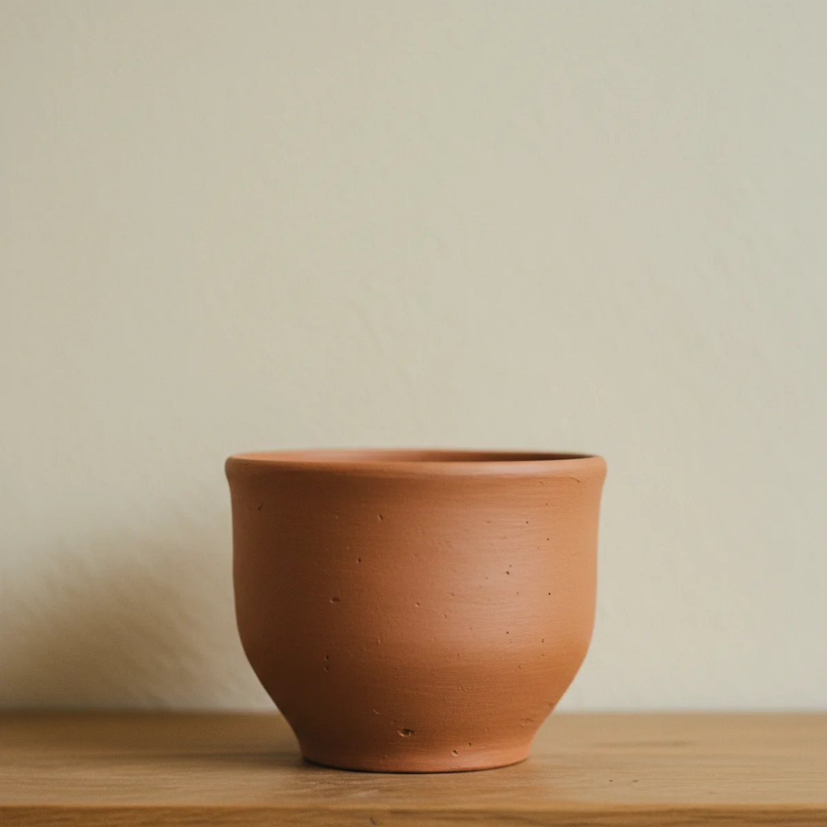
Pick sculptural objects 4 to 10 inches in any dimension, in stoneware, ceramic, wood, stone, brass, or mixed media — never plastic or anything obviously mass-produced. Sources: thrifted studio pottery at $5 to $30 (Goodwill, estate sales, ReStore), vintage African or Japanese carved wood at $20 to $100 (Etsy, antique dealers), small artist-made sculptures from craft fairs at $30 to $150. Position the sculptural object at the center or anchor point of the vignette, with books and frames arranged around it. The eye should register the sculptural piece as the visual subject of the vignette.
AFFILIATE SLOTOBJECTSOne sculptural object per vignette (stoneware, wood, stone, or brass)Add affiliate URL when configuredWhy it works
Because sculptural objects have higher visual weight than ordinary decor — the irregularity of their shape, the materiality of their surface, the evidence of hand-making all signal art to the eye. A vignette with one sculptural object and three supporting pieces reads as a small still-life composition; the same vignette with four ordinary decorative objects reads as a decoration row. The sculptural piece is what gives the vignette its center of gravity.
Pro tip — Use one sculptural object per vignette as the anchor, and let the other objects in that vignette echo its tone, color, or material — a stoneware sculpture is supported by oat-toned books and a wooden frame; a brass sculpture is supported by warm-cream ceramics and an aged leather notebook. The cohesion makes the supporting cast read as deliberately chosen for the anchor, not just placed nearby.
One stoneware vessel as the anchor, books and frame supporting — vignettes need a center of gravity. See also: thrifted studio pottery
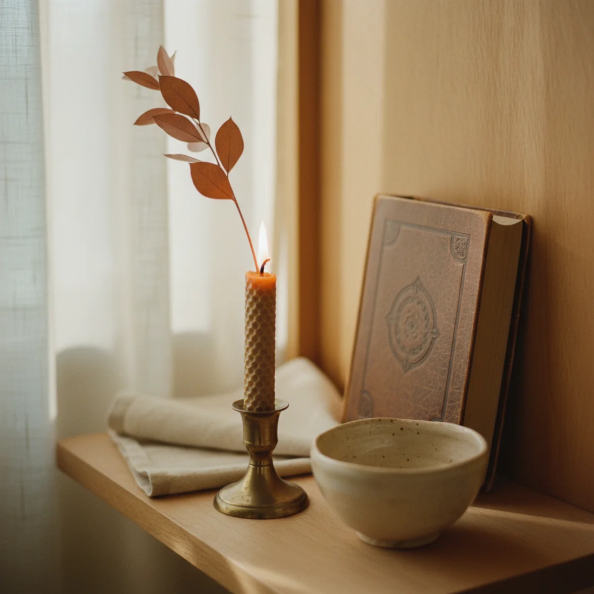
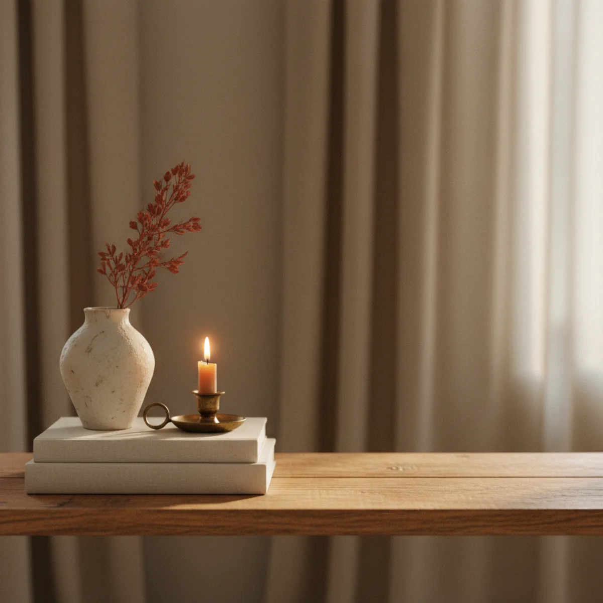
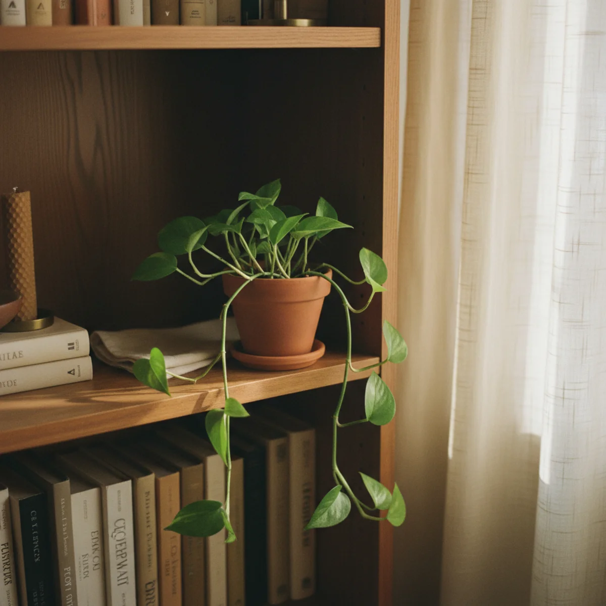
07Bring In One Small Plant or Branch Per Shelf
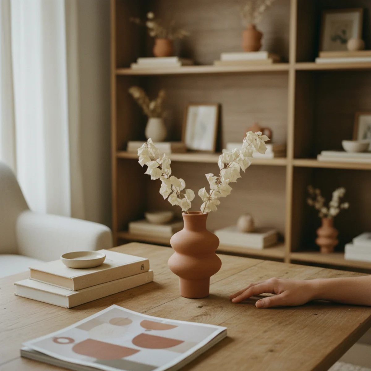
Every shelf benefits from a single living element — a small potted plant, a branch in a bud vase, a small terrarium, or a dried botanical. The organic shape and color break the geometric rigidity of books and rectangular frames, and the slight asymmetry of plant growth reads as life amid the styled objects. One plant per shelf (not per vignette); too many overwhelm the styled balance.
Best small shelf plants: small succulents at 3 to 6 inches in a small ceramic pot (low maintenance, sculptural shape), small trailing pothos or string-of-pearls at 4 to 8 inches (cascading shape), a single dried branch (eucalyptus, olive, or twisted willow) in a bud vase at 8 to 14 inches. Avoid: large leafy plants (overwhelm shelf scale), fake plastic plants (read cheap immediately), fresh flowers (require constant maintenance and look wilted within days). The dried branch option is the lowest-maintenance and most architectural — single curved branch in a small heavy vase.
AFFILIATE SLOTORGANICOne small succulent, trailing plant, or dried branch per shelfAdd affiliate URL when configuredWhy it works
Because organic shapes contrast with the geometric rigidity of styled objects (rectangular books, round vessels, square frames), and the slight irregularity of plant growth reads as alive amid the static decor. The plant also adds a subtle color note (green, dried tan, occasionally floral) that breaks the otherwise neutral palette of styled shelves. One plant per shelf is enough; the contrast is what does the work, not the volume of greenery.
Pro tip — If you can't keep live plants alive on shelves (low light, busy schedule, cats), a single high-quality dried branch in a bud vase replaces a live plant beautifully — eucalyptus or olive branches last 2-3 years before needing replacement, look architectural rather than dead, and require zero maintenance.
One small succulent in a ceramic pot — the organic shape that breaks geometric rigidity of styled objects. See also: dried branch
08Repeat a Material or Tone Across Vignettes
Multi-vignette shelves work best when materials or tones repeat across separate vignettes — one stoneware vessel on the left shelf, another stoneware piece on the right shelf, a third on the middle shelf. The repetition creates visual rhythm across the whole shelving unit and ties separate vignettes into a cohesive whole. Without repetition, multi-shelf units read as disconnected collections.
Pick one material (stoneware, brass, oak, books) or one tone (warm cream, oat, terracotta) and repeat it across at least three vignettes on a shelving unit. The repetition can be subtle (three different stoneware vessels in different shapes) or obvious (three identical small ceramic bowls). For larger shelving units (6 to 12 shelves), repeat two or three different materials across the unit — stoneware appears on three shelves, brass appears on four, oak appears throughout. The eye follows the repeated material across the shelves, registering the whole unit as cohesive.
AFFILIATE SLOTPRINCIPLEOne material or tone repeated across at least 3 vignettes per shelving unitAdd affiliate URL when configuredWhy it works
Because shelves with no repetition read as disconnected — each vignette becomes a separate styling project competing with the others. Repetition creates visual rhythm: the eye notices a stoneware piece on one shelf, then registers a related piece three shelves down, and the unit reads as one composition rather than several. The repetition is what makes shelves feel curated rather than randomly assembled.
Pro tip — Photograph your shelving unit and try to spot the repeated material or tone across it — if you can't, the repetition isn't strong enough. The repetition should be obvious within five seconds of looking, even from across the room. If the eye has to search for it, add another piece in the repeated material or tone to a vignette that lacks it.
Stoneware on three different shelves — the repetition that ties separate vignettes into one composition. See also: warm cream
09Lean Art Against the Wall Instead of Hanging
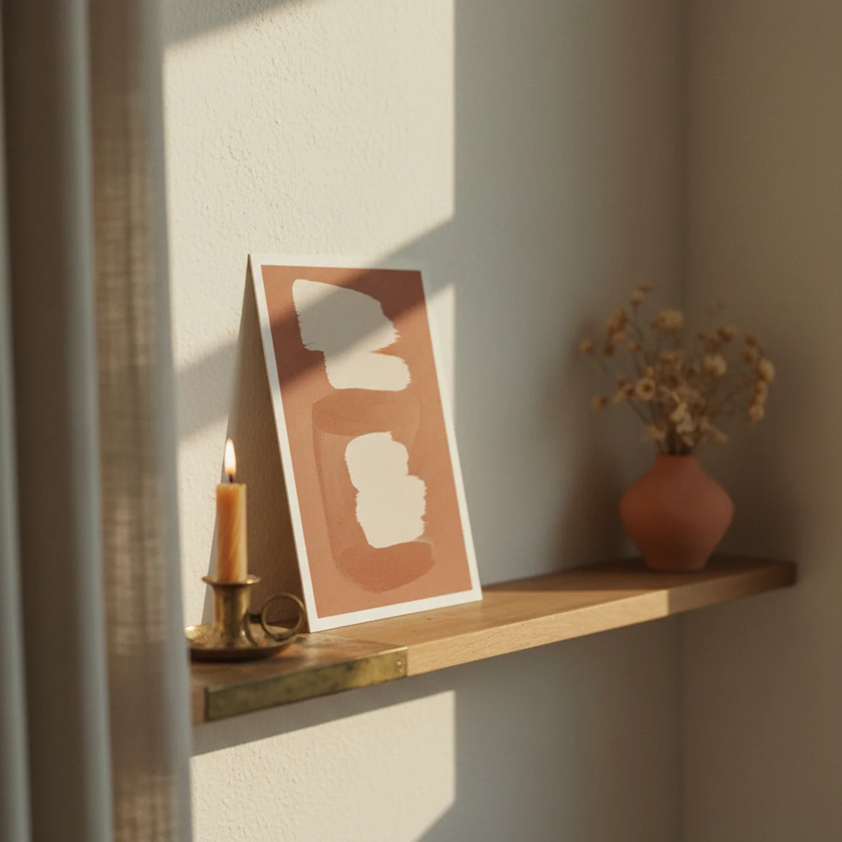
Hanging art on shelves requires holes, brackets, and commitment to a specific position. Leaning art against the back wall of the shelf gives the same visual effect with none of the commitment, plus the leaning posture reads more informal and lets you swap pieces freely. Most shelf-styled art looks better leaning than hanging, and the technique works on any open shelf at any depth.
Choose framed pieces 8x10 to 16x20 inches, in warm-toned frames (oak, walnut, aged brass, vintage gilt). Lean against the back wall of the shelf at a slight angle (the frame's bottom edge sits 1 to 2 inches forward of where it touches the wall at the top). Position the leaning art in the back depth plane of a vignette (per rule 1) — books or smaller objects sit in front of it, partially overlapping. Mix sizes across the shelving unit: one larger leaning piece per unit, smaller leaning pieces in supporting vignettes. Subject matter: thrifted oil paintings, vintage botanical prints, your own photographs printed at Mpix, small abstracts. Avoid mass-produced inspirational prints.
AFFILIATE SLOTARTLeaning framed pieces 8x10-16x20 in warm-toned frames, no holesAdd affiliate URL when configuredWhy it works
Because leaning art adds depth to a vignette (it becomes a back-plane element in the layering system) while hung art is flat against the wall behind the shelf. The leaning posture also reads as casual and collected — the piece is here for now, can be moved tomorrow — where hung art reads as permanent and committed. Most shelf vignettes benefit from one leaning piece somewhere in the unit, occupying the role of a tall back-plane element without requiring drilling.
Pro tip — Lean two pieces of varied sizes together — a larger 11x14 frame in the back with a smaller 5x7 frame leaning against its front. The double-lean reads as a casual gallery within the vignette and adds the depth of two back-plane elements without taking horizontal space.
One leaning frame in the back, books and ceramic in front — depth from art without putting holes in the wall. See also: vintage gilt
10Style in Vignettes, Not Continuous Rows
Multi-shelf units work best when styled in discrete vignettes (groups of objects with clear boundaries between them) rather than continuous rows that span the full shelf width. Two or three vignettes per shelf, with empty space between them, gives the eye discrete compositions to register — each one a small still-life. Continuous rows blur the styling into a single horizontal stripe.
Aim for two distinct vignettes per shelf, with 4 to 8 inches of empty shelf between them (the third-empty rule). Each vignette occupies 12 to 18 inches of shelf width and contains 3 to 5 objects in varied heights and depths. The empty space between vignettes is essential — without it, two separate vignettes blur into one large messy row. For tall shelving units, stagger the vignette positions across shelves (left on shelf 1, right on shelf 2, center on shelf 3) so the eye moves across and down the unit rather than scanning each shelf horizontally.
AFFILIATE SLOTARRANGEMENT2 distinct vignettes per shelf, 4-8 inches empty space betweenAdd affiliate URL when configuredWhy it works
Because discrete vignettes give the eye boundaries to read — each one starts and ends, so the brain processes each composition individually before moving to the next. Continuous rows have no internal boundaries, so the eye scans the whole shelf as a single blur and the styling effort goes unrecognized. The boundaries are what let each carefully-arranged vignette read as a deliberate composition rather than part of a larger mass.
Pro tip — Photograph the styled shelf from across the room, then cover one vignette at a time with your hand in the photo — each vignette should look complete on its own, like a small still-life you'd photograph independently. If a vignette doesn't work when isolated, it's not really a vignette; it's part of a row.
Two vignettes per shelf, clear empty space between — discrete compositions, not continuous rows. See also: empty space
11Edit by Category and Color Before Arranging
Before placing any object on a shelf, sort everything you're considering by category (books, ceramics, frames, sculptural objects, plants) and by color (warm whites, neutrals, accent colors). The editing process reveals which categories you have too many of, which colors clash, and which objects need to be removed before styling even begins. Most shelf styling fails because the editing step gets skipped — and great styling can't rescue too many objects or too many competing colors.
Pull every object you're considering for the shelf and lay them out on a flat surface (floor, large table, bed). Sort by category: books in one pile, ceramics in another, frames, sculptural objects, plants, candles, small boxes. Within each category, sort by color and material. Remove anything that doesn't fit your warm-home palette (bright primary colors, glossy plastic, anything obviously mass-produced) and anything in excess of what you need (two ceramic vases when you need one, four picture frames when you need two). The edited collection is what you style with; everything else goes to storage or donation.
AFFILIATE SLOTPROCESSSort all candidate objects by category and color before stylingAdd affiliate URL when configuredWhy it works
Because most styled shelves fail from over-abundance — too many ceramics, too many frames, too many books — rather than from poor arrangement. The editing step reveals the excess before you've spent thirty minutes arranging it, saving you from the slow realization that the shelf is over-styled after the fact. Editing also reveals gaps: if you have eight ceramics but no plants or sculptural objects, the shelf will read mono-thematic; you can shop or thrift for the missing categories before styling.
Pro tip — Take a photograph of all your potential shelf objects together before sorting — the photo reveals the overall density and color story more honestly than viewing the pile in person. Photographs flatten the visual, which is exactly how shelves read across the room, and the photo will show what to cut.
Editing step before styling — sort by category and color, cut excess, then arrange. See also: warm-home palette
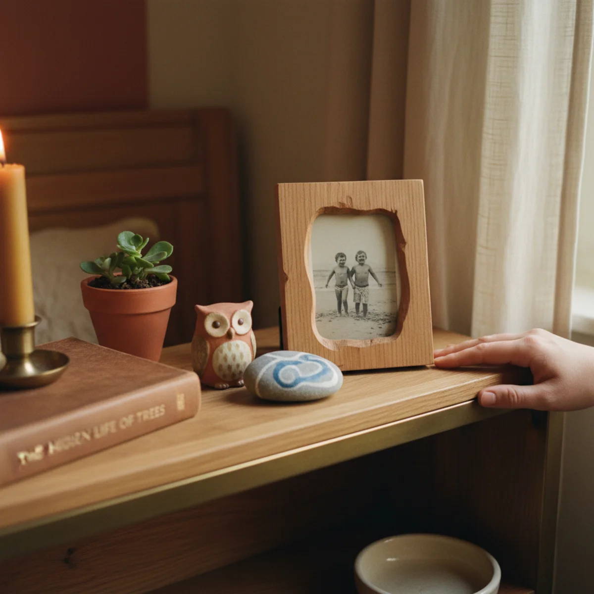
12Add One Personal Object That Belongs Only to You
The final principle that elevates a styled shelf from generic to specifically yours: one personal object somewhere on the unit. A small piece of art a friend made, a souvenir from a meaningful trip, an heirloom from a parent or grandparent, a child's small drawing in a nice frame. The object signals that someone specific styled this shelf, has memories specific to these objects. Without it, the most beautifully styled shelf still reads as generic.
The personal object should be small enough to fit naturally within a vignette (4 to 10 inches in any dimension) and visually compatible with the surrounding warm-home palette. Examples: a small piece of pottery from a craft fair, a vintage postcard from a meaningful trip framed simply, an heirloom letter opener or small inherited object, a small landscape painting your grandmother made, a single book that belonged to a parent. Mass-produced inspirational signs or generic decor objects don't count — the object has to have specific personal meaning to you.
AFFILIATE SLOTPERSONALOne small personally meaningful object integrated into a vignetteAdd affiliate URL when configuredWhy it works
Because personality is the missing variable in most well-styled shelves — they look right but read as generic. A single object with specific personal meaning signals that this shelf was styled by a person with a specific history, not by a magazine stylist following rules. The same shelf with one personal object reads as inhabited; without it, it reads as decorated. The personal object is the smallest possible signal of identity and the largest possible upgrade to a shelf's character.
Pro tip — Rotate the personal object every six months — pull a different framed photograph, swap in a different inherited piece, change the small artwork. The rotation keeps the shelf from becoming visual background and gives you something quietly different to notice each season.
One inherited ceramic among the styled objects — the personal meaning that turns generic into specific. See also: small piece of art
How to style a shelf step by step
Layer, group, vary height, and leave space. Work in this order.
- 1Clear it and start with books
Take everything off, then place books — some stacked horizontally, some standing — as the foundation across the shelves.
- 2Add the back layer
Lean framed art or larger objects at the back of each shelf to create depth and a backdrop.
- 3Build vignettes in odd numbers
Group objects in threes and fives in front, varying height and texture, overlapping the back layer.
- 4Edit for negative space
Step back and remove until roughly a third of each shelf is empty. The empty space is what makes the rest read intentional.
Quick tips
- Leave roughly a third of each shelf empty; negative space is the rule most people break.
- Layer taller items behind shorter ones for depth, not a flat single row.
- Group objects in odd numbers — threes and fives read more natural than pairs.
- Mix books stacked and standing to vary height and create perches for objects.
- Repeat a material or tone across the shelves to tie the display together.
- Add one personal object with a story so the shelf reads as yours.
Shelf styling by type
Books as the foundation, leaned art at the back, vignettes in odd numbers, and a third left empty.
Mostly useful, beautiful things — earthenware, glasses — styled with restraint and breathing room.
One small vignette — a leaned frame, an object, a trailing plant — with room around it.
The same rules on a horizontal surface; see our fireplace mantel decor guide.
A styled shelf is layering, varied height, and the courage to leave empty space. Most people fail on the empty space.
Frequently asked questions
How much empty space should I leave on a shelf?+
Should I group objects in odd or even numbers?+
How do I style a shelf without it looking cluttered?+
What objects work best for shelf styling?+
Should I hang or lean art on shelves?+
How do I make a shelf feel personal rather than generic?+
A shelf is the trickiest thing to style in a house, but the rules are learnable: layer front to back, group in odd numbers, vary the height, and leave a third empty. We'd obsess over the negative space before anything else; it's the move almost everyone skips and the one that turns a cluttered or bare shelf into a magazine-worthy display. When in doubt, take half the objects off and group what's left in threes. The empty space is the secret — the courage to leave it is the whole skill.