These twelve gallery wall ideas are tested across actual living-room, hallway, and stairwell installations — not stylist photoshoots. Every principle below names the exact spacing, sizing, and unifying-element rules that separate a deliberate-looking gallery wall from a random cluster of frames. The most common gallery-wall mistakes (uneven spacing, mixed frame chaos, hanging too high) all have specific fixes in the rules that follow.
Gallery walls work best when planned on the floor before any nail enters drywall. The floor-planning step is the single highest-impact gallery-wall move — 30 minutes of arranging pieces on the ground prevents the kind of incremental misalignment that turns a thoughtful arrangement into a confused cluster. Hang in haste, regret across the entire wall.
By the end of this guide, you'll know exactly how to plan a gallery wall on the floor before hanging, the spacing rule (2 to 3 inches consistent) that makes any group of frames read intentional, and the unifying threads (frame color, art subject, tonal palette) that hold mixed pieces together.
WHAT'S INSIDE
- The 30-minute floor-planning step that prevents 90% of gallery-wall failures
- Why 2 to 3 inches of consistent spacing matters more than any other dimension
- The single unifying thread (frame, palette, or subject) that ties mixed art together
- How to start big — anchor first, then add smaller pieces around it
A great gallery wall looks collected over years, even if it went up in a weekend. The secret is planning it on the floor first.
— Studio McGee blog [citation needed — verify before publish]
What makes a good gallery wall?
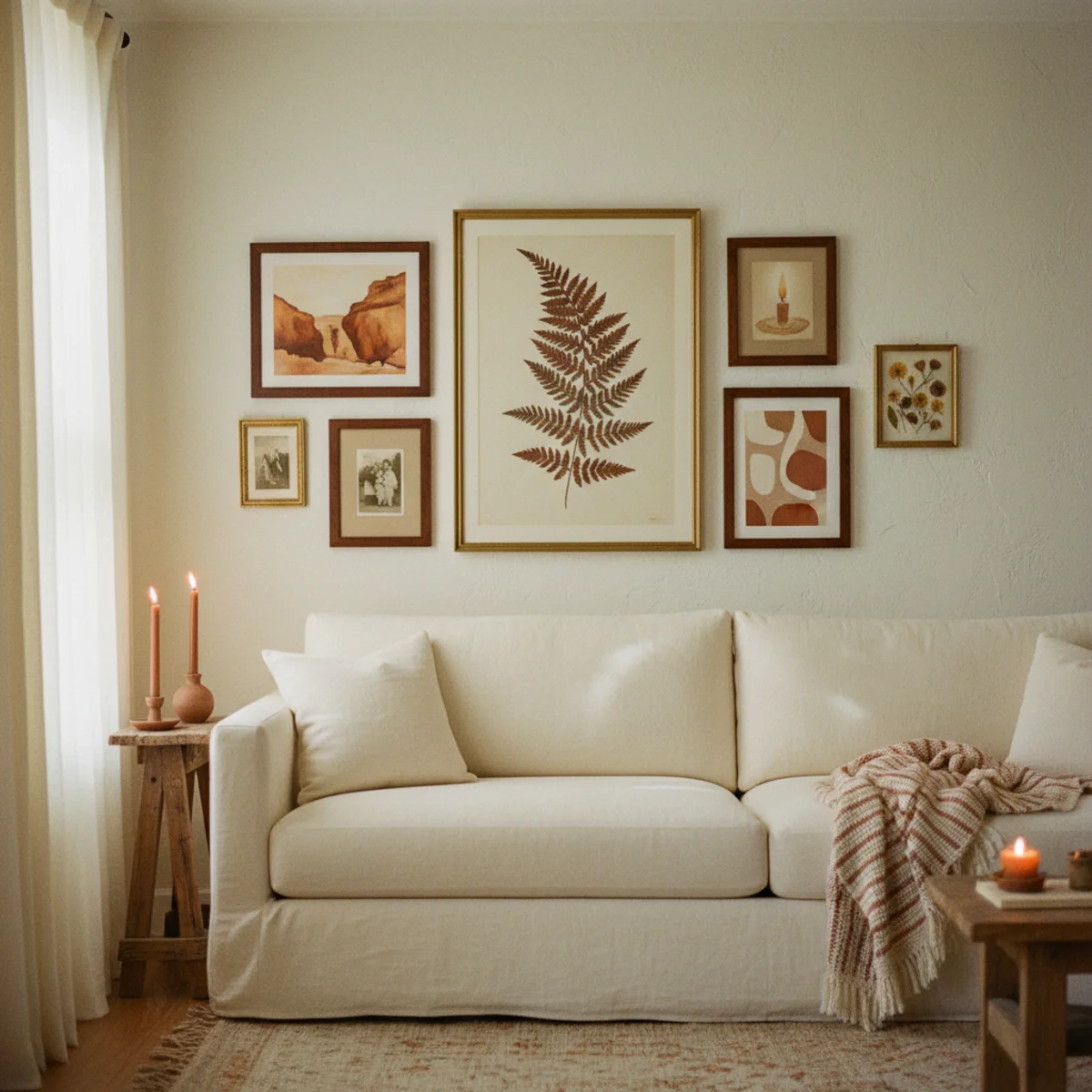
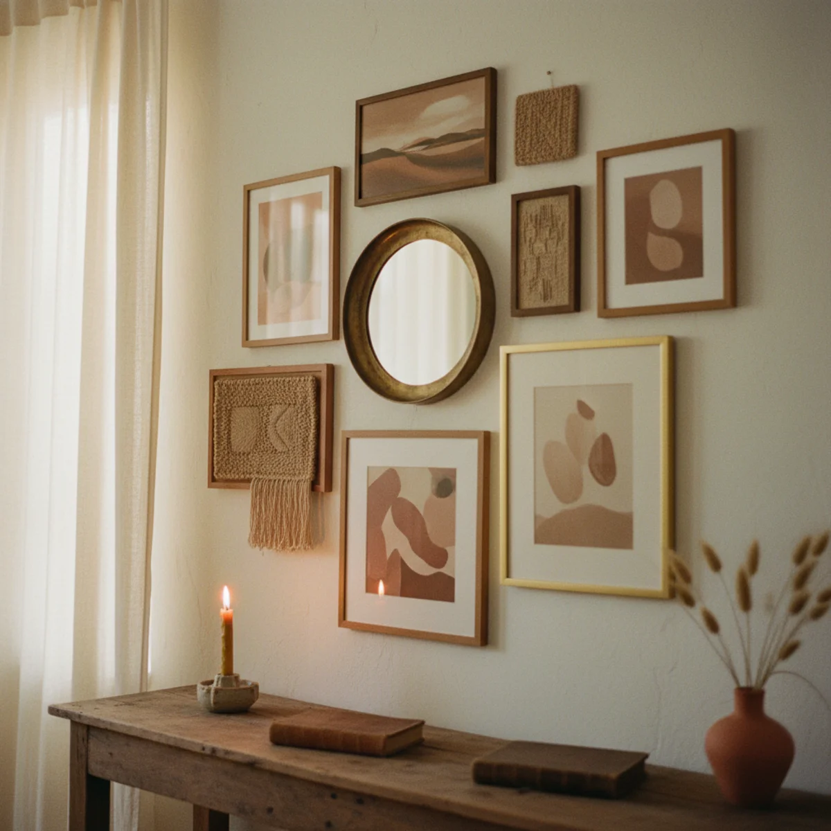
A good gallery wall combines a mix of art, frames, and objects, unified by one consistent thread, arranged with even spacing around a center line, and planned before a single nail goes in. The mix is the point — varied sizes, types, and subjects read as collected over time — but it needs one unifying element to keep it from chaos: a consistent frame color, a shared palette, or a common theme.
Planning is what separates success from a wall of regret. Laying the arrangement out on the floor (or tracing the frames onto paper templates taped to the wall) lets you adjust before you commit, keeping the spacing consistent — usually two to three inches between frames — and the whole grouping balanced around a center line at eye level. Get the unifying thread, the even spacing, and the floor-planning right, and a gallery wall becomes a warm, personal focal point rather than a haphazard cluster.
More in Styling you may love
See allWhy gallery walls matter in 2026
The gallery wall stayed a fixture of the warm, collected home — a way to display art, photos, and personal pieces together — and 'how to hang a gallery wall' is a perennial top decorating question. Pinterest's gallery wall searches climb every year, toward warm, collected, mixed-frame arrangements over rigid matching grids.
The honest reason people keep asking is that gallery walls are genuinely hard to get right and easy to get wrong, and the instinct to just start hanging is what dooms them. As the warm-home aesthetic prized collected, personal displays, the gallery wall offered a way to fill a wall with story and warmth — but only with the planning, spacing, and unifying thread that most people skip. Done right, it's one of the warmest features in a room; done wrong, it undermines it.
12 gallery wall ideas and rules
01Plan the Entire Layout on the Floor First
Before any nail enters the wall, lay every piece you're considering on the floor in the rough arrangement you want — same total dimensions as your wall, same proportional spacing. This single 30-minute step prevents 90 percent of gallery-wall failures. Move pieces around freely, swap pieces in and out, photograph from multiple angles. The arrangement that survives 20 minutes of rearrangement is the one to hang.
Use the floor space in front of the actual wall the gallery will hang on. Lay the pieces face-up in the arrangement you're testing. Measure the total dimensions of the planned arrangement (height and width) and confirm it fits on the wall with appropriate margins (at least 6 to 12 inches from any other furniture or wall edge). Photograph the arrangement from your normal viewing distance and angle, then critique the photo — flaws read more clearly in a photo than on the floor. Adjust, re-photograph, iterate. Total time: 30 to 60 minutes. Once the arrangement is right, trace each piece on butcher paper (or use paper cut to size as a template) and tape the paper to the wall to confirm placement before driving nails.
AFFILIATE SLOTPROCESS30-60 minute floor-planning step + paper templates taped to wall before nailingAdd affiliate URL when configuredWhy it works
Because gallery walls require commitment with every nail — moving a piece an inch up or over requires a new hole and spackle for the old one. Most gallery-wall failures cascade from the first one or two pieces being slightly off, with every subsequent piece adjusting to the wrong reference. Floor planning eliminates the cascade by letting you find the right arrangement entirely with movable pieces before any commitment, then transferring the planned layout directly to the wall.
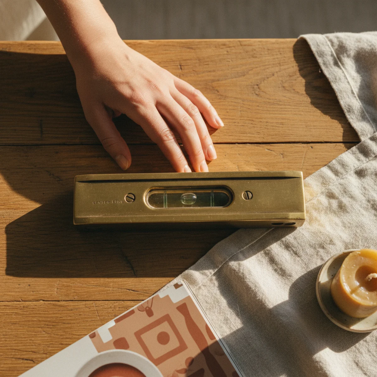
Pro tip — Cut paper templates the exact size of each frame and tape them to the wall before driving any nails — the paper templates let you adjust the actual hang positions by inches without putting holes in the wall. After 24 hours of looking at the paper templates from various angles, you'll know exactly where the final positions belong.
Floor first, hammer second — the 30-minute planning step that prevents most gallery-wall failures. See also: paper templates
02Unify Every Gallery Wall With One Thread
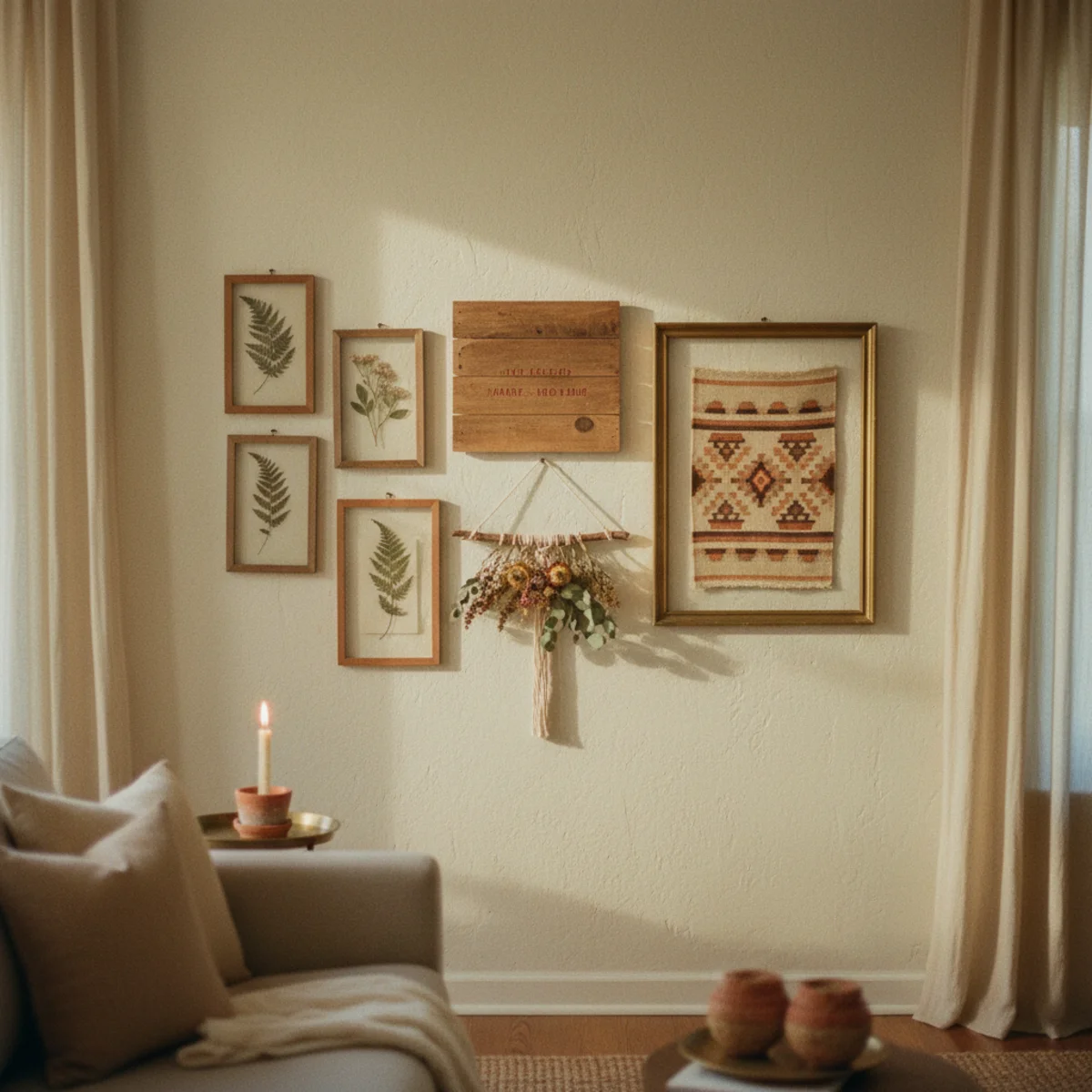
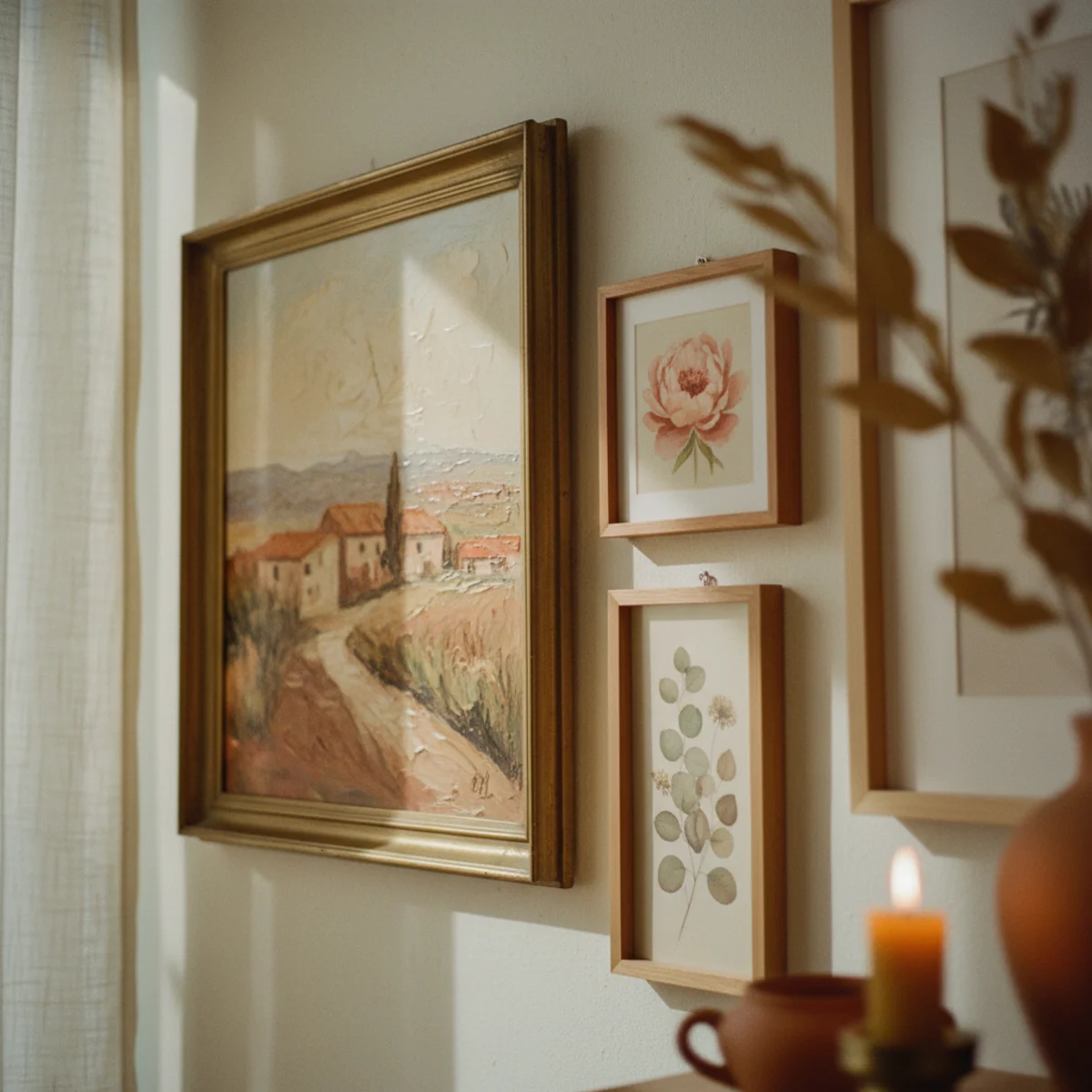
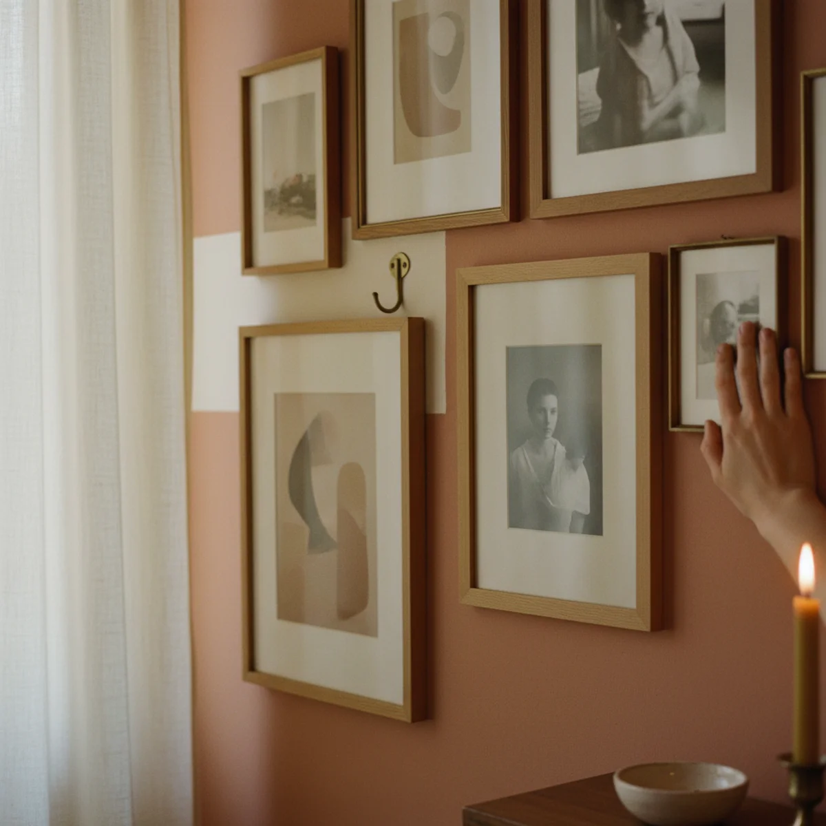
Mixed gallery walls (different sizes, different subjects, different artists) only work when one element unifies them — same frame color across all pieces, same subject category (all landscapes, all portraits, all botanicals), same tonal palette (all warm earth tones), or same medium (all black-and-white photography). Without one unifying thread, mixed pieces read as confused; with one, the same mix reads as collected.
Pick exactly one unifying thread before assembling: FRAMES — all pieces in matching oak, walnut, or aged brass frames regardless of art type. PALETTE — all pieces in warm earth tones (no bright primaries) regardless of subject. SUBJECT — all landscapes, all botanicals, all portraits, all abstracts. MEDIUM — all black-and-white photography, all line drawings, all oil paintings. The thread is what your eye uses to read the whole wall as one composition rather than a random collection. Two threads (matching frames AND warm palette) tighten the cohesion further but aren't required; one is the minimum.
AFFILIATE SLOTPRINCIPLEPick exactly one thread: matching frames, matching palette, matching subject, or matching mediumAdd affiliate URL when configuredWhy it works
Because one strong thread is enough to tie diverse pieces together while preserving the visual interest of variety. Two threads (same frame + same subject) start to read as themed rather than collected — too cohesive feels like a curated set, where one thread feels like an inhabited home. The sweet spot is exactly one threading element strongly applied; the variety in everything else is the warmth.
Pro tip — If your gallery wall feels random after assembly, the missing piece is usually the frame thread — replace all the existing frames with matching warm-wood or aged-brass frames at $20 to $40 each, and the same art instantly reads as one cohesive collection rather than a random cluster.
Diverse art, matching brass frames — one unifying thread is all a gallery wall needs. See also: warm-wood or aged-brass frames
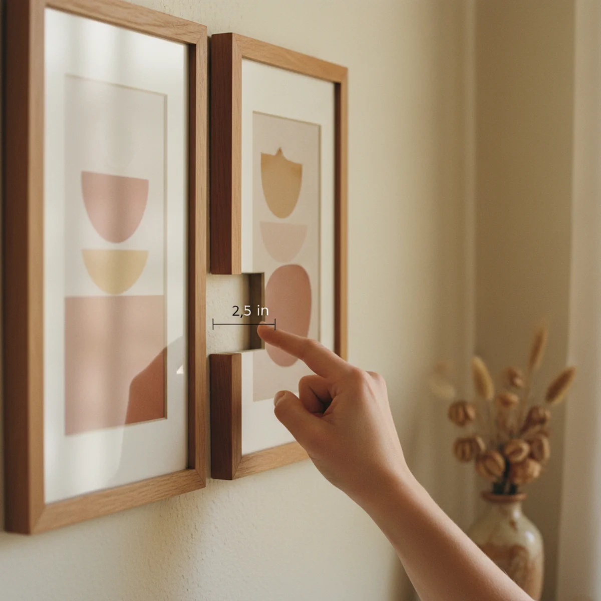
03Keep Spacing Consistent at 2 to 3 Inches
The single most-violated gallery-wall rule is consistent spacing between pieces. Eye reads consistent gaps as deliberate, varied gaps as accidental. Maintain 2 to 3 inches of space between every adjacent frame, regardless of frame size or position. The consistency is what makes the gallery wall register as one arrangement rather than as multiple disconnected pieces.
Use a measuring tape and small piece of cardboard cut to 2 inches as a spacer between adjacent frames when hanging. The spacing should be 2 to 3 inches between every pair of frames that touch on any edge — vertically, horizontally, or diagonally. Tighter spacing (under 2 inches) reads cramped; wider spacing (over 4 inches) reads as separate pieces rather than one wall. The 2 to 3-inch sweet spot reads as deliberate composition with each piece given space to breathe. Resist the instinct to vary the spacing for visual interest — the consistency is the visual interest.
AFFILIATE SLOTRULE2 to 3 inches consistent spacing between all adjacent frames, using cardboard spacerAdd affiliate URL when configuredWhy it works
Because the human eye registers consistent intervals as deliberate composition, the way a designer or curator would arrange a gallery. Inconsistent intervals read as casual or accidental — the eye doesn't know where the composition starts or ends. The 2 to 3-inch spacing works because it's narrow enough to read as one arrangement and wide enough that each piece registers individually; tighter spacing blurs pieces together, wider spacing separates them entirely.
Pro tip — Use a 2-inch cardboard spacer cut from a cereal box — easier to use than measuring tape because it slides between frames without measuring. Hold the spacer against the bottom of the first frame, then position the second frame's top edge against the spacer. Move the spacer to the next gap, repeat. The spacing stays exactly consistent across the whole wall without measurement errors.
2.5-inch consistent spacing — the gap rule that reads deliberate at any frame size. See also: cardboard spacer
04Anchor the Arrangement Around a Center Line
Gallery walls work best when arranged around an invisible center line — usually the eye level of an average standing adult, around 57 to 60 inches above the floor. The largest piece or visual focal anchors the arrangement on this center line, and smaller pieces extend up, down, and sideways from there. Without a center anchor, gallery walls drift upward (most people hang too high) or feel ungrounded.
Establish the center line at 57 to 60 inches above the floor (standard gallery hanging height — eye level for a 5'9" person standing). Position the largest or most-important piece so its center sits on this line. Add smaller pieces extending up, down, and sideways from the anchor. The total arrangement extends 18 to 36 inches above the center line and 18 to 36 inches below — symmetric or asymmetric is fine, but never weighted only above or only below the center line. Use a pencil mark on the wall to indicate the center line during planning; erase or paint over after hanging.
AFFILIATE SLOTPLACEMENTCenter line 57-60 inches above floor, anchored by the largest pieceAdd affiliate URL when configuredWhy it works
Because gallery walls without a defined center drift upward as people add pieces over time — each new piece gets placed slightly above the existing arrangement, which over months results in galleries that hang at ceiling height with nothing below the visual center of the wall. The fixed center line at 57 to 60 inches prevents the drift and keeps the gallery anchored at a viewing height that matches normal sight lines. Eye-level hanging is the single most important hanging-height rule.
Pro tip — Stand in front of your wall as you'll normally view the gallery (from a sofa, hallway, or doorway) and look at the spot where your eyes naturally land — that's your real center line, often different from the standard 57 inches. Anchor your gallery's center piece there instead of at the textbook height; the wall reads more comfortable from your actual viewing position.
Center line at 58 inches, largest piece anchoring — the rule that prevents galleries from drifting upward. See also: 57 inches
05Mix Sizes and Types — Don't Match Everything
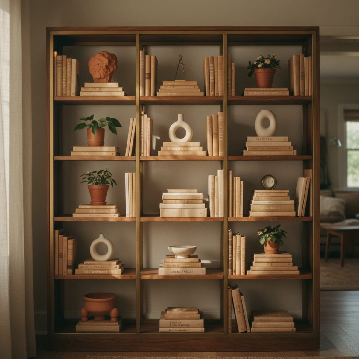
A gallery wall of all identical-size frames reads as a grid rather than a gallery — appropriate for some contexts (museum-style installations) but not most warm-home settings. The fix is mixing sizes: one or two large pieces (16x20 or larger), several medium pieces (8x10 to 11x14), and a few smaller pieces (4x6 to 6x8). The size variation creates visual rhythm and lets the unifying thread (rule 2) do the cohesion work without requiring matching dimensions.
Aim for roughly: 1 to 2 large pieces (16x20, 18x24, or larger) as anchors. 3 to 5 medium pieces (8x10, 11x14, 12x16) as the workhorse middle layer. 4 to 8 small pieces (4x6, 5x7, 6x8) filling around the anchors. Mix vertical and horizontal orientations within each size range. Include at least one round or shaped frame (oval, octagonal, or unconventional) as a visual break from rectangular monotony. Keep the unifying thread (frame color, palette, subject) consistent across all sizes.
AFFILIATE SLOTCOMPOSITION1-2 large pieces (16x20+), 3-5 medium (8x10-12x16), 4-8 small (4x6-6x8)Add affiliate URL when configuredWhy it works
Because uniform size creates visual monotony — the eye scans the wall as a single repeating pattern rather than a composition with hierarchy. Mixed sizes create natural focal points (the large pieces) and supporting elements (the smaller pieces), giving the eye somewhere to land and somewhere to wander. The composition reads as a deliberately curated collection rather than as a printed grid.
Pro tip — Use one frame larger than feels comfortable — most people instinctively pick frames that are smaller than the wall actually warrants. A 20x30 or 24x36 anchor piece reads more impressive than three 11x14 pieces at the same total wall coverage. Go big on the anchor; small on the supporting cast.
One 16x20 anchor, medium frames around, small pieces filling gaps — size hierarchy is the visual rhythm. See also: round or shaped frame
06Start the Whole Composition With the Biggest Piece
Build the gallery wall from the largest piece outward. Position the anchor first (on the center line, at the planned center of the arrangement), then add medium pieces around it, then fill with smaller pieces. Working large-to-small prevents the common gallery-wall failure of running out of space for the largest piece because all the small pieces are already hung.
On the floor planning step: lay the largest piece down first in its final position. Then place medium pieces around it, leaving 2 to 3-inch gaps. Then fill with smaller pieces in the remaining spaces. When transferring to the wall, hang the same way: largest piece first, anchored to the center line; medium pieces next; smallest pieces last filling gaps. The order matters because the smallest pieces are the most flexible (they can fit anywhere), while the largest piece has the fewest viable positions. Start with the most-constrained piece (largest) and let flexibility cascade down.
AFFILIATE SLOTPROCESSHang largest piece first on center line; add medium pieces; finish with smallest fillersAdd affiliate URL when configuredWhy it works
Because the largest piece has the strongest visual weight and the smallest pieces have the most placement flexibility — starting with the small pieces locks in their positions and then forces the large piece into whatever spot remains, which is rarely the optimal position. Starting with the large piece lets it occupy the optimal anchor position and constrains the smaller pieces around it. The order is the difference between a deliberate composition and an improvised one.
Pro tip — Take a photograph after placing the largest piece on the floor but before adding any others — the photo lets you confirm the anchor position works in isolation. If the anchor reads off-center or wrong-sized for the planned wall, you can adjust before committing the supporting pieces. The anchor decision is the most-important and most-irreversible; treat it as the central problem.
Anchor piece first, supporting pieces second, smallest pieces last — the order that builds compositions, not improvisations. See also: anchor position
07Balance Visual Weight Across the Arrangement
Beyond size, every piece has a visual weight — darker pieces feel heavier than lighter ones, busy patterns feel heavier than simple ones, saturated colors feel heavier than muted. Distribute the visual weight across the arrangement rather than clustering it on one side. A balanced gallery wall has roughly equal visual weight on the left and right (or top and bottom for vertical arrangements).
Squint at the arrangement on the floor (or in the photo) — squinting blurs detail and reveals visual weight. Heavy elements (dark frames, saturated art, busy patterns) should distribute evenly across the composition, never clustering on one side. If the left half feels heavier than the right, move one heavy piece from the left to the right (or swap a heavy left piece with a lighter right piece). The squint-test is the fastest way to identify imbalance; the human eye reads weight imbalance even when individual pieces look fine.
AFFILIATE SLOTBALANCESquint-test or black-and-white photo to verify even visual weight across compositionAdd affiliate URL when configuredWhy it works
Because two pieces of the same physical size can have entirely different visual weights — a dark moody oil painting versus a soft pastel watercolor at the same dimensions read as different masses on the wall. Visual weight is what the eye actually perceives, not just dimensions. A gallery wall with even physical sizes but uneven visual weight reads as lopsided; one with mixed sizes but balanced visual weight reads as cohesive.
Pro tip — Photograph the floor arrangement in black-and-white — the monochrome view strips out color and reveals visual weight (darker areas = heavier, lighter areas = lighter) more clearly than a color photo. If the black-and-white version reads balanced, the wall will read balanced; if not, redistribute before hanging.
Squint at the wall — heavy pieces should distribute evenly, never cluster on one side. See also: squint-test
08Mix In Personal Pieces, Not Just Bought Art
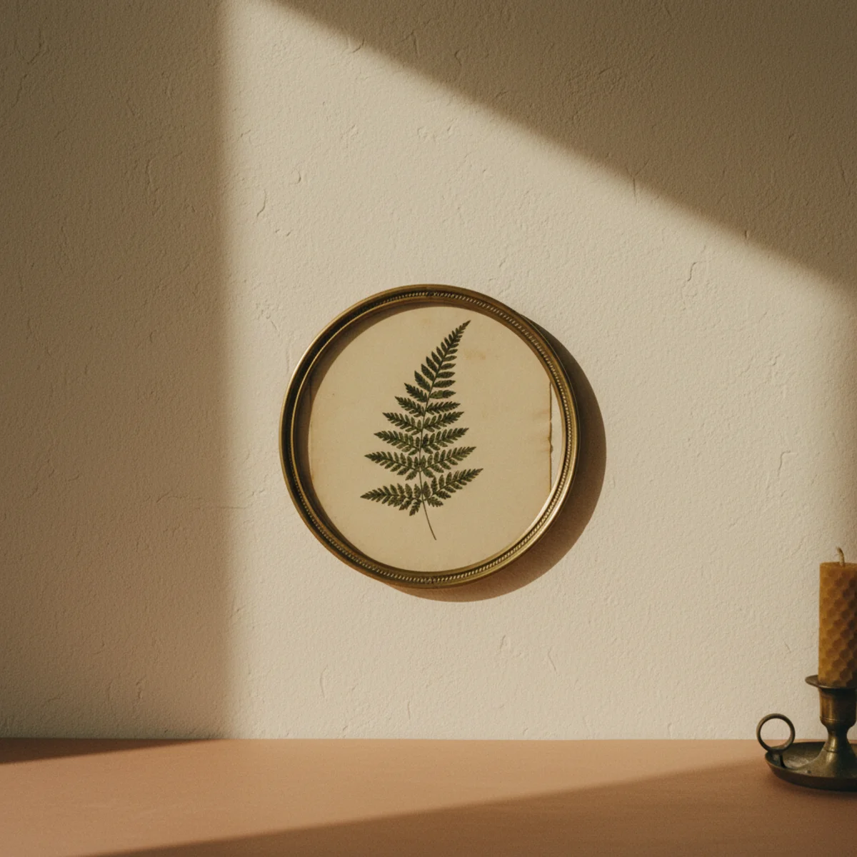
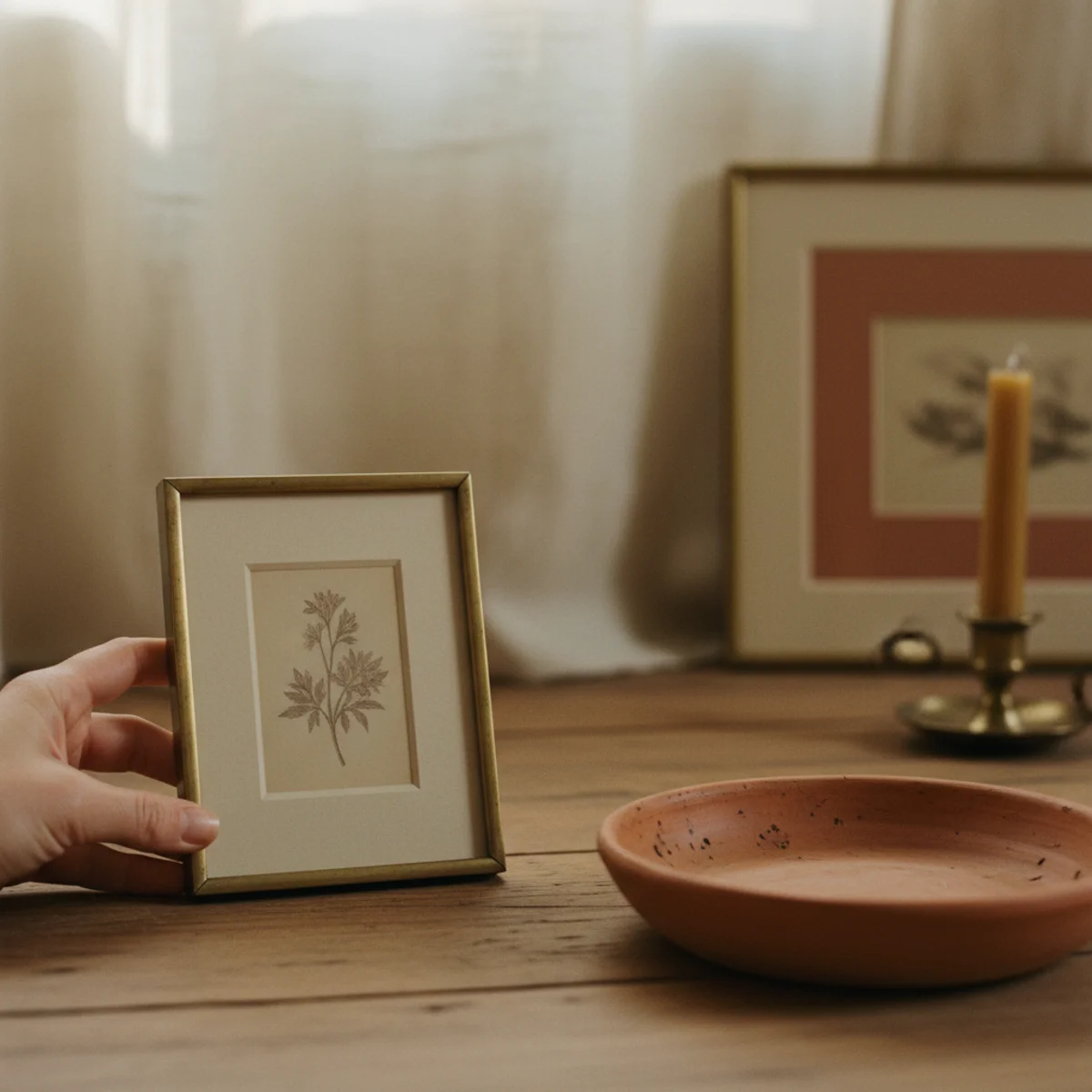
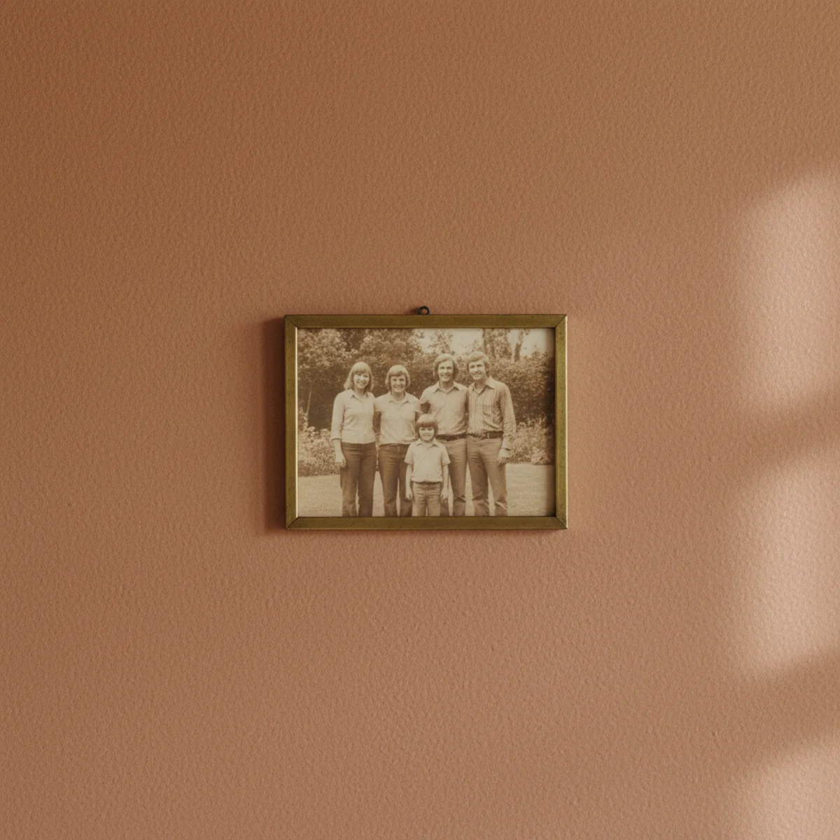
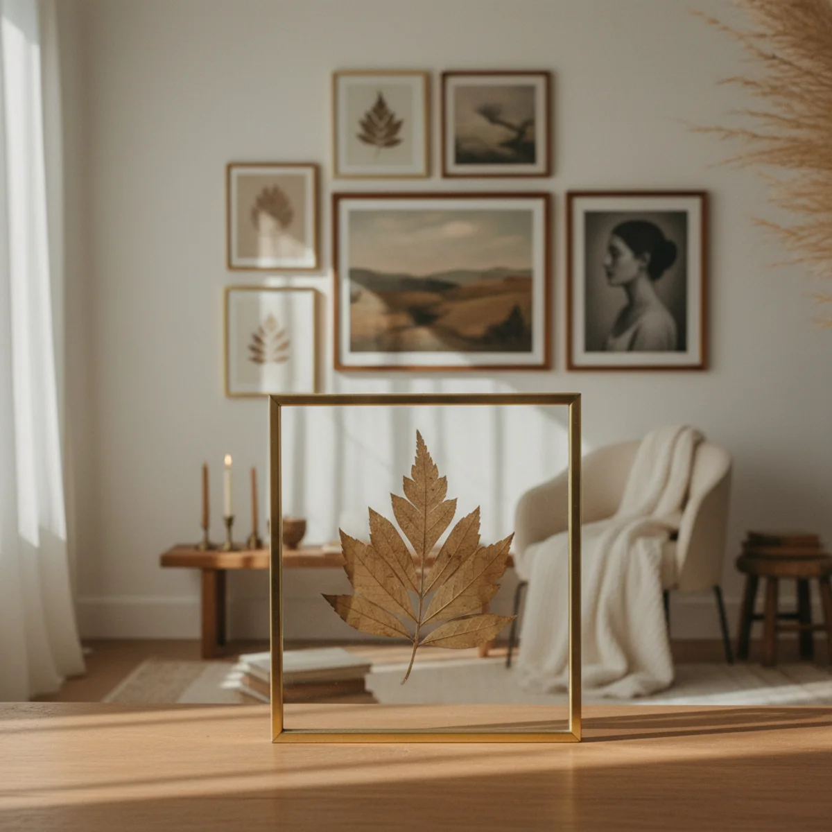
The gallery walls that read most personal include at least one or two pieces that aren't bought art — a child's drawing in a nice frame, a vintage map of a meaningful place, a thrifted family photograph, a small piece of nature framed (a pressed flower, a leaf collection). The personal pieces signal that the gallery belongs specifically to you, not to a stylist who could have arranged it for anyone.
Aim for 20 to 40 percent of the gallery wall to be personal pieces — pieces with specific meaning to you that you couldn't have bought from a generic art retailer. Examples: a child's drawing in a nice frame, a vintage postcard from a meaningful trip, a family black-and-white photograph reframed, a handwritten note from a parent or grandparent in a small frame, a pressed flower or leaf collection in a shadow box, a small piece of nature you found and framed. Frame personal pieces in the same matching frames as the rest (per the unifying thread rule) so they integrate visually rather than reading as the cheap outliers.
AFFILIATE SLOTCONTENT20-40% personal pieces (child's drawings, family photos, vintage maps) matted and matched to other framesAdd affiliate URL when configuredWhy it works
Because gallery walls of all bought art read as decoration; gallery walls with personal pieces read as biography. The personal pieces tell a story about who lives here, where they've been, what they value — none of which bought art can communicate. The same wall with even one or two personal pieces among the bought art reads as inhabited by a specific person rather than styled by a generic decorator. The mix is the soul of the wall.
Pro tip — Mat your personal pieces the same way as your other framed art (acid-free mats from Michael's at $5 to $15 per piece) so the personal pieces read as deliberately framed rather than improvised. A child's drawing in a 4-inch oak frame with a 2-inch white mat reads as art; the same drawing taped to the wall reads as a temporary decoration.
Personal pieces among the bought art — the mix that turns decoration into biography. See also: personal pieces
09Keep the Whole Grouping Tight, Not Sprawling
The best gallery walls cluster pieces tightly into a defined region rather than spreading across an entire wall. A tight cluster reads as one composition; a sprawling arrangement reads as scattered pieces. Confine the gallery wall to a defined rectangle on the wall — typically 4 to 7 feet wide and 3 to 5 feet tall — with no piece outside that boundary.
Aim for a total gallery wall footprint of 4 to 7 feet wide by 3 to 5 feet tall — substantial enough to read as a deliberate installation, contained enough to read as one composition. The boundary is the outer edge of the outermost pieces; everything inside the boundary follows the 2 to 3-inch spacing rule. Avoid spreading pieces across a 10 to 12-foot wall — the gallery becomes scattered rather than cohesive. If you have a long wall to fill, consider two separate gallery clusters with clear empty space between them, each following the tight-grouping rule.
AFFILIATE SLOTSIZE4-7 feet wide x 3-5 feet tall total footprint, never sprawling across a wallAdd affiliate URL when configuredWhy it works
Because the human eye reads a tight cluster as one composition (one thing to register), while a sprawling arrangement reads as many separate compositions (many things to register). One composition has more visual weight and impact than five scattered ones, even when the total art content is identical. The tight cluster also creates a clear visual focal point for the wall, which spreading pieces never achieves.
Pro tip — Outline the planned gallery wall area on the wall with painter's tape before any planning — the tape boundary helps you visualize the total footprint and prevents the impulse to expand the arrangement as you add pieces. Once the gallery wall is hung, peel away the painter's tape; the cluster looks correctly contained within the boundary it never quite reached.
Six feet by four feet, all pieces clustered tightly — the boundary that reads as one composition. See also: outline with painter's tape
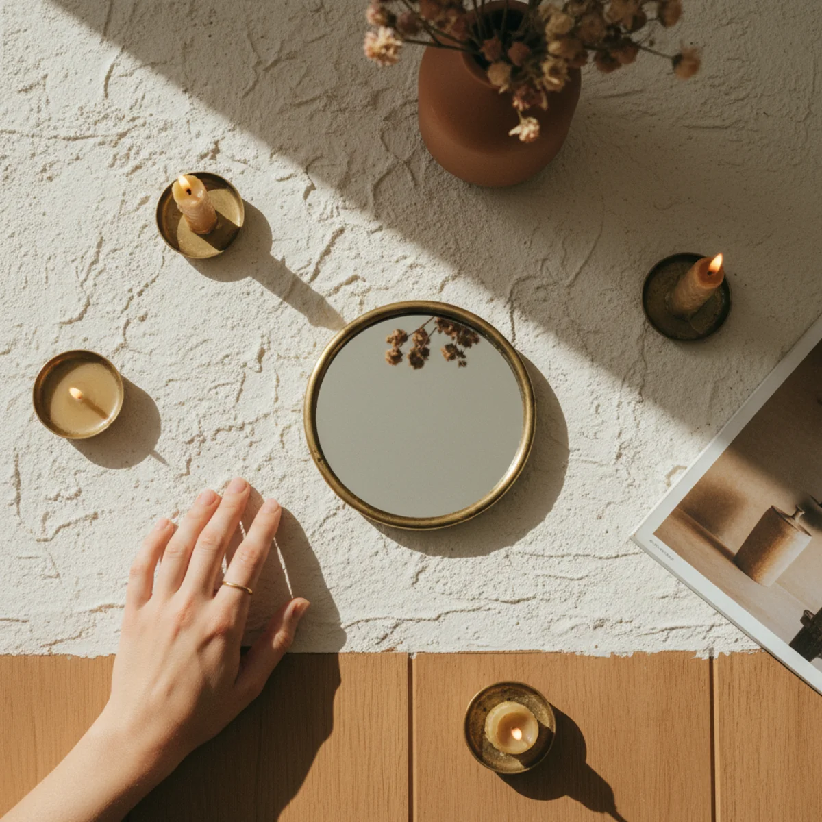
10Add One Mirror or Sculptural Object
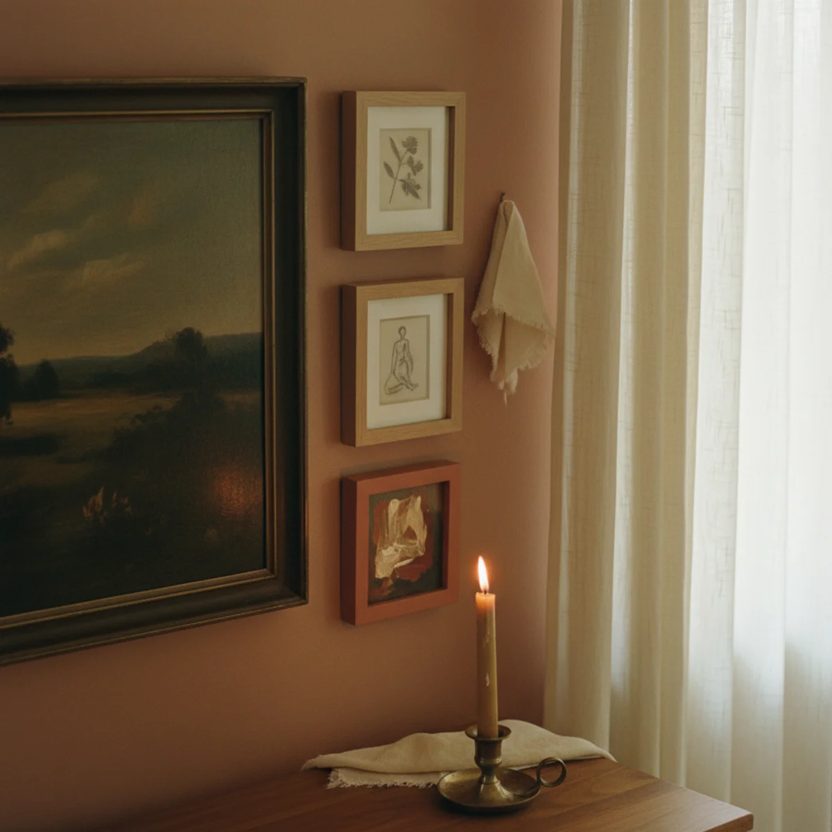
The best gallery walls include one non-flat element — a small round mirror, a small wall sconce, a single sculptural object on a small shelf — among the framed pieces. The non-flat element breaks the visual monotony of all-rectangular-art and adds the same kind of depth that mixing book orientations does on shelves. One per gallery wall, no more.
Choose one non-flat element to include in the arrangement: a small round or oval mirror (8 to 14 inches diameter, $20 to $80 from West Elm, IKEA, or thrift shops); a small wall sconce or picture light (mounted as part of the gallery, $40 to $150 from Cedar & Moss, Schoolhouse, or vintage); a small floating shelf with one sculptural object on it ($30 to $80 for the shelf + object); a small wall-mounted ceramic or sculpture ($30 to $200 from artisan makers on Etsy). Position the non-flat element about a third of the way into the arrangement, never at the dead center (it would compete with the main anchor) and never at the edge (it would look isolated).
AFFILIATE SLOTVARIETYOne non-flat element: small round mirror, sconce, or sculptural object on small shelfAdd affiliate URL when configuredWhy it works
Because all-framed gallery walls have one consistent visual mode — flat 2D rectangles or other shapes — which reads as homogeneous regardless of variety in art type. One non-flat element (mirror, sconce, sculptural object) introduces a different visual mode that breaks the homogeneity without breaking the cohesion. The contrast adds depth and visual texture that pure flat-art galleries can't achieve.
Pro tip — Use a round mirror as the non-flat element if you have any south- or east-facing window opposite the gallery wall — the mirror catches and bounces the morning natural light across the gallery, adding ambient brightness to the surrounding art. Round mirror at 12 inches catches more light than rectangular at the same area.
One small round mirror among the frames — the non-flat element that adds depth without breaking cohesion. See also: small floating shelf
11Use Consistent or Closely-Related Frames
The single tightest unifying thread (per rule 2) is the frame. Galleries with all-matching frames or all-related-frames read as deliberately curated regardless of how diverse the actual art content is. The opposite — every frame a different color, material, and style — turns even cohesive art into visual chaos. Frame consistency does the cohesion work that art subject alone can't.
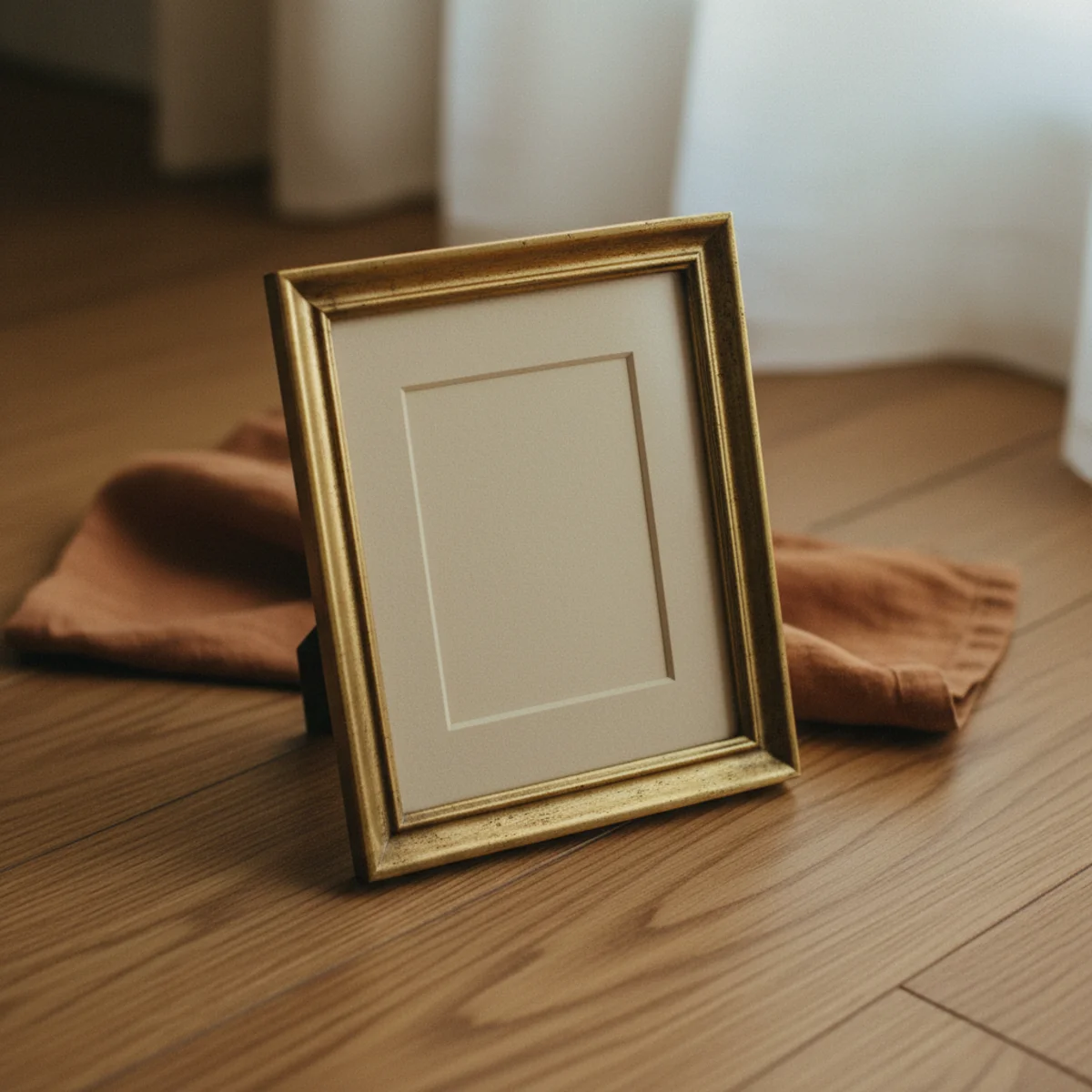
Three approaches: ALL MATCHING — every frame in the same warm wood (oak, walnut), aged brass, or oiled black. The strongest cohesion approach. ALL RELATED — frames in the same color family but different materials (one oak frame, one walnut, one warm oiled black). More casual cohesion. MIXED WITHIN A WARM PALETTE — mix of warm wood frames in different species (oak, walnut, teak, oiled pine) but all in the same warm-toned family. Most relaxed cohesion. Avoid mixing cool-toned (bright chrome, white plastic) and warm-toned frames in the same gallery — the temperature mismatch breaks the cohesion immediately. Sources for affordable frames: IKEA HOVSTA ($20-40), Pottery Barn ($40-80), thrifted vintage frames ($5-15).
AFFILIATE SLOTFRAMESAll matching, all related, or all within warm-toned palette; avoid mixed temperaturesAdd affiliate URL when configuredWhy it works
Because the frame is the visual element the eye registers first when scanning a wall full of art — before the art content itself. Consistent frames create a strong border pattern that holds the entire arrangement together, even when the art inside the frames varies wildly. Inconsistent frames disrupt the border pattern and force the eye to process each frame individually, which fragments the composition. The frame is the wall's skeleton; the art is the skin.
Pro tip — Reframe inherited or thrifted art in matching frames if your gallery wall has too much frame chaos — the same art in matched frames at $20 to $40 each from IKEA transforms a mismatched collection into a curated gallery for under $200 total in reframing. The art is unchanged; only the frames matter for cohesion.
Diverse art, all warm oak frames — frame consistency is the strongest cohesion thread available. See also: reframing
12Grow the Gallery Wall Over Time
The best gallery walls aren't built in one weekend — they grow over months or years as you collect art, find personal pieces, frame inherited objects. Start with 5 to 7 pieces, live with them for a few months, add 2 to 3 more, live, add, repeat. The slow build is what makes the gallery read as collected rather than curated, and the iterative process means you can fix mistakes before they compound.
Begin with a core 5 to 7 pieces — enough to anchor the visual composition but not enough to fill the planned gallery boundary completely. Hang these pieces using all the rules above. Live with the arrangement for 1 to 3 months. Then add 2 to 3 new pieces in the empty zones within the boundary — newly framed inherited art, new prints, recent thrift-shop finds, personal pieces you've matted and framed. Live with the expanded arrangement. Continue adding 2 to 3 pieces every few months until the gallery feels complete (usually 12 to 20 pieces total). The slow growth means each addition gets full consideration; quick assembly means every piece is a compromise.
AFFILIATE SLOTPROCESSStart with 5-7 core pieces, add 2-3 every few months over 1-3 years to 12-20 totalAdd affiliate URL when configuredWhy it works
Because slow-grown galleries accumulate pieces with specific personal meaning — the painting you bought on a trip, the photograph a friend gave you, the inherited piece you finally got framed. Single-session builds can only use pieces you already own at that moment, which limits the personal depth. Slow growth also lets you fix early mistakes (move a piece, replace a frame) before too many other pieces have been arranged around them. The patience is what builds galleries that feel earned.
Pro tip — Keep an ongoing 'gallery wishlist' — a small notebook or notes app where you record art ideas, framed pieces you want to commission, photographs you want to print, thrift-shop pieces you almost bought. Reviewing the wishlist every few months tells you what to look for or commit to, and the gallery's growth becomes intentional rather than reactive.
Started with seven, grew to eighteen over two years — slow-build galleries read as collected, never curated. See also: personal pieces
How to hang a gallery wall step by step
Plan first, hang last. The floor work is the whole game.
- 1Gather and plan on the floor
Collect your frames and pieces, then arrange the whole grouping on the floor, starting with the largest piece off-center and building outward with consistent spacing.
- 2Make paper templates
Trace each frame onto paper, cut out the templates, and tape them to the wall in your planned layout to confirm it before any nails.
- 3Check spacing and center line
Keep two to three inches between frames and balance the grouping around a center line at gallery eye level, around 57–60 inches.
- 4Hang from the center out
Hang the anchor piece first, then work outward, marking the hook position through each paper template before removing it.
Quick tips
- Plan the whole arrangement on the floor before hanging a single piece.
- Trace frames onto paper templates and tape them up to confirm the layout first.
- Keep spacing consistent — two to three inches between every frame.
- Unify the mix with one thread: a frame color, a palette, or a theme.
- Anchor the grouping around a center line at gallery eye level, about 57–60 inches.
- Mix in personal pieces and a mirror or object so it reads collected and warm.
Gallery walls by style
Mixed frames, sizes, and types unified by a shared palette — the warmest, most personal version.
Matching frames in a clean grid for a more ordered, modern look.
A dense, floor-to-ceiling cluster of art; see our English country decor guide for the maximalist take.
Frames following the diagonal of a staircase, spaced consistently along the rise.
A great gallery wall looks collected over years even if it went up in a weekend. The secret is planning it on the floor first.
Frequently asked questions
How do I plan a gallery wall before hanging?+
How much space should I leave between frames?+
What height should I hang a gallery wall?+
How do I make mixed art look cohesive?+
How many pieces should be in a gallery wall?+
Should every frame match exactly?+
A gallery wall can read as a warm, collected story of a life or as a chaotic grid of regret, and the difference is almost entirely planning. Lay the whole arrangement on the floor first, unify the mix with one thread, keep the spacing consistent, and balance it around a center line. We'd spend an hour floor-planning and tracing paper templates before touching a hammer; that hour is the whole difference between a wall that looks collected over a decade and one that looks like a ransom note. Plan first, hang last, and let the personal pieces make it warm.