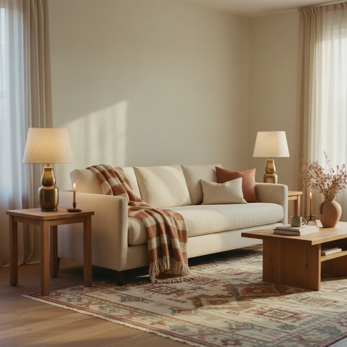
These eight coffee-table styling principles are tested in real living rooms — not stylist photoshoots — where the same table also holds remotes, water glasses, and last week's magazine. Every rule below assumes the table needs to function daily (somewhere to set a mug, somewhere to put your feet up) while also reading as styled. The two purposes coexist if the styling occupies one defined zone of the table and the functional clutter has somewhere else to go.
The biggest mistake in coffee-table styling is treating the whole table as the styled zone. Real living-room coffee tables need 40 to 60 percent of the surface kept clear for actual use — drinks, remotes, the book you're reading right now. The styled vignette occupies the other 40 to 60 percent. The two coexist because they're physically separated, not because the table is somehow magically large enough for both.
By the end of this guide, you'll know exactly how to claim half the coffee table as a styled zone with a tray, build a vignette with one stack of books and one sculptural object, add the small bit of green that brings it alive, and leave the breathing room that prevents the whole thing from reading as cluttered.
WHAT'S INSIDE
- The tray that contains styled objects and leaves the rest of the table free
- Why books are the workhorse of coffee-table styling — and which books to use
- The single sculptural object that anchors any styled coffee table
- The breathing-room rule (40-60% empty) that prevents over-styling
Coffee-table styling is the most learnable thing in decorating. Tray, books, object, green — that formula never fails.
— Studio McGee blog [citation needed — verify before publish]
What's the formula for styling a coffee table?
The reliable coffee-table formula is four elements: a tray to corral small things, a stack of books for height and a surface, one sculptural object, and a bit of green like a small plant or fresh stems. Grouped together with breathing room around them, these read as a considered vignette rather than clutter — and the tray quietly solves the remote-and-coaster problem that buries most coffee tables.
The principles underneath are the same as any styling: vary the height (the book stack lifts the object), group rather than scatter, leave negative space, and keep a tight palette. The tray is the secret weapon — it contains the daily clutter and defines a styled zone in one move, so the table never reads messy even in use. Scale the formula to the table: a small table might take just a tray, a small stack, and one object; a large one can hold two groupings.
More in Styling you may love
See allWhy coffee-table styling matters in 2026
The coffee table sits at the literal center of the living room and the styled coffee table became a defining detail of the warm, considered home — Pinterest's coffee table styling and decor searches climb steadily, toward the tray-books-object-green formula.
The honest reason people ask is that the coffee table is the most-seen surface in the room and the easiest to get wrong — bare looks unfinished, cluttered looks chaotic. As the warm-home aesthetic prized considered, lived-in surfaces, the simple repeatable formula made coffee-table styling accessible to everyone. It's a small detail with outsized impact: a styled table pulls a whole living room together, while a buried or empty one undermines it.
8 coffee table styling moves
01Start With a Tray to Define the Styled Zone
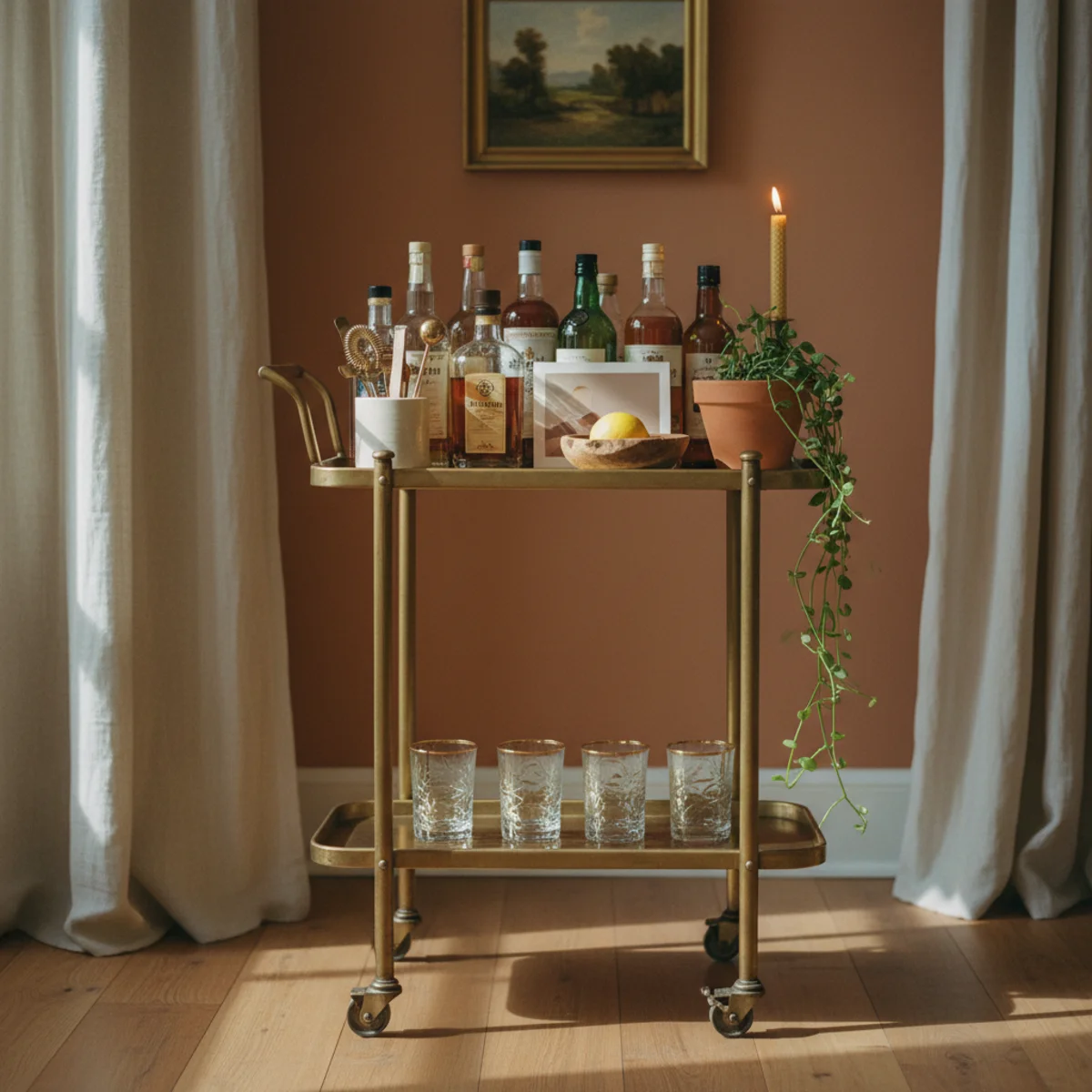
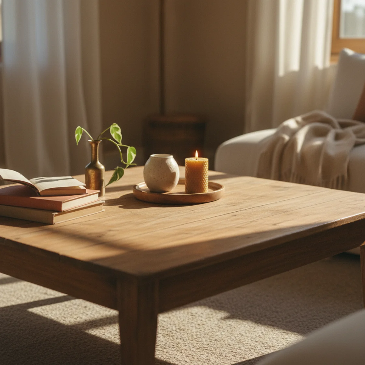
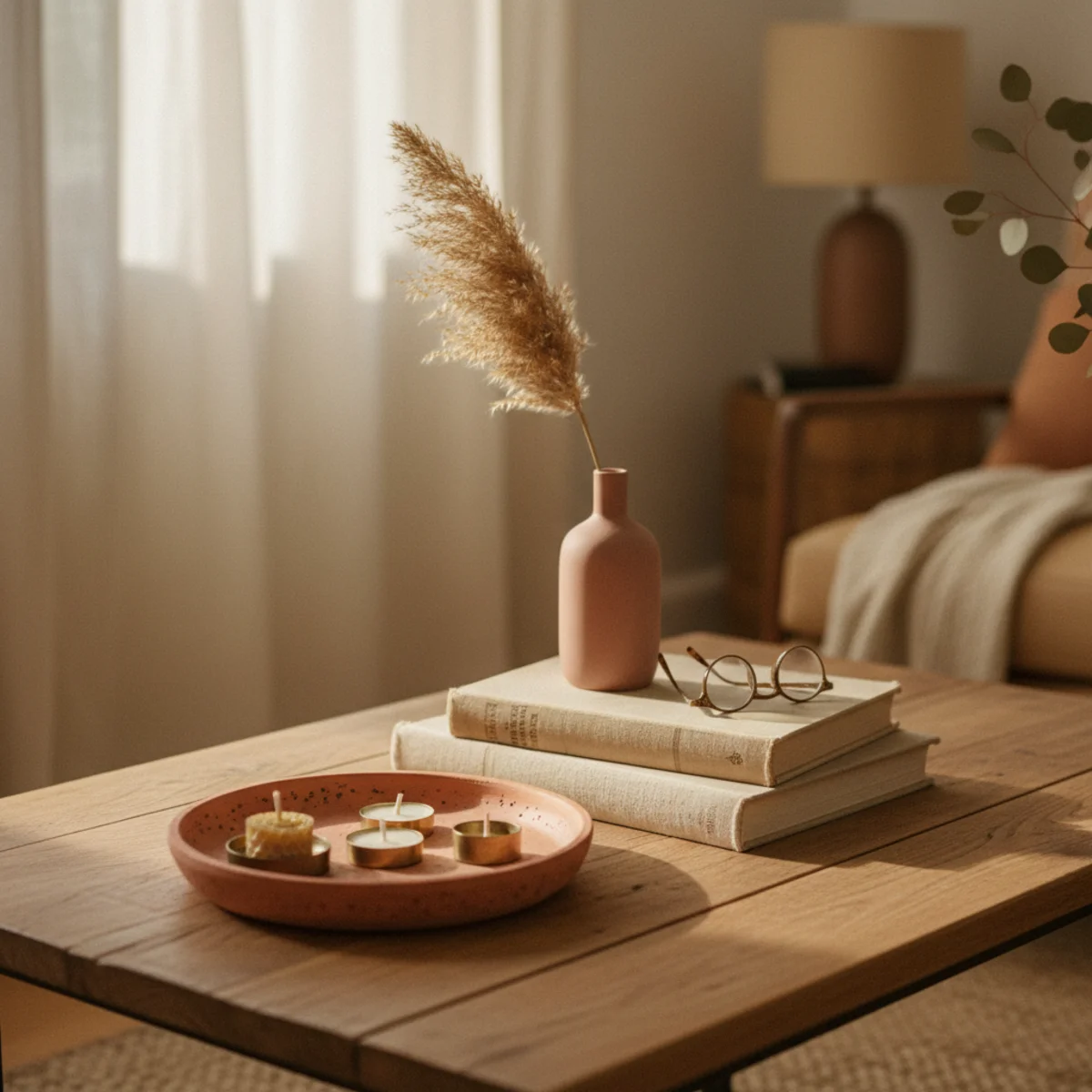
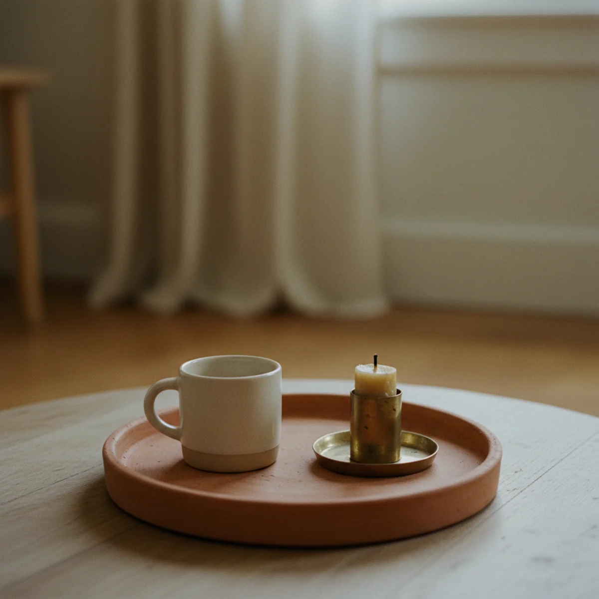
The single most-important coffee-table styling move is a tray — it visually contains the styled objects within a defined rectangle, leaving the rest of the table free for daily use. A 12-by-18-inch wooden, brass, or rattan tray placed on one half (or one third) of the coffee table instantly turns scattered objects into a styled vignette and reserves the remaining surface for functional clutter.
Choose a tray 12 to 18 inches long, 8 to 12 inches deep — large enough to hold a small stack of books, a sculptural object, and a small accent, small enough to leave 50 to 60 percent of the table tray-free. Materials: oiled walnut or oak (most forgiving for spills), aged brass (warmest visual), rattan or woven (most casual), or marble (most heirloom). Sources: thrifted wood trays at $5 to $25 (Goodwill, ReStore), HomeGoods at $20 to $40, West Elm at $44 to $89, Pottery Barn marble at $89 to $179. Position the tray on one half of the coffee table, leaving the other half clear for daily use. Style only inside the tray; the rest of the table stays unstyled.
AFFILIATE SLOTFOUNDATION12-18 inch wooden, brass, rattan, or marble tray on one half of the coffee tableAdd affiliate URL when configuredWhy it works
Because the tray creates a visual boundary that the eye uses to register the styled objects as a deliberate vignette rather than scattered decor. Inside the tray, three objects read as a composition; outside the tray, the same objects read as clutter. The boundary is what does the styling work — your actual object choices matter less than the tray that contains them.
Pro tip — Use the tray's edges to define both styling AND function — the tray contains the vignette, the empty area beside the tray holds remotes, drinks, and current reading. The physical edge of the tray reminds everyone in the room which side is for daily use, which side is left styled. Spills and crumbs stay contained on the function side.
Tray defines the styled half, the other half stays clear — the foundation that makes coffee-table styling work. See also: thrifted wood trays
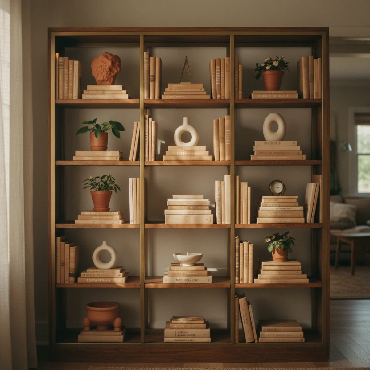
02Add a Stack of Books — The Workhorse
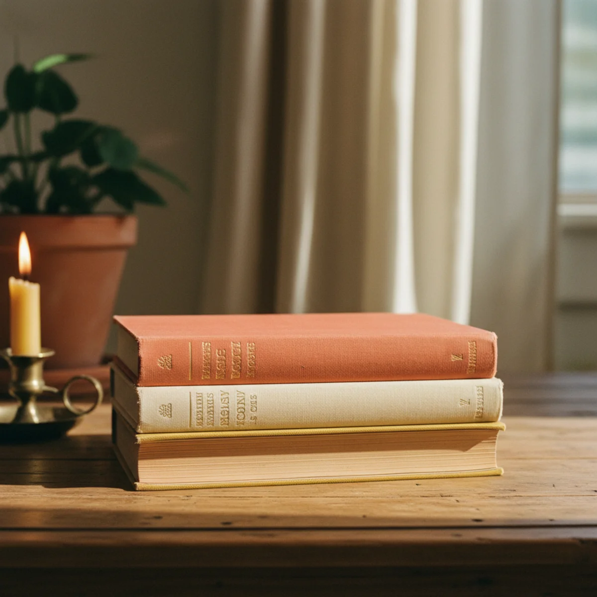
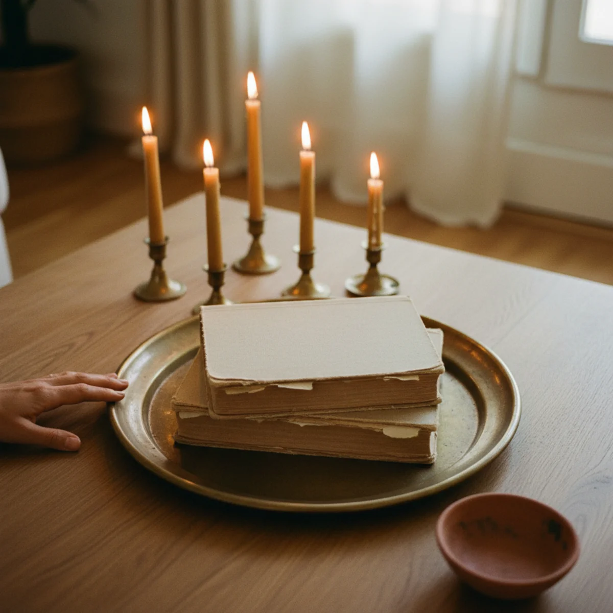
Books are the workhorse object of coffee-table styling — they fill space, add visual weight, create a platform for smaller objects, and read as intellectual without trying. A stack of three to five large coffee-table books (or any oversized hardcover books) inside the tray anchors the vignette and provides the horizontal surface for the sculptural object that goes on top. Hardcovers only; paperbacks read flimsy.
Stack 3 to 5 hardcover books inside the tray, horizontally — the largest book on the bottom, smaller books ascending. Use real books you actually like (art and photography books, atlases, monographs, novels with beautiful covers, design or architecture books) rather than 'decor books' purchased for styling. Strip dust jackets to expose cloth bindings — the cloth binding colors and textures read as more sophisticated than printed dust jackets, which can compete with the warm-home palette. The stack should be 3 to 6 inches tall total; taller reads precarious, shorter doesn't function as a platform. Source from your own bookshelves, thrift shops at $1 to $5 per book, or library book sales at $2 to $10 per oversized hardcover.
AFFILIATE SLOTANCHORStack of 3-5 hardcover books with dust jackets stripped, inside the tray, total height 3-6 inchesAdd affiliate URL when configuredWhy it works
Because books have rectangular regularity that fits perfectly inside the tray's rectangular boundary, plus enough mass to read as visually substantial without feeling cramped. A book stack also creates a flat horizontal platform at 3 to 6 inches above the table — the perfect height to elevate the sculptural object that follows in rule 3. Other potential anchor objects (single large ceramics, large candles) lack either the rectangular fit or the platform function. Books do both.
Pro tip — Place a small object (a single small ceramic, a brass bowl, a tiny framed photograph) directly on top of the book stack to use it as a styling platform. The combination of book stack + small object on top reads more sophisticated than either alone, and the elevation gives the small object visual weight it wouldn't have at table-surface level.
Four hardcover books, dust jackets stripped, cloth bindings showing — the workhorse anchor of coffee-table styling. See also: cloth bindings
03Place One Sculptural Object on Top of the Book Stack
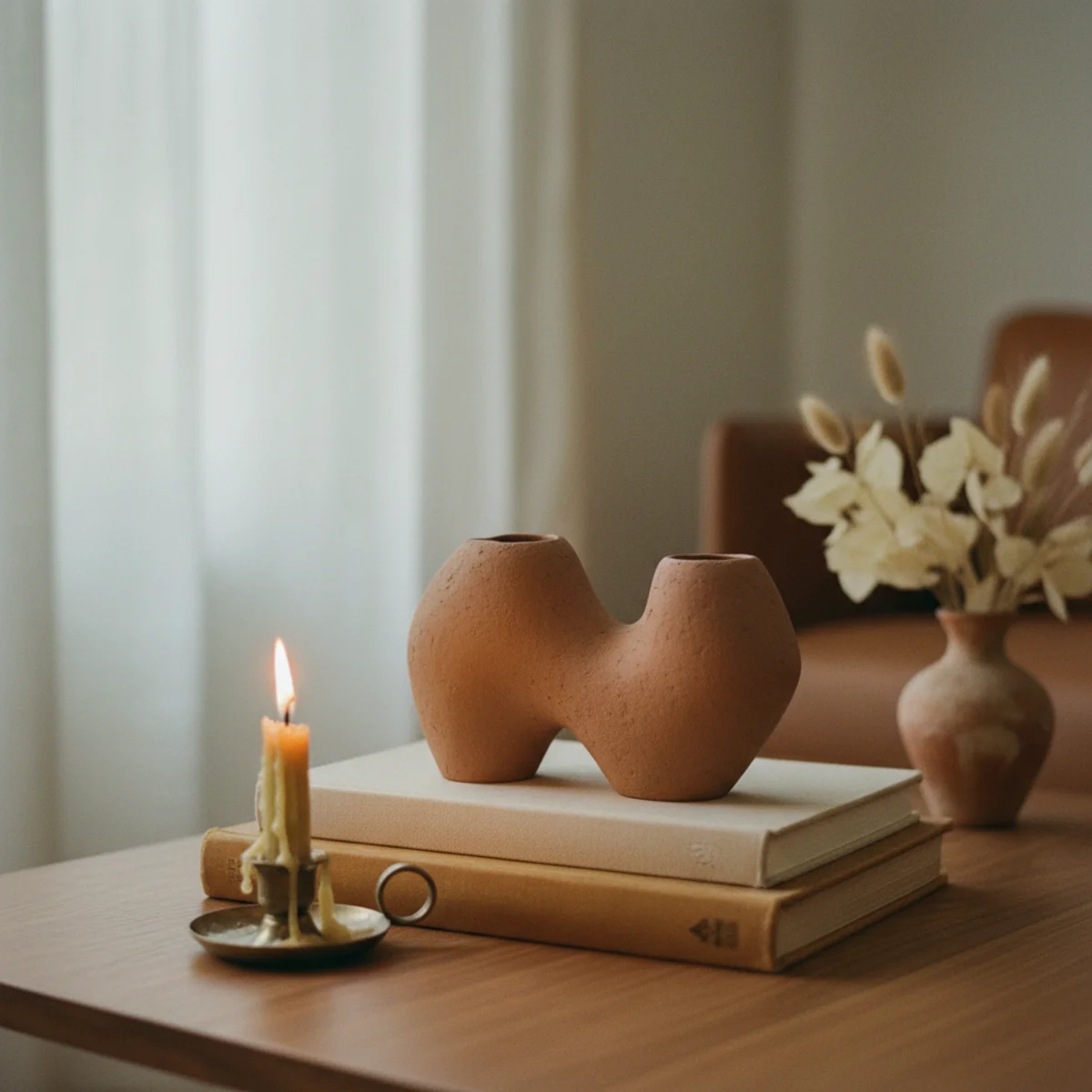
On top of the book stack goes one sculptural object — a hand-thrown ceramic vessel, a worn wooden bowl, a small piece of weathered driftwood, a small abstract sculpture. The object becomes the vignette's anchor; the books and tray are supporting structure. One object only — multiple sculptural pieces compete and dilute the focal effect.
Choose a sculptural object 4 to 8 inches tall (or wide), in stoneware, ceramic, wood, stone, or aged brass — never plastic or anything obviously commercial. The object should have weight, irregular shape, and surface texture that reads as hand-made. Sources: thrifted studio pottery at $5 to $30 (Goodwill, estate sales, ReStore), vintage African or Japanese carved wood at $20 to $100 (Etsy, antique dealers), small artist-made sculptures from craft fairs at $30 to $150. Position the object centered or slightly off-center on top of the book stack — its base sits flat on the topmost book. The object becomes what your eye registers first when entering the room.
AFFILIATE SLOTANCHOROne sculptural object 4-8 inches in stoneware, wood, stone, or brass, placed on top of book stackAdd affiliate URL when configuredWhy it works
Because sculptural objects have higher visual weight than ordinary decor — the irregularity of their shape, the materiality of their surface, the evidence of hand-making all signal art to the eye. A vignette with one sculptural object and supporting books reads as a small still-life composition; the same vignette with three sculptural objects reads as a cluster competing with itself. The discipline of one piece, isolated on the book stack, gives the object its full weight.
Pro tip — Choose the sculptural object based on how it feels in your hand — pieces with real weight (a 6-inch ceramic that weighs 2 pounds versus the same ceramic at 8 ounces) read as significant on the coffee table, where lighter pieces read as disposable even when visually similar. The weight is part of the warmth.
One stoneware vessel on top of the book stack — the anchor that gives the whole vignette its center of gravity. See also: thrifted studio pottery
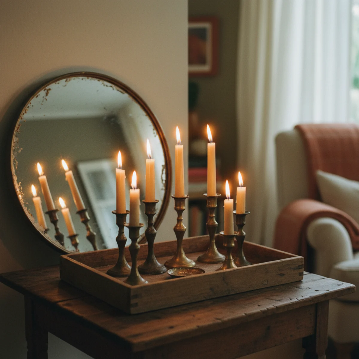
04Add a Small Bit of Green
Every coffee-table vignette benefits from one small living or organic element — a small succulent in a ceramic pot, a small branch in a bud vase, a single stem of dried botanical, a small bowl of pinecones in fall. The organic shape breaks the geometric rigidity of books and rectangular trays, and the slight asymmetry of plant growth reads as life amid the styled objects. One small element only; never a large arrangement that competes with the sculptural object.
Best small coffee-table greenery: a small succulent at 3 to 5 inches in a small ceramic pot (low maintenance, sculptural shape), a single fresh stem (eucalyptus, olive branch, dried wheat) in a small bud vase 4 to 8 inches tall, a small dried botanical (lavender, baby's breath, dried hydrangea), a seasonal natural element (small bowl of dried oranges in winter, fresh white wildflowers in summer, pinecones in fall). Position beside the book stack inside the tray, not on top (the sculptural object owns the top). Avoid: large floral arrangements (compete with the sculptural object), fake plastic plants (read cheap immediately), bouquets (overwhelm the small coffee-table scale).
AFFILIATE SLOTORGANICSmall succulent, single branch in bud vase, or dried botanical inside the trayAdd affiliate URL when configuredWhy it works
Because organic shapes contrast with the geometric rigidity of styled objects (rectangular tray, stacked books, often round or angular sculptural object), and the slight irregularity of plant growth reads as alive amid the static decor. The plant also adds a subtle color note (green, dried tan, seasonal accent) that breaks the otherwise neutral palette. One small organic element is enough; the contrast is what does the work, not the volume of greenery.
Pro tip — Use a small dried branch (eucalyptus, olive, twisted willow) instead of fresh flowers — dried branches last 1 to 2 years before needing replacement, look architectural rather than dying, and require zero maintenance. The same coffee table looks loved without weekly flower-buying.
Small succulent beside the book stack — the organic shape that breaks geometric rigidity and reads alive. See also: dried branch
05Vary the Height Across the Vignette
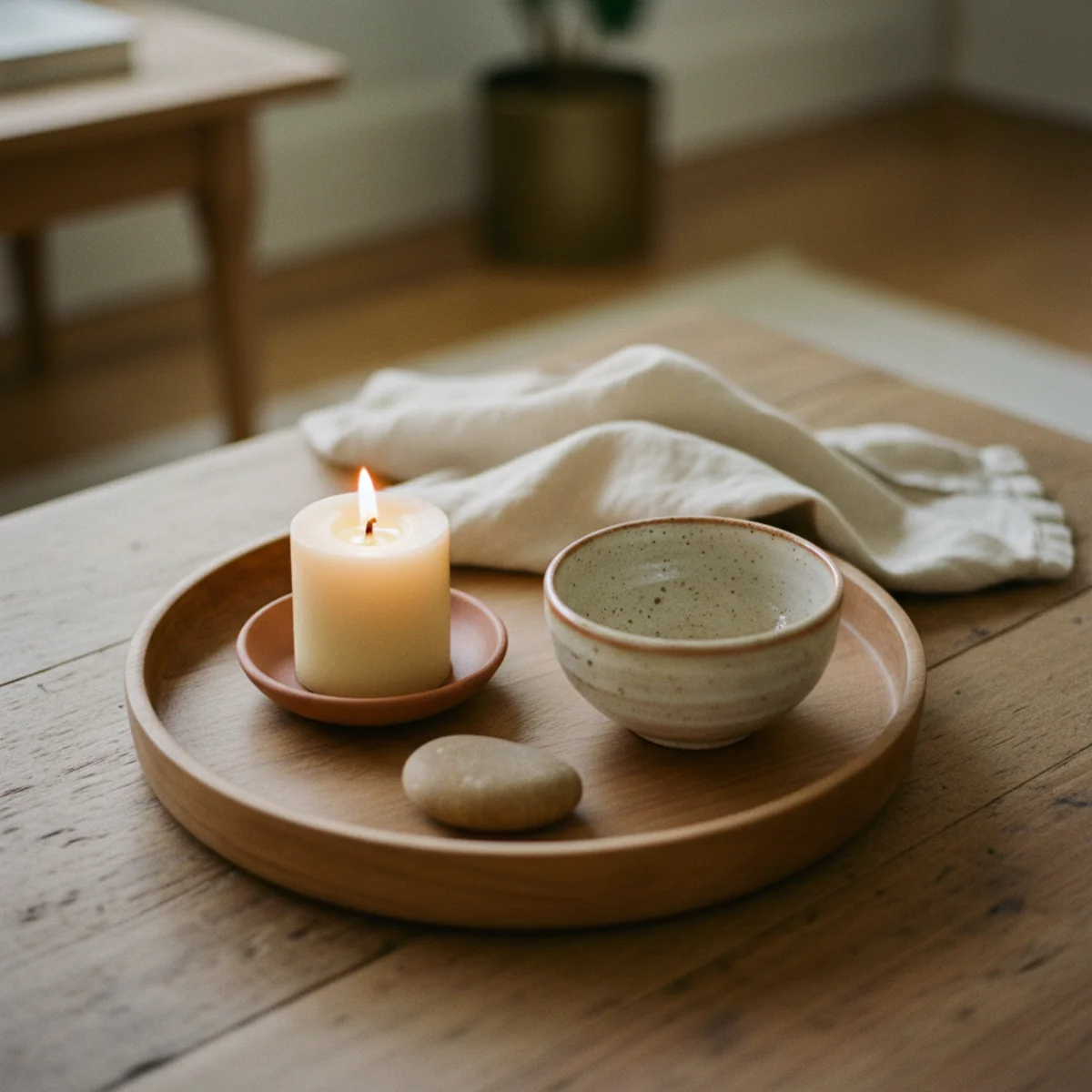
The styled vignette inside the tray should have at least three different heights — the sculptural object on top of the book stack is the tallest, a small accent at table-surface level is the shortest, the greenery in the bud vase sits at the middle. Without height variation, the vignette reads flat; with it, the vignette reads as a small still-life composition.
Aim for three height tiers within the tray: TALLEST (5 to 9 inches, sculptural object on top of book stack), MIDDLE (3 to 5 inches, the book stack itself OR a small bud vase with greenery), SHORTEST (1 to 2 inches, a small accent at table-surface level — a small ceramic dish, a single small candle, a small framed photograph). The tallest object should be roughly double the height of the shortest in the same vignette. Place the tallest at the rear of the tray, middle in the middle, shortest in front — same depth layering as shelves.
AFFILIATE SLOTPRINCIPLEThree height tiers in vignette: tallest 5-9 inches, middle 3-5 inches, shortest 1-2 inchesAdd affiliate URL when configuredWhy it works
Because height variation creates visual rhythm and depth — the eye moves up and down across the heights, registering the vignette as a small composition rather than a row of objects. Flat-height arrangements give the eye nothing to follow; the styled objects collapse visually into a single horizontal line. The height variation is also what creates the front-to-back depth illusion within the small tray footprint.
Pro tip — If your vignette feels flat after assembly, look for a small object you can stack underneath the sculptural piece to raise its height — a single book under a ceramic, a small brass tray under a vessel. The stack-up move adds height without adding objects, keeping the vignette tight while creating the rhythm.
Tall vessel, medium bud vase, small dish — three heights make a vignette read as composition. See also: shelves
06Leave 40 to 60 Percent of the Table Clear
The most-violated coffee-table rule is the breathing-room rule. The styled vignette inside the tray occupies one half (or one third) of the table; the other half stays mostly clear, available for daily use. Spreading the styling across the whole table eliminates the functional zone and creates the cluttered look that styled coffee tables are supposed to prevent. Discipline yourself to the tray and its surroundings.
Of the total coffee-table surface area, aim for 40 to 60 percent left intentionally clear — usually one half of the table, beside the tray. The clear zone holds daily-use items as needed: drinks (on coasters), current book or magazine you're reading, remotes (or in a small tray for them), occasional snack plate. After clearing the daily-use items, the surface returns to mostly bare. This breathing room is what makes the styled vignette read as deliberate against the functional zone. Without it, every object on the table reads as clutter regardless of how carefully styled.
AFFILIATE SLOTDISCIPLINE40-60% of coffee-table surface left clear for daily-use items beside the trayAdd affiliate URL when configuredWhy it works
Because coffee tables function as both decoration and daily-use surface — they have to support drinks, remotes, and books while also reading styled. The two roles only coexist when they're physically separated: styled half versus functional half. Spreading styling across the entire table forces every daily-use item to land in the styled zone, which destroys the styling within minutes of normal living. The breathing room is what makes the styling survive contact with daily life.
Pro tip — Add a small wooden or marble coaster on the unstyled half of the table — the coaster signals 'put your drink here' and protects the wood, while keeping drinks out of the styled vignette. A single 4-inch wooden coaster at $5 from a craft fair becomes part of the functional zone's design.
Half styled, half clear — the breathing room that lets styling survive daily living. See also: warm-home palette
07Keep the Palette Tight
Every object inside the tray should fit within the same tonal palette — warm cream, oat, terracotta, walnut, aged brass, soft sage. Bright primaries (true red, cobalt blue), saturated patterns, and competing colors don't belong in a warm-home coffee-table vignette. The tight palette is what lets diverse object types (books, ceramic, plant, brass) read as one curated collection rather than a random accumulation.
Stay within the warm-home palette across every object: BOOKS in cloth bindings of cream, oat, sage, navy, terracotta (no glossy bright dust jackets). CERAMICS in stoneware, matte cream, terracotta, sage, or warm earth tones. WOOD in oak, walnut, teak, or warm-stained pine. METALS in aged brass, antique bronze, hammered copper (never chrome or bright nickel). GREENERY in natural green or dried-botanical tan/brown. The cohesion comes from the palette consistency, not from matching individual object types.
AFFILIATE SLOTPALETTEAll objects within warm-home palette: cream, oat, terracotta, walnut, aged brass, sageAdd affiliate URL when configuredWhy it works
Because small coffee-table vignettes only contain 4 to 6 objects total — and even one off-palette object (a bright blue book, a chrome candle holder, a fake-bright-green plant) dominates the whole vignette by its color contrast. The small object count means each object has higher relative weight, so palette mistakes show immediately. Wider vignettes (shelves, gallery walls) can absorb one off-palette element; coffee tables cannot.
Pro tip — If you have a beloved object that doesn't fit the warm-home palette (a vintage navy ceramic, a saturated red book you love), use it on a shelf or gallery wall instead of on the coffee table — the larger styling zones absorb the off-palette piece more gracefully than the small vignette can. Reserve the coffee table for the tightest-palette objects.
Cream books, walnut tray, aged brass vessel — every object in the same warm palette. See also: warm-home palette
08Scale the Vignette to the Table Size
The vignette inside the tray needs to match the scale of the coffee table — too small reads insignificant, too large overwhelms. The rule: the tray should be roughly one-third to one-half the width of the coffee table, and the tallest object in the vignette should be no taller than about 9 inches (roughly the height of a coffee mug, which is the visual benchmark on a coffee table).
Measure the coffee table: a typical 48-inch table needs a tray 16 to 24 inches wide; a 36-inch table needs a tray 12 to 18 inches wide; a 60-inch table can support a tray up to 30 inches wide. The vignette's tallest element (the sculptural object on the book stack) should be 6 to 9 inches above the table surface — taller obstructs the view across the room from the sofa. The book stack itself should be 3 to 6 inches tall; the sculptural object 3 to 5 inches on top of that. Total vignette height stays under 9 inches; total tray width stays at one-third to one-half of table width.
AFFILIATE SLOTPROPORTIONTray = 1/3 to 1/2 of coffee table width; vignette max height 9 inchesAdd affiliate URL when configuredWhy it works
Because coffee tables are viewed at multiple angles and from very close — from the sofa (often only 18 inches away), from a chair across the room (8 to 12 feet away), from standing in the doorway. The vignette has to work at all three viewing distances. Out-of-scale vignettes (too small, too tall, too large) fail at one or more distances; properly-scaled vignettes work at all of them. The scale rule is what keeps the vignette in proportion to both the table and the room.
Pro tip — Photograph the vignette from a seated sofa position — that's the viewing angle that exposes scale problems most clearly. If the vignette looks too short or too tall in the photo, adjust before considering the styling finished. Photos reveal proportion better than in-person eyeballing.
Tray at half-table width, tallest vignette element under 9 inches — scaled to work from sofa view and across-room view. See also: viewing distances

How to style a coffee table step by step
Four elements, grouped with breathing room. Work in this order.
- 1Place the tray
Set a tray on the table as the base — it corrals clutter and defines the styled zone. Wood, brass, or woven all work.
- 2Add the book stack
Stack two or three books, largest on the bottom, to add height and a surface for an object.
- 3Add the object and the green
Top the books or set beside them a sculptural object, and add a small plant, bud vase, or fresh stems for life.
- 4Edit for breathing room
Group everything to one area, vary the heights, and leave part of the table clear for a cup and for the eye to rest.
Quick tips
- Start with a tray; it corrals clutter and defines the styled zone in one move.
- Stack books to add height and a surface to perch an object on.
- Vary the height — low tray, mid books, a taller vase or object.
- Leave part of the table clear for breathing room and for a cup.
- Hold the objects to two or three tones pulled from the room.
- Scale the formula to the table — two vignettes on a big one, just a tray on a small.
Coffee table styling by table
Two groupings — a tray vignette at one end, books and a plant at the other — with space between.
Just a tray, a small book stack, and one object or a bud vase — the formula scaled down.
A sturdy tray makes a soft ottoman a usable surface; see our small living room ideas.
A tray and a couple of sturdy objects, easy to clear, with a storage ottoman below for the clutter.
Tray, books, object, green — group them with breathing room and a coffee table styles itself. The tray is the cheat code.
Frequently asked questions
What should I put on my coffee table?+
How do I make my coffee table not look cluttered?+
What kind of books should I put on a coffee table?+
How high should objects be on a coffee table?+
Do I need a tray for coffee-table styling?+
How often should I restyle my coffee table?+
Styling a coffee table is the most learnable thing in decorating, because the formula is so reliable it's almost a cheat code: a tray, a stack of books, a sculptural object, and a bit of green, grouped with breathing room. We'd buy the tray first; it corrals the remotes-and-coasters clutter and gives the styled pieces a defined home, so the table reads considered even in daily use. Four elements, a little negative space, and the center of your living room pulls the whole room together.