Cream decor and warm-white interiors get reduced to a single Pinterest aesthetic, when in reality they're built from twelve specific decisions that any home can apply room by room. These twelve cream decor ideas cover the exact paint codes, fabric weights, wood tones, and accent moves that turn a cool, sterile white room into a layered, lived-in warm-white space — without painting over the cream.
Every guide below assumes you already love the cream-and-warm-white aesthetic and want to make it work in your actual home, with your actual light. The principles work in apartments lit only by overhead bulbs (with bulb swaps), bright south-facing rooms, and shadowy north-facing rooms. The Benjamin Moore, Farrow & Ball, and Sherwin-Williams paint codes that consistently deliver are named where they matter.
By the end of this guide, you'll know exactly which warm-white paint to choose, which three textiles to layer, the wood and metal tones that pair with cream, and the one saturated accent that keeps the whole room from going flat.
WHAT'S INSIDE
- The three warm-white paint codes (BM, F&B, SW) that never read blue under 2700K bulbs
- Why mixing cream tones beats matching them — and which textures to combine
- The one warm metal that brightens a cream room without competing (it's not gold)
- The single accent color that fixes the too-white problem most cream rooms have
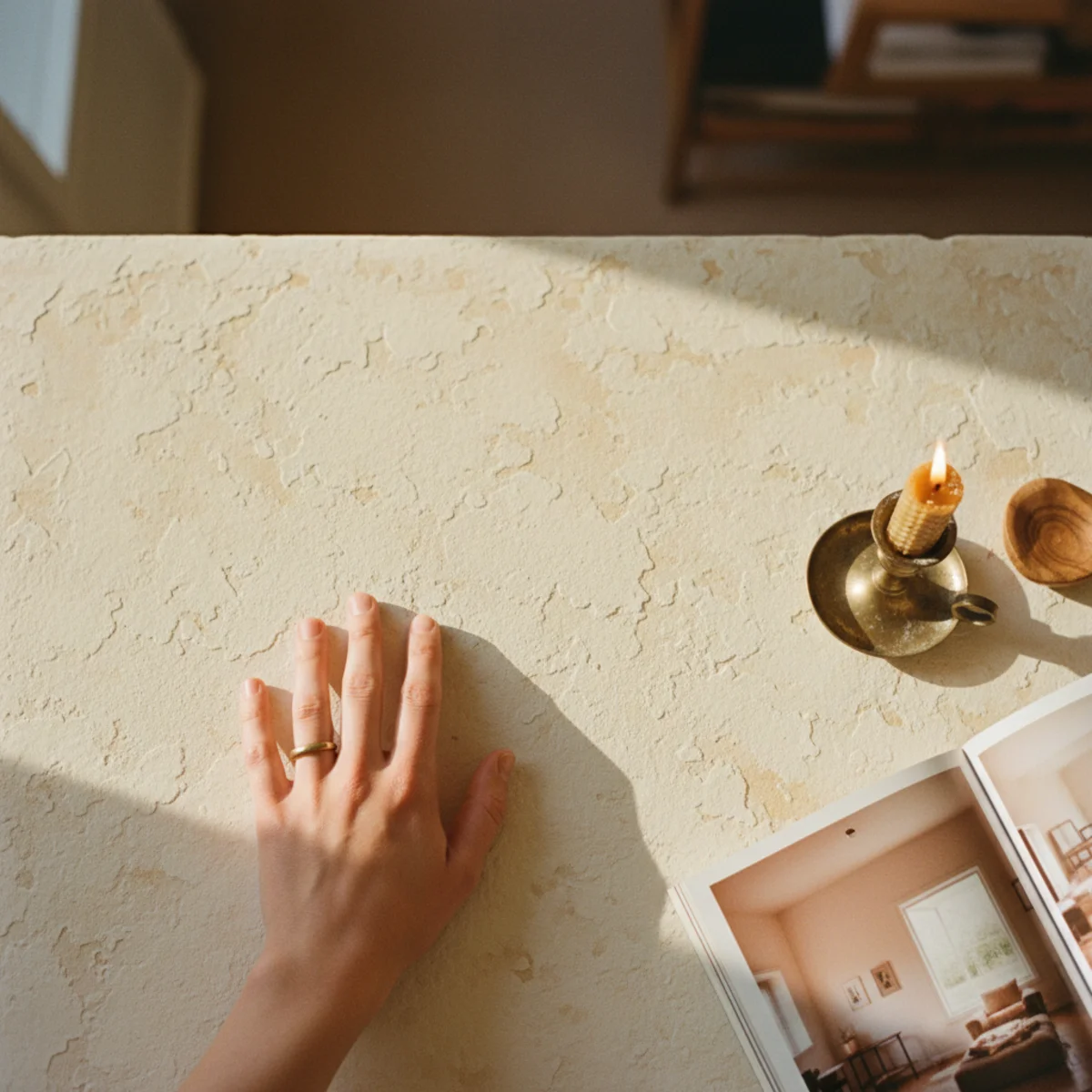
An all-cream room lives or dies by texture. Without it, you have a beige box; with it, you have the warmest room in the house.
— Studio McGee blog [citation needed — verify before publish]
What makes a cream palette work?
A cream palette works when it builds depth through layered tone and texture rather than flat single-color expanses. Cream and warm white — ivory, oat, bone, and warm off-white — are the warmest neutral foundation, but an all-cream room reads as a flat beige box unless it's layered with contrasting textures and slightly varied tones.
Texture is the entire secret. A cream room with a chunky wool rug, a nubby bouclé chair, smooth linen curtains, a limewashed wall, and warm wood reads rich and warm; the same room in one flat cream with no texture reads dull and cold. The other half is tonal variation — layering ivory against oat against bone, rather than matching everything to one cream — which adds subtle depth. Get the texture and tone right and cream becomes the warmest, most light-filled backdrop there is.
More in Color Stories you may love
See allWhy cream is everywhere in 2026
As cold, stark white fell out of favor, warm cream and ivory rose as the cozy alternative — the foundation of warm minimalism and the warm-home palette. Pinterest's cream decor and warm white searches climb steadily, toward layered, textural, tonal cream rooms over flat white ones.
The honest appeal is that cream is the warm backdrop everything else needs. It reads soft and light-filled where stark white reads clinical, and it lets wood, texture, and one accent do the work. As warm minimalism prized restraint plus warmth, the cream-and-texture room became the default canvas — light and calm but never cold, as long as the texture is there to give it depth. It's the warm neutral that makes a whole palette cohere.
12 ways to use cream without it going flat
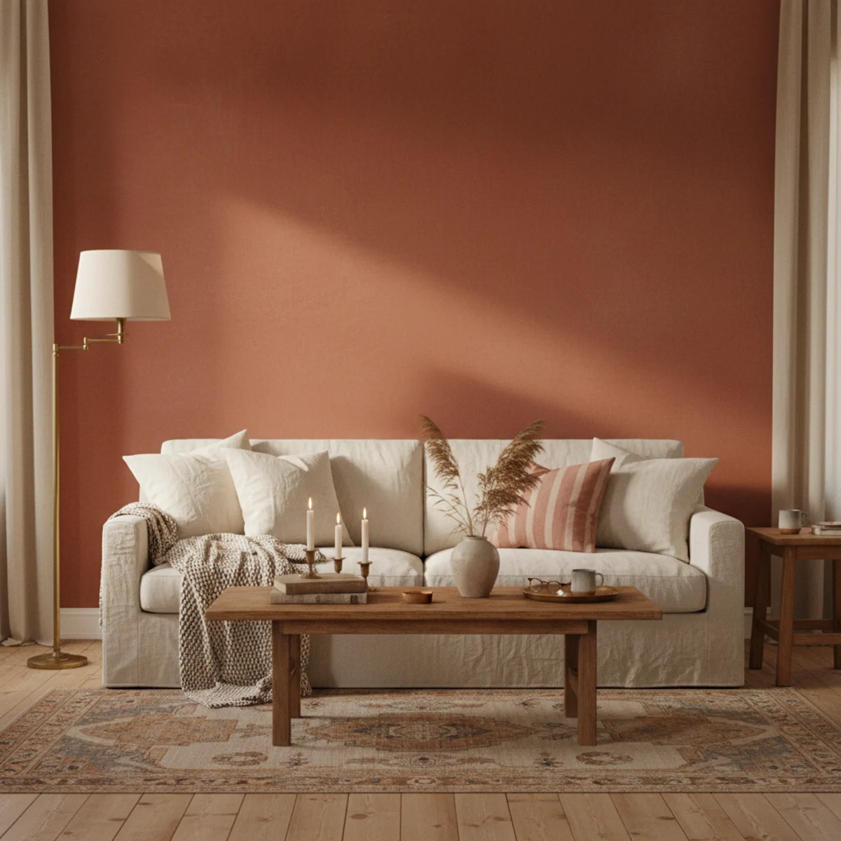
01Layer Texture Generously Across the Room
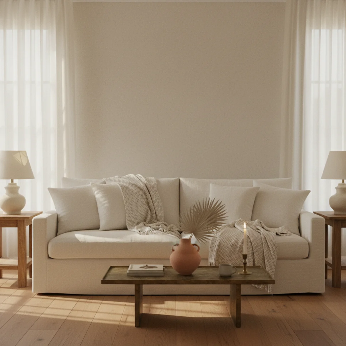
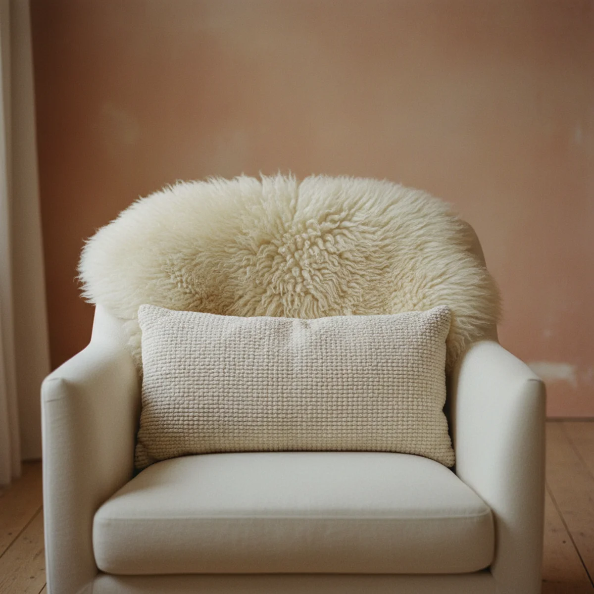
A cream room without texture is a cream room that reads as a hotel lobby. The fix is not adding color — it's adding layered textures in the same cream-to-oat-to-bone tonal family. A boucle armchair next to a linen sofa next to a wool rug under a sheepskin — same color story, four different surfaces. The layering creates depth without warming up the palette into beige territory, which is what most people fear when they pick cream in the first place.
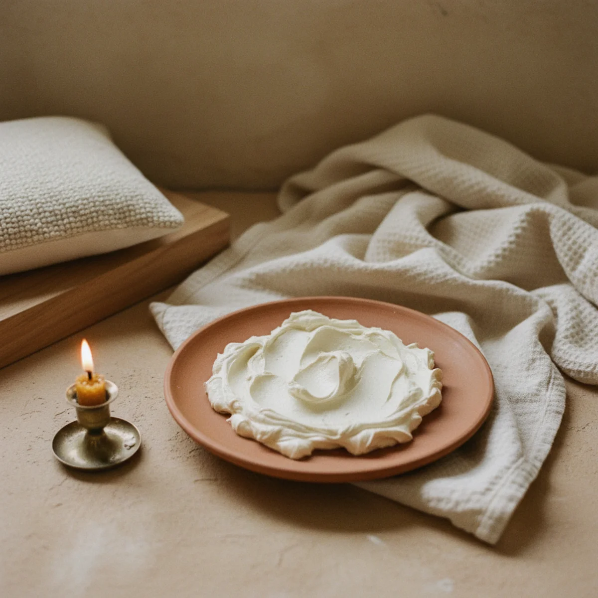
Layer at least four textures in the room, all in the warm-white-to-oat range: smooth linen (sofa upholstery, curtain panels, throw cushions), nubby boucle (one chair, lumbar pillow), chunky knit wool (one throw), and a pile or natural-fiber rug (jute, wool, or vintage cream-tone Persian). Add one or two woven elements: a rattan side table, a seagrass basket, a paper pendant shade. The eye reads layered texture as warmth even without color contrast — which is exactly what cream decor needs to feel intentional rather than empty.
AFFILIATE SLOTTEXTILESFour texture layers — linen, boucle, knit wool, and woven natural fiberAdd affiliate URL when configuredWhy it works
Because cream and warm-white walls give the eye no chromatic information to process — so everything else in the room becomes about how light catches each surface. Smooth linen reflects evenly; boucle scatters; wool absorbs; rattan creates shadow lines. Without textural variety, a cream room reads as a single visual surface, no matter how nice the paint. With it, the same room reads as a layered composition.
Pro tip — Run your hand across every textile in the room — if more than two surfaces feel the same, the room is texture-poor. Add one rougher and one softer surface (a chunky knit and a soft sheepskin) before adding any new color. Texture fixes cream-room problems far faster than color does.
Four textures, one color family — depth without warming the palette into beige territory. See also: linen
02Vary the Cream Tones, Don't Match Them
The instinct in cream decor is to match every cream object to every other cream object. The reality: matching creams flatten a room into a single dead color. The move is to vary the cream tones across the warm-white spectrum — true cream, oat, bone, ivory, eggshell, parchment — with two to three steps of variation between elements. The result reads as collected over time, with the cream feeling deliberate rather than monolithic.
Pick a primary cream (walls, large upholstery), then layer in three secondary tones at increasing warmth: a true cream curtain panel, an oat-toned wool throw, a bone-colored ceramic. Each step adds 5 to 15 percent more warmth than the primary cream — visible but not contrasting. Sources for varied cream tones: linen at H&M Home or Quince in warm white and oatmeal; wool at Pendleton in cream or oat; ceramics at HomeGoods or thrifted in matte bone or eggshell. Avoid bright optical white and gray-leaning whites in this layering — both fight cream rather than complement it.
AFFILIATE SLOTPAINT/TEXTILESPrimary cream + 2-3 secondary tones at increasing warmth (true cream, oat, bone)Add affiliate URL when configuredWhy it works
Because matching creams read as a single-tone wash, the visual equivalent of a beige wall with beige furniture against beige carpet — the entire room reduces to one note. Varying the cream tones across a 10 to 20 percent warmth range gives the eye something to register, while keeping the room cohesively warm-white. The room reads as a careful collection rather than a careless one-color decision.
Pro tip — Buy fabric samples or paint swatches in three or four warm-white tones at once and look at them together under your actual room's light. The cream that looks perfect on its own often fights the room's existing wood tones — testing all three at once shows the relationship that matters.
Walls one cream, curtains another, throw a third — three tones that read collected, never matchy. See also: linen at H&M Home
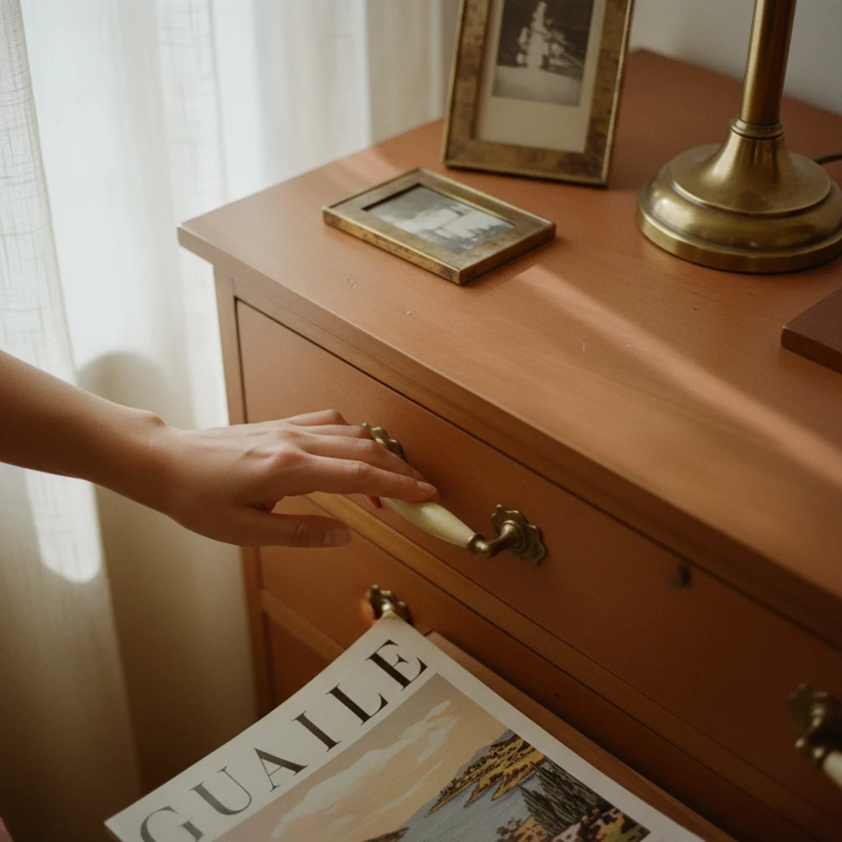
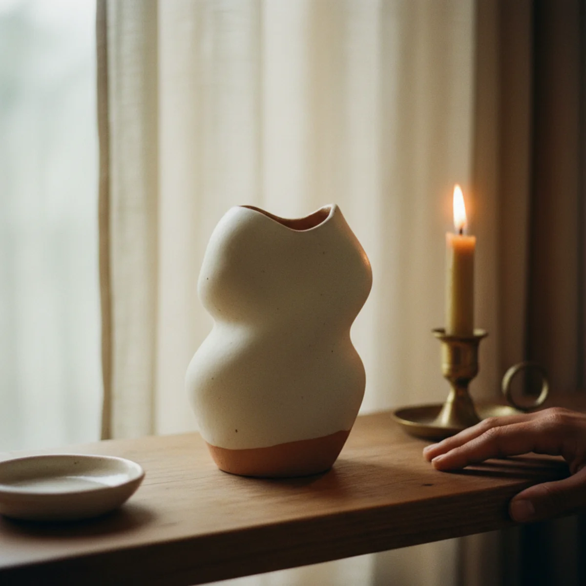
03Add Warm Wood to Anchor the Palette
Cream rooms can drift into clinical territory without wood to anchor them. The single most reliable move to keep a warm-white room feeling lived-in is adding warm-toned wood — oak, walnut, teak, ash — across at least three pieces. The wood gives the cream a counterpoint, a thermal anchor, a place for the eye to land. Without it, even the warmest cream can read like a hotel reception. With it, the same room reads as a curated home.
Add wood across three different elements: one large piece (sofa frame, console, dining table), one medium (side table, coffee table, bench), and one small (picture frame, candle holder, decorative bowl). Solid oak and walnut read warmest; ash and teak slightly cooler; pine and maple too pale to anchor. Avoid wood-look laminate or veneer; the eye reads the difference. Sources: vintage solid oak from estate sales at $50-$200, Article walnut at $400-$800, IKEA solid pine pieces ($60-$200) stained darker. The wood needs to be visible, not buried under throws or hidden in corners.
AFFILIATE SLOTFURNITURESolid oak, walnut, teak, or ash across one large + one medium + one small pieceAdd affiliate URL when configuredWhy it works
Because cream and warm-white walls share the same tonal family but lack a thermal anchor. Wood, especially warm-toned wood, provides the visual gravity the room needs — the eye reads the wood as warmth source, in the same way the brain reads a hearth as warm even when no fire is lit. Without wood, cream rooms drift toward clinical; with it, they read as lived-in.
Pro tip — Oil the wood with butcher block oil ($12) once a year instead of leaving it dry — the slight darkening from the oil deepens the warmth without staining the piece, and the visible care reads as evidence of a tended home. Skip lacquered or polyurethaned finishes; they read commercial.
Oak console, walnut frame, small wood bowl — three wood touches that anchor every cream room. See also: vintage solid oak
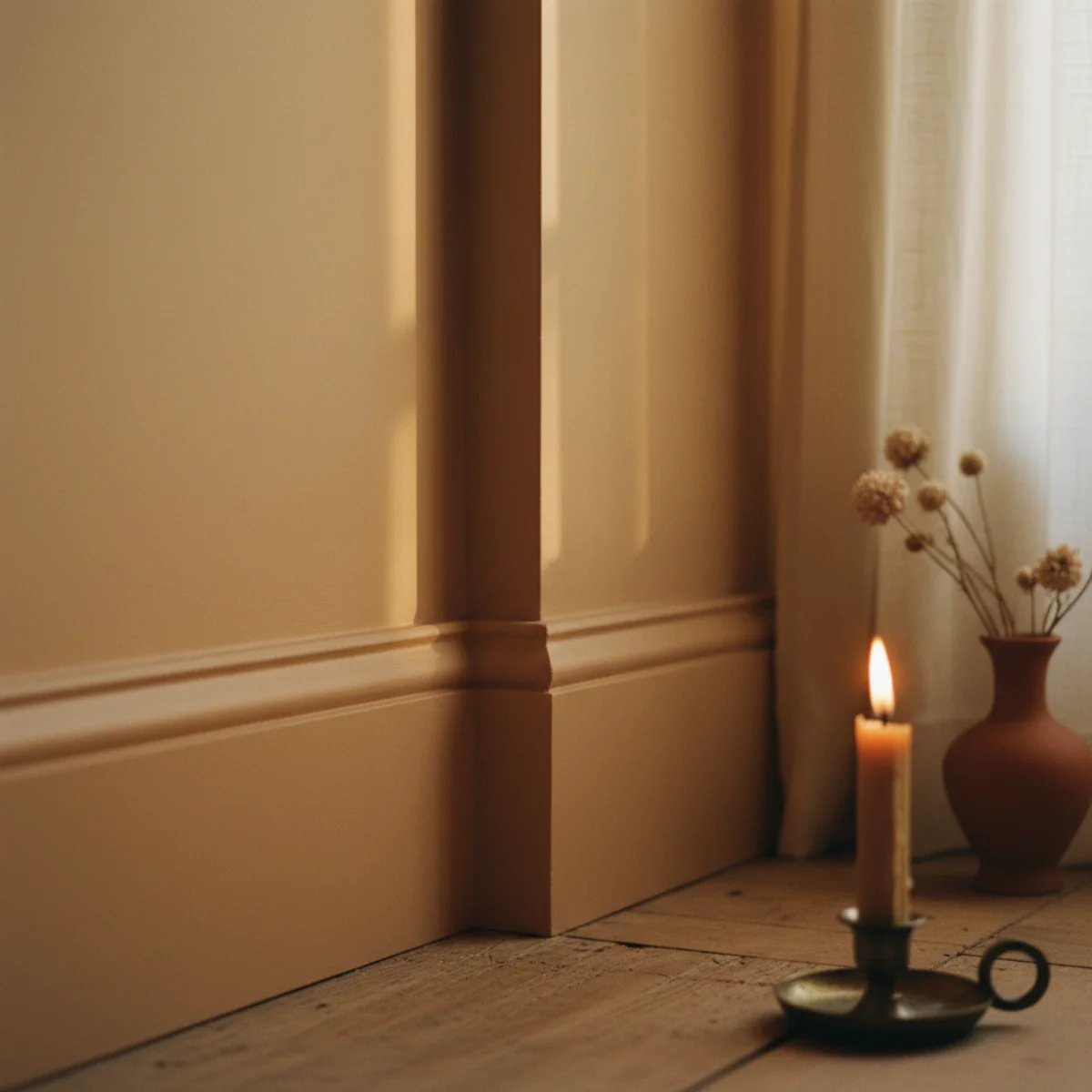
04Limewash One Cream Wall for Depth
Flat painted walls in cream tend to look manufactured no matter the quality of the paint. The fix that's gaining ground in 2026 cream decor: limewashing one wall. Limewash creates a subtle two-tone mottled finish — the same cream as the rest of the room, but with visible variation from the wash technique. The wall reads as plaster, not paint. Just one wall is enough — usually the focal wall behind the sofa or bed. Costs $40 to $80 in materials and one Saturday afternoon.
Buy limewash paint from Bauwerk Color, Romabio, or Portola Paints in a warm white or cream tone ($40 to $80 per gallon, covers 200 square feet). Apply two coats with a 4-inch lime brush in crosshatching X-shaped strokes (not the smooth roller technique of regular paint). The first coat looks streaky; the second coat blends the texture into a subtle two-tone wash. Limewash works on raw drywall and primed surfaces; skip glossy or previously latex-painted walls unless you sand them lightly first. Allow 24 hours between coats. Total time: 4 to 6 hours active, plus drying.
AFFILIATE SLOTPAINTLimewash paint in warm white or cream (Bauwerk, Romabio, or Portola)Add affiliate URL when configuredWhy it works
Because limewash is real lime-based plaster (the same material used in ancient Italian and Moroccan walls), and it creates microscopic texture and tone variation that no flat paint can replicate. The mottled finish catches light differently at every hour, which keeps the wall from reading dead under 2700K lighting. Photographs of limewashed walls always look richer than painted ones because they actually are.
Pro tip — Practice your brush strokes on a 4-by-4-foot piece of drywall scrap or the inside of a closet first before committing to the focal wall. The X-shaped crosshatching technique is unlike normal painting and takes about thirty minutes to get the hang of.
One limewashed wall — the depth that flat paint cannot fake at any price. See also: limewash paint
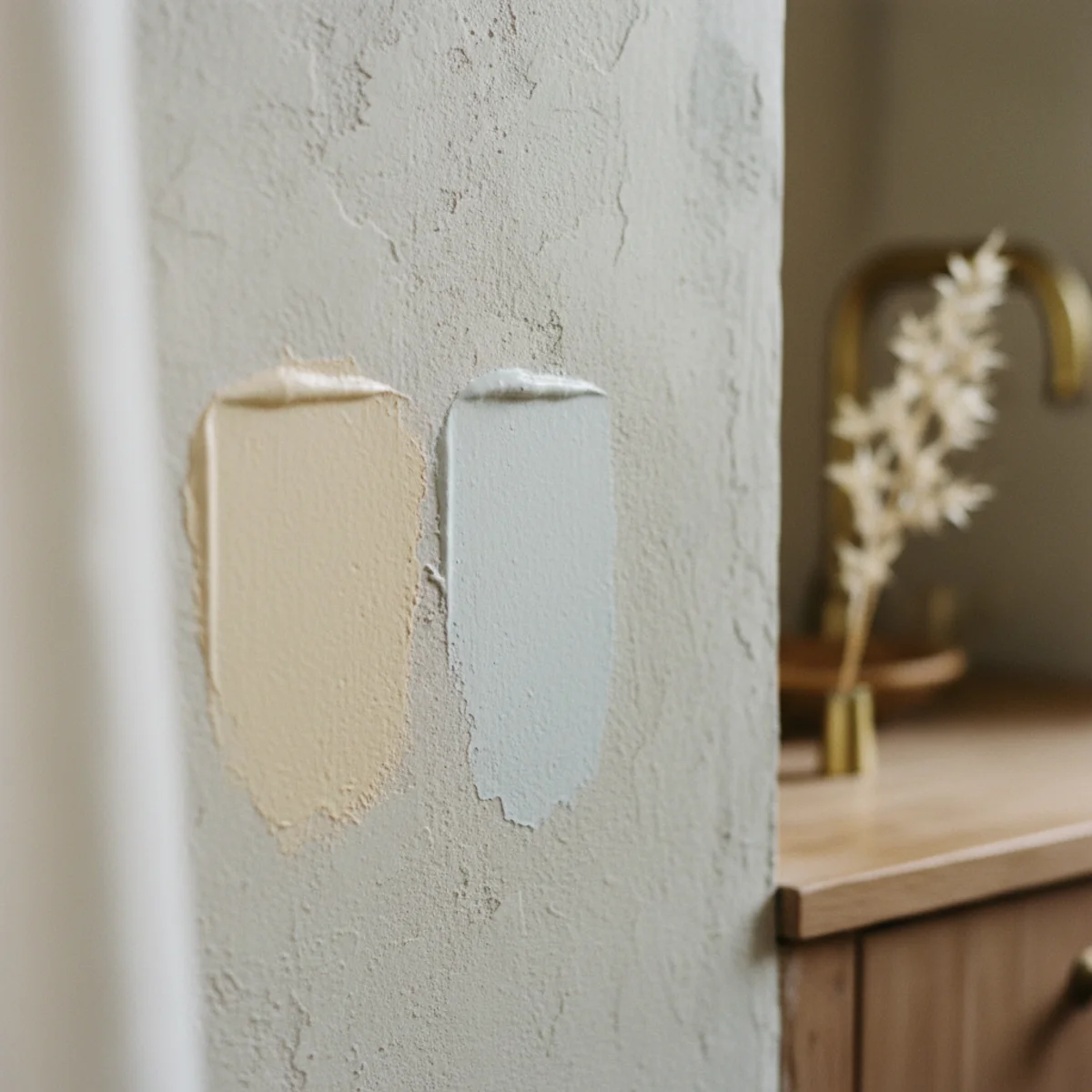
05Choose Warm-Undertone White Paint, Always
The single biggest mistake in cream decor is picking a white paint with a cool undertone — the room reads blue, gray, or sterile under any 2700K bulb. The fix is choosing whites with documented warm undertones: yellow, orange, or red, never blue or gray. The three reliably warm whites that work across every light condition: Benjamin Moore White Dove OC-17, Farrow & Ball Pointing 2003, and Sherwin-Williams Alabaster SW7008. Test all three with swatches before committing.
Order 12-by-12-inch peel-and-stick swatches from Samplize ($5 each) in BM White Dove, F&B Pointing, and SW Alabaster — never test paint on a small white card; the warm undertones don't read at small scale. Apply each swatch to a different wall (or different walls of the same room) and view all three at three times of day: morning, mid-afternoon, evening. North-facing rooms need the warmest white (Pointing); south-facing can handle Alabaster or White Dove. Avoid Decorator's White, Chantilly Lace, or any pure white — all read cool under 2700K bulbs.
AFFILIATE SLOTPAINTBM White Dove OC-17, F&B Pointing 2003, or SW Alabaster SW7008Add affiliate URL when configuredWhy it works
Because every white paint has an undertone that determines how it reads under different light conditions. A white with a yellow or red undertone looks warm and creamy under 2700K bulbs; a white with a blue or gray undertone looks sterile and clinical under the same bulbs. The named color (White Dove, Snowfall White, Decorator's White) tells you almost nothing without knowing the undertone — which is why every paint guide recommends swatching before committing.
Pro tip — Look at the back of the paint chip card or the manufacturer's online color spec — most reputable paint companies now list the LRV (Light Reflectance Value) and undertone. Warm whites have LRV between 80 and 90 and undertones described as yellow, red, or earth-toned. Cool whites have undertones described as blue, gray, or green and tend to have LRV above 90.
Three warm-undertone whites swatched side by side — never trust a small paint chip. See also: Benjamin Moore
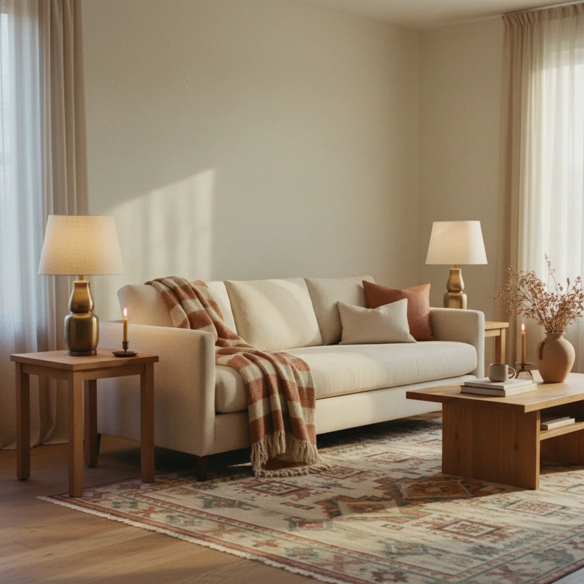
06Add One Saturated Accent to Prevent Flatness
A pure cream-on-cream-on-cream room eventually reads as flat — beautiful in photos, less interesting in person. The fix is adding one saturated accent color, used sparingly across two or three small objects: a single deep rust cushion, a sage book spine, a navy candle. The accent gives the eye somewhere to land amid the cream, and the contrast lets the cream itself read as a deliberate choice rather than a default. One accent color, never more than two.
Pick the accent from the warm-saturated end of the spectrum: rust, terracotta, deep mustard, sage green, dusty navy, or burgundy. Avoid bright primaries (true red, cobalt blue, bright orange) — they fight cream rather than enhance it. Use the accent across three small objects maximum: one cushion, one ceramic, one stack of book spines, or one candle. The accent should occupy roughly 5 to 10 percent of the visual real estate, never more. Sources: H&M Home cushion covers at $15 in rust, sage, or navy; thrifted ceramics in deep glazes at $5 to $15.
AFFILIATE SLOTSTYLINGSingle saturated accent (rust, sage, navy) across 2-3 small objectsAdd affiliate URL when configuredWhy it works
Because the human eye fatigues on monotone surfaces and seeks contrast points to register the room. Without a saturated accent, a cream room becomes one large visual flat field that the eye stops processing. One small dark or saturated accent — a single rust cushion against a cream sofa — anchors the visual composition and makes the cream itself read as intentional rather than uninspired.
Pro tip — Pick the accent color that already exists somewhere in your room you can't change — the warm undertone in your wood floor, the rust in your vintage rug, the navy in a piece of inherited art. Matching the accent to an existing element makes it feel like a discovery rather than a decision.
One rust cushion, one rust ceramic — the small accent that lets the cream read as deliberate. See also: warm-saturated
07Bring In Natural Fibers Beyond Wool and Cotton
Cream decor leans heavily on wool and cotton — for good reason — but introducing other natural fibers broadens the texture palette without adding color. Linen for window panels, jute for floor coverings, seagrass for baskets, rattan for side tables, paper for pendant shades, hemp for upholstery accents. Each fiber catches light slightly differently, and the variety reads as collected rather than themed. Five different natural fibers in one cream room is the spec, not the indulgence.
Layer in fibers beyond your wool/cotton baseline: jute or sisal rug under the main wool rug ($60-$200), seagrass or water hyacinth basket beside the sofa ($25-$80), rattan-frame side table or floor lamp ($40-$200), paper pendant or floor lamp shade ($30-$150 from Noguchi-style makers), hemp or flax-blend cushion covers ($15-$40). The combined texture reads as a home that has gathered honestly, not one that bought a single natural fibers set. Avoid synthetic versions (faux jute, plastic rattan) — they read cheap and break the cream-room spell.
AFFILIATE SLOTTEXTILES/DECORJute rug + seagrass basket + rattan side table + paper pendant + hemp cushionAdd affiliate URL when configuredWhy it works
Because each natural fiber has its own light-catching texture — jute is matte and rough, seagrass is woven and shadowed, rattan is structural and gridded, paper is translucent and soft. Together they create visual depth without color, which is exactly what cream rooms need to escape flatness. Synthetic versions miss this entirely; they all reflect light the same way, which is why faux natural fiber objects always read wrong in cream interiors.
Pro tip — Replace one synthetic object in your cream room (a plastic basket, a faux-rattan tray, a polyester-blend cushion) with a real natural fiber version every month. The cumulative effect over a year is dramatic, even though no single swap registers immediately. Real materials compound visually in a way replicas never do.
Five natural fibers in one room — depth that synthetic versions cannot fake. See also: jute rug
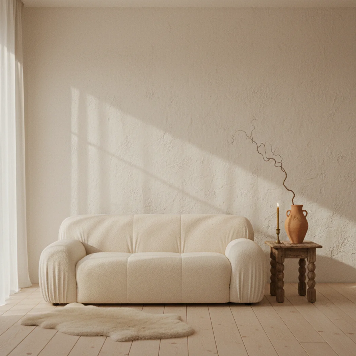
08Use a Sheepskin or Boucle for Visual Warmth
The single highest-impact texture addition to a cream room is a real sheepskin pelt or a boucle textile — both materials read as concentrated warmth without changing the color palette. Draped over an armchair back, layered on a sofa, or placed at the foot of a bed, sheepskin and boucle add the visual depth that cream needs without warming the tone into beige. Cost: $40 to $150 for real sheepskin; $60 to $200 for boucle accents.
Real sheepskin pelts (Icelandic, New Zealand, or Australian) at 24 to 36 inches long, in natural cream or oatmeal — Costco at $40-$60, IKEA LUDDE at $60, Pottery Barn at $150-$250. Boucle: cushion covers at H&M Home ($20), Article boucle accent chair at $799, West Elm boucle throw at $79. Place sheepskin draped diagonally over the back of an armchair, on the seat of a wooden bench, or at the foot of a bed. Layer boucle as cushion covers (two or three on a sofa) and one accent chair or ottoman. Both textures concentrate the warmth in spots where the eye lands.
AFFILIATE SLOTTEXTILESReal sheepskin pelt (24-36 inches) + boucle cushion covers or accent chairAdd affiliate URL when configuredWhy it works
Because both textures share the cream color palette while adding extreme visual depth — sheepskin reads as fur (warmth shorthand evolutionarily), boucle reads as nubby plush (tactile invitation). They give the eye a focal point in an otherwise tonally similar room, and the matching color means they enhance the cream rather than fighting it. Synthetic versions of either material read shiny under 2700K bulbs and miss the entire effect.
Pro tip — Place a single sheepskin pelt on a wooden stool or bench rather than on the chair itself — the contrast between the wood grain and the wool pile reads as two distinct textures rather than one chair with stuff on it. The stool becomes a small styled vignette by itself.
Sheepskin and boucle — two textures that intensify cream's warmth without changing its color. See also: Icelandic
09Match Trim and Ceiling to the Wall Color
The traditional approach paints the trim and ceiling bright white against the wall color — fine for many palettes, wrong for cream decor. The move that produces the most cohesive warm-white room is to paint trim, ceiling, and walls in the same warm-white tone (or one slight variation). The result reads as enveloping rather than framed, and the eye doesn't catch the contrast between cream wall and stark-white trim that breaks the spell in most cream rooms.
Paint walls, trim (baseboards, window casings, door frames), and ceiling all in the same warm white from the BM/F&B/SW palette (White Dove, Pointing, or Alabaster). If you want subtle variation, paint trim and ceiling in the same warm white as the walls but in a slightly different sheen — flat or matte on walls, eggshell on trim. Avoid bright white semi-gloss trim against cream walls; the contrast cancels the warmth. The match-everything approach also visually expands the room, since the eye doesn't trace dividing lines between surfaces.
AFFILIATE SLOTPAINTWalls + trim + ceiling all in the same warm-white tone (BM, F&B, or SW)Add affiliate URL when configuredWhy it works
Because the contrast between bright white trim and cream walls creates visual lines that fragment the room — the eye registers wall, then trim, then ceiling as three separate planes. Painting all three in the same warm white blurs those boundaries, letting the room read as one continuous warm envelope. The cream becomes the entire room, not just one element fighting against white trim.
Pro tip — If your existing trim is bright white and you're not ready to repaint everything, paint just the baseboards in the matching warm white as a starter. The change is visible and the project is short — most rooms have 30 to 50 linear feet of baseboard, two to three hours of work with a 2.5-inch brush.
Trim, walls, ceiling — same warm white. The room reads as one continuous envelope, never fragmented. See also: match everything
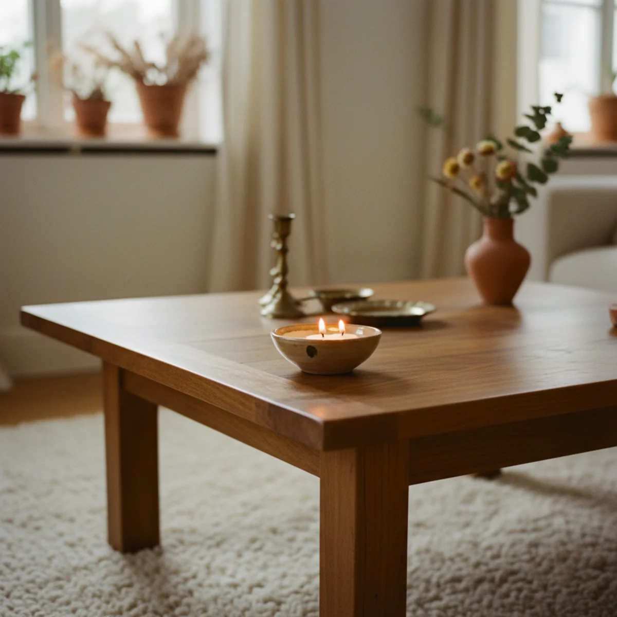
10Add Warm Metal — Brass or Antique Bronze
Chrome and stainless steel are the wrong metals for cream rooms — both read cool and clinical against warm whites. The correct metals: aged brass, antique bronze, hammered copper. One or two metal accents per room is enough; introducing them across lamp bases, picture frames, candle holders, and small hardware ties the warm palette together with a thermal accent the eye registers as gold-toned firelight.
Aim for two to three brass or bronze pieces in any cream room: a brass floor or table lamp base, a brass picture frame or two, a small brass tray or candlestick. Look for aged or unlacquered brass (will continue to develop patina) over polished gold-tone finishes. Sources: thrifted brass at $5-$25 each (Goodwill, ReStore), House of Antique Hardware at $30-$150, Schoolhouse at $80-$300. Polish lightly with Bar Keepers Friend ($4) and a soft cloth to brighten without removing patina. Avoid mixing gold-toned plated finishes with real brass — the eye reads the difference immediately.
AFFILIATE SLOTMETALS2-3 aged brass or bronze pieces — lamp base, picture frame, small trayAdd affiliate URL when configuredWhy it works
Because brass and bronze have warm yellow-orange undertones that match the cream color palette; chrome and stainless steel have cool blue-gray undertones that fight it. Brass in a cream room reads as a thermal continuation of the warm-white scheme — the metal version of the wall color. Chrome in the same room reads as a visual interruption, even when the chrome piece is beautiful in isolation.
Pro tip — Mix several types of warm metal rather than committing to one — aged brass plus antique bronze plus hammered copper reads as collected over time, where matching gold-tone hardware everywhere reads as one shopping trip. Three warm metals in conversation always outperform one matching set.
Brass, bronze, copper — three warm metals in conversation, never one matching set. See also: House of Antique Hardware
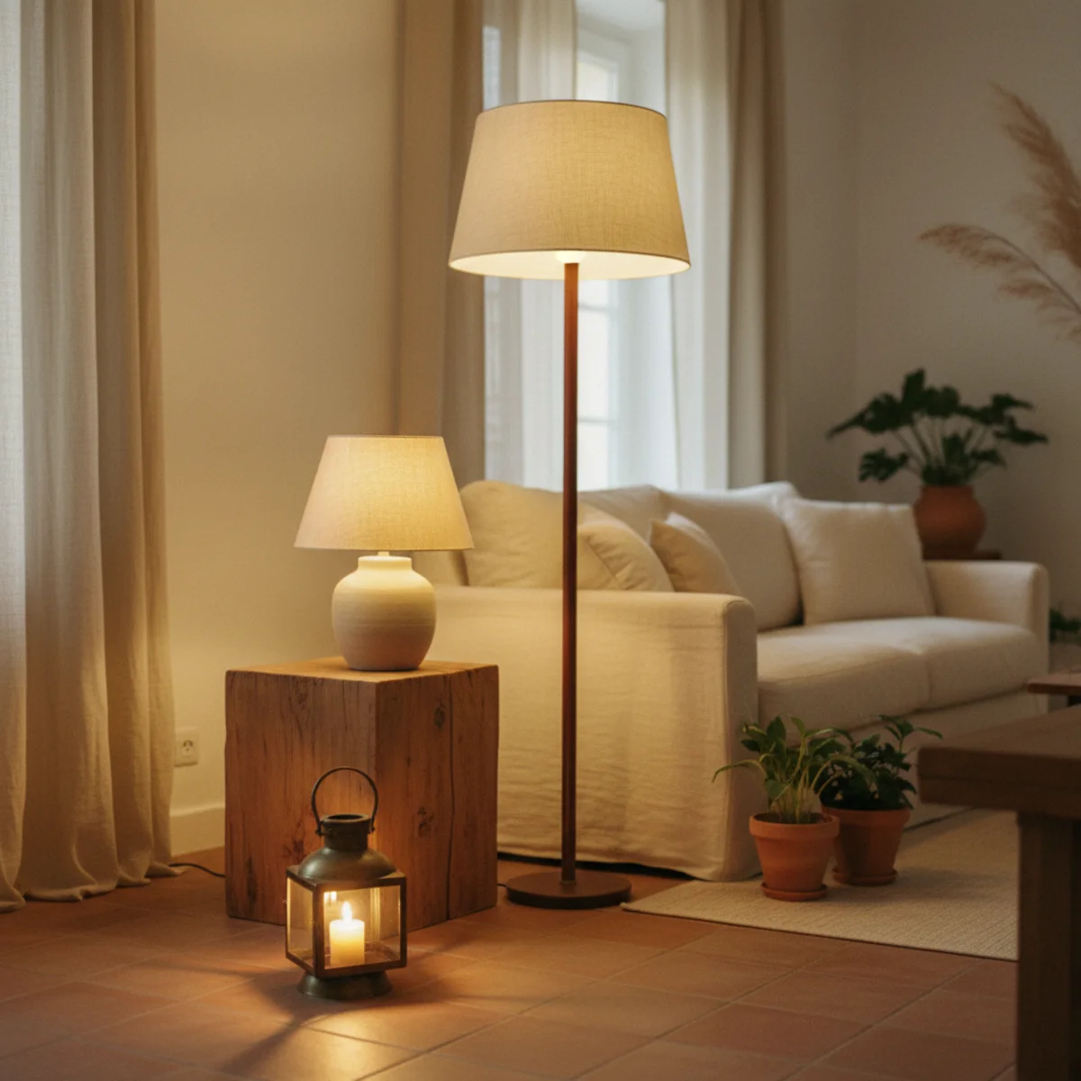
11Layer Soft Lighting From Three Heights
Cream rooms suffer most under bright overhead light — the cool 4000K bulbs typical in older fixtures turn warm whites into gray-whites instantly. The fix is the three-height rule from the cozy living room playbook: one floor lamp at 58 to 64 inches, one table lamp at 24 to 28 inches, one accent light below 18 inches. All 2700K, all warm. Overhead off after sunset. The cream walls finally read warm.
Three lamps, three heights, all 2700K LEDs at 800 lumens or less per fixture. Floor lamp: brass or oak base, linen shade, 58 to 64 inches tall (IKEA HOLMÖ at $20 with bulb swap, Pottery Barn at $399). Table lamp: ceramic or brass base, 24 to 28 inches tall (thrifted at $20, West Elm at $129). Accent light: small picture light, uplight, or candle (Govee battery puck at $12, IKEA NYMÅNE at $30). Position the three across the room so light comes from at least three different angles. Avoid central pendants and ceiling-mounted bright fixtures.
AFFILIATE SLOTLIGHTINGThree 2700K lamps at floor (60 inches), table (24 inches), and accent (12 inches) heightsAdd affiliate URL when configuredWhy it works
Because cream and warm-white walls share the same yellow-red undertones as 2700K bulbs — they enhance each other under that color temperature. Under 4000K bulbs (or daylight LED), the cream's warm undertone is canceled by the cool light, and the room reads gray or blue-white. The lighting must match the wall palette; without warm lighting, cream rooms cannot read warm regardless of furniture and textile choices.
Pro tip — Put one of the three lamps on a smart plug timed to turn on at sunset — the cream room transitions to its evening warmth automatically, without anyone remembering to flip a switch. The transition is one of the most satisfying daily rituals in a warm-white home.
Three heights, three lamps, all 2700K — the lighting that lets cream walls finally read warm. See also: 2700K
12Keep One Surface Sculptural and Empty
The final cream decor move is restraint: leaving one surface mostly empty as a deliberate sculptural moment. A console with one ceramic, a coffee table with one tray and nothing else, a windowsill with a single dried botanical. The empty space gives the room's textures and tones somewhere to be quiet, and the single object reads as art rather than clutter. Without this restraint, layered cream rooms tip into busyness — which kills the calm cream is supposed to deliver.
Choose one prominent surface per room (the console behind the sofa, the dining table center, the windowsill, the entryway shelf) and keep it almost empty. Place a single sculptural object — a tall ceramic vessel, a small piece of art on a leaning frame, a single branch in a heavy vase, a stack of two books with one small object on top. Keep 70 to 80 percent of the surface bare. The empty space is the point. Resist the urge to fill: cream rooms specifically require negative space to read as composed rather than overstuffed.
AFFILIATE SLOTSTYLINGOne mostly-empty sculptural surface with a single anchor objectAdd affiliate URL when configuredWhy it works
Because cream rooms already use texture and tone to create visual interest — adding objects on every surface compounds the density and tips the room into visual fatigue. One restrained surface lets the eye rest amid the layered cream, which is what makes the layering itself read as deliberate. Without that rest point, every cream room eventually reads as cluttered, even when the individual objects are beautiful.
Pro tip — Photograph your cream room from the doorway every two weeks. The surface that consistently looks busiest in the photos is the one to clear first — your camera reveals visual density that your in-person eye misses. Edit ruthlessly; cream rooms improve from subtraction faster than addition.
One surface, one object, 80 percent empty — the restraint that cream rooms reward. See also: negative space
How to use cream without it going flat step by step
Build depth through texture and tone, not color. Work in this order.
- 1Choose a warm white
Pick a warm cream or ivory over a stark or blue-white, and test it at 4pm — warm whites go soft and golden at sunset, cool ones go grey.
- 2Layer texture generously
Add a chunky wool rug, a bouclé or sheepskin texture, smooth linen, and warm wood. Texture is the whole difference between rich and flat.
- 3Vary the tone
Layer ivory against oat against bone rather than matching everything to one cream. Tonal variation adds subtle depth.
- 4Add one accent and warm light
Introduce a single saturated accent — terracotta, sage, navy — and light the room with warm 2700K bulbs so the cream glows.
Quick tips
- Layer texture generously — it's the entire difference between rich cream and a beige box.
- Vary the tone (ivory, oat, bone) rather than matching everything to one cream.
- Choose a warm white and test it at 4pm; warm whites go golden, cool ones go grey.
- Match trim to the walls; bright white trim makes cream look dirty by contrast.
- Add one saturated accent so the all-cream room doesn't feel empty.
- Light it with warm 2700K bulbs; a cool bulb turns cream grey.
Cream palettes by room
Layered cream textures — a chunky rug, a bouclé chair, linen — warm wood, and one terracotta accent.
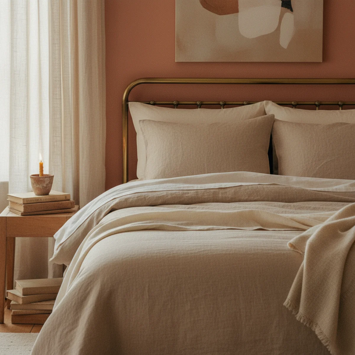
Tonal cream and oat linen, a limewashed wall, and warm bedside lamps; see our cozy bedroom inspo.
Cream as the restrained backdrop with generous texture and one sculptural object; see our warm minimalism guide.
Warm-white or cream cabinets with oak shelving, brass hardware, and natural-fiber textures.
An all-cream room lives or dies by texture. With it, the warmest room in the house; without it, a beige box.
Frequently asked questions
What's the warmest white paint color for cream decor?+
How do I make cream decor not look boring?+
Can I mix different shades of cream in one room?+
What metals work best with cream decor?+
Does cream decor work in small spaces?+
What's the difference between cream and warm white?+
Cream is the warm foundation of the whole cozy-home palette, but it lives or dies by texture — get that wrong and you have a flat beige box, get it right and you have the warmest room in the house. Layer contrasting textures generously, vary the cream tones rather than matching them, and light it warm. We'd add a chunky rug, a bouclé chair, and a limewashed wall before worrying about anything else; texture, not color, is what gives cream its depth. Build the warmth into the surfaces, and cream becomes a refuge rather than a beige box.