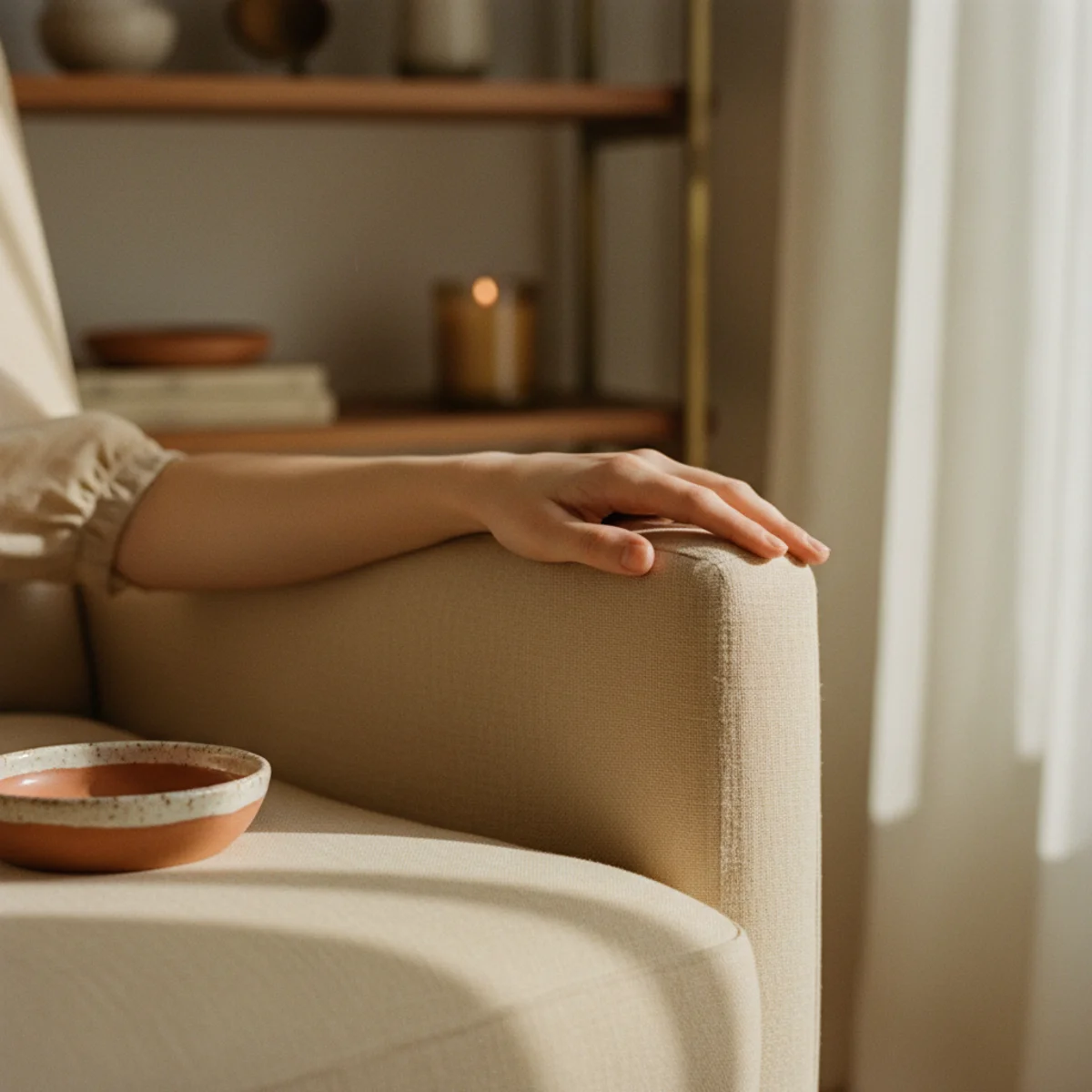
These twelve warm paint colors are tested across real rooms in actual homes — north-facing rooms with cool natural light, south-facing rooms with warm natural light, small bedrooms, large open-plan main floors, kitchens with overhead lighting, dining rooms used primarily in evening. Each color below names the specific Farrow & Ball, Benjamin Moore, or Sherwin Williams shade, the exact light condition where it succeeds, the rooms where it works best, the trim and ceiling pairings, the textile and material accents that support it, and the lighting requirements (warm 2700K, multiple sources) that the color depends on to read correctly.
Most paint color failures come from one of two errors: choosing colors based on commercial paint chips under bright fluorescent showroom lighting (which makes warm colors look duller and cool colors look brighter than they will at home), OR choosing trendy 'warm' colors that aren't actually warm when applied (cool greige marketed as 'warm grey,' blue-leaning whites marketed as 'warm white'). The twelve principles below name specific shades that consistently deliver warmth in real home conditions, and explain why each works for which specific room and light situation.
By the end of this guide, you'll know exactly which warm paint color fits your specific room — the clay or terracotta for north-light rooms that need temperature correction, the right warm off-white that reads cream rather than blue, the sage green chosen specifically rather than generically, the deep cocoon charcoal for cocoon spaces, and eight other options that actually deliver warmth in real lighting conditions.
WHAT'S INSIDE
- Why clay and terracotta specifically correct north-facing rooms' inherent cool light
- The warm off-whites that genuinely read as cream rather than as commercial blue-white
- Sage green chosen carefully — the specific shade that works versus the generic versions that fail
- Deep cocoon charcoal for the cocoon room that asks for darkness rather than light
Paint is the highest-impact, lowest-cost change in any room. The only mistake is choosing it off a chip instead of on the wall.
— Architectural Digest [citation needed — verify before publish]
What makes a paint color warm?
A warm paint color has yellow, red, or brown undertones rather than blue or gray ones, which is what makes a room feel enveloping instead of cool. Warm whites read as cream or oat; warm neutrals lean greige rather than true gray; and saturated warm colors run toward clay, terracotta, ochre, and earthy greens.
The undertone is everything, and it only fully reveals itself in your room's specific light. Farrow & Ball's Setting Plaster works well in north-facing rooms precisely because its warm pink-clay undertone counteracts cool natural light — the room reads warm instead of gray. The same color in a south-facing room can read noticeably pinker. This is why you test large swatches at different times of day before committing.
More in Color Stories you may love
See allWhy warm paint is everywhere in 2026
The cold gray-and-white palette that dominated the 2010s gave way to a hard swing toward warmth — clay, terracotta, and earthy greens are among the most-searched paint colors, and the major brands have responded with whole warm-leaning collections.
The shift dovetails with warm minimalism and the cozy-home movement: people want rooms that feel enveloping, and color is the cheapest way to get there. A single weekend and a tin of warm paint transform a room more than any piece of furniture, which is why color stories rank among the most-saved home content year after year.
12 warm paint colors and where they work
01Clay and Terracotta for North Light
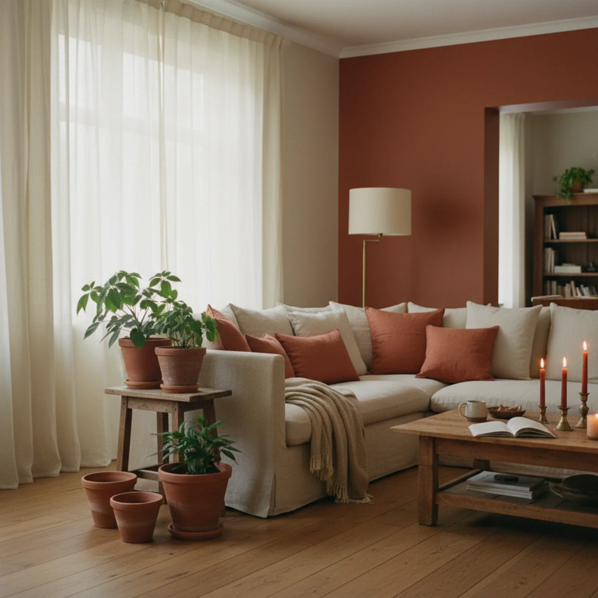
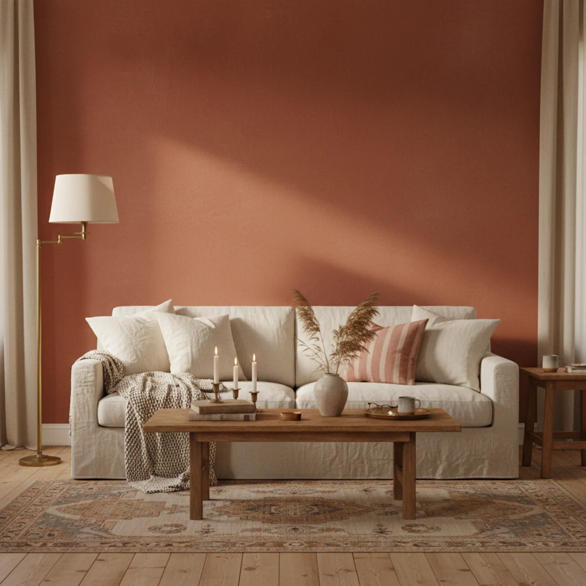
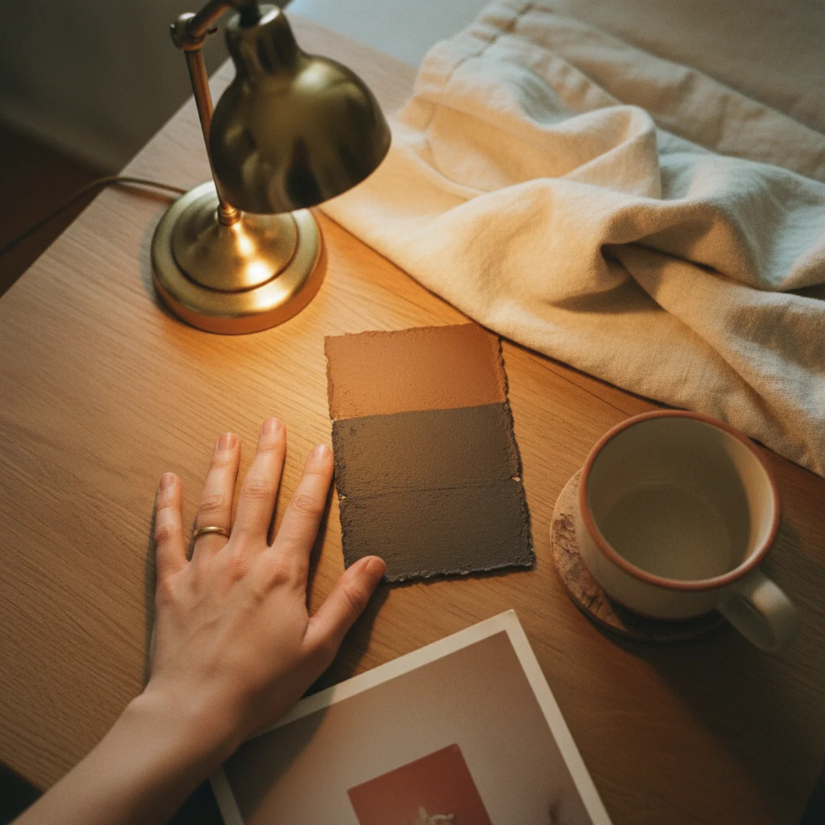
Clay and terracotta paint colors are the temperature correction for north-facing rooms — rooms that receive only indirect cool natural light all day. The warm earth-pigment colors counteract the cool light, producing visual warmth that white walls in the same room would fail to deliver. Best colors: Farrow & Ball Red Earth 64, Benjamin Moore Pottery 1297, Sherwin Williams Terra Brun 6034.
Clay and terracotta paint specifications: FARROW & BALL RED EARTH 64 — soft muted terracotta with brown undertone, works in north-facing rooms 9 to 14 feet wide, pairs with cream trim and ceilings. PRICE: $115-130 per gallon. BENJAMIN MOORE POTTERY 1297 — slightly lighter terracotta with rosy warmth, works in north-facing rooms or south-facing rooms wanting saturated warmth. PRICE: $75-90 per gallon. SHERWIN WILLIAMS TERRA BRUN 6034 — muted brown-terracotta, deepens north light effectively. $80-95 per gallon. ROOM APPLICATIONS — best for: north-facing offices, north-facing dining rooms (especially when used during evening), north-facing libraries, small bedrooms wanting cocoon warmth. AVOID for: south-facing rooms with already-warm bright light (overwhelming), small rooms under 8 feet wide (compresses visually), open-plan main floors needing color flow with adjacent rooms. PAIRING — cream or warm white trim (NOT pure white which fights the warm earth tone), warm wood floors (oak, walnut, warm pine), brass or aged-bronze hardware, vintage textiles in coordinated earth tones. LIGHTING REQUIREMENTS — multiple warm 2700K LED sources (3+ table lamps minimum), beeswax candles for evening atmospheric burn. The terracotta walls plus warm lighting compound the effect; cool overhead lighting (4000K+) destroys it. APPLICATION technique: 2 to 3 coats over white primer for full color depth. Total cost for 12x14 foot room: $80-130 in paint + $30-50 in supplies.
AFFILIATE SLOTCOLORF&B Red Earth 64, BM Pottery 1297, SW Terra Brun 6034 for north-facing rooms 9-14 feet wide with warm lightingAdd affiliate URL when configuredWhy it works
Because north-facing rooms receive only indirect daylight without direct sun — the light is naturally cooler in temperature (around 8000-10000K versus south-facing 5500-6500K). White or cool walls in north-light rooms read as institutional or cold because the cool light reflects off cool walls compounded. Warm earth-pigment paint (clay, terracotta) reflects warm tones back into the room despite the cool incoming light, producing the visual warmth that the room would otherwise lack. The result: the same room that felt cold and institutional in white paint feels warm and inviting in terracotta. The single paint color decision can transform north-facing rooms more than any other change.
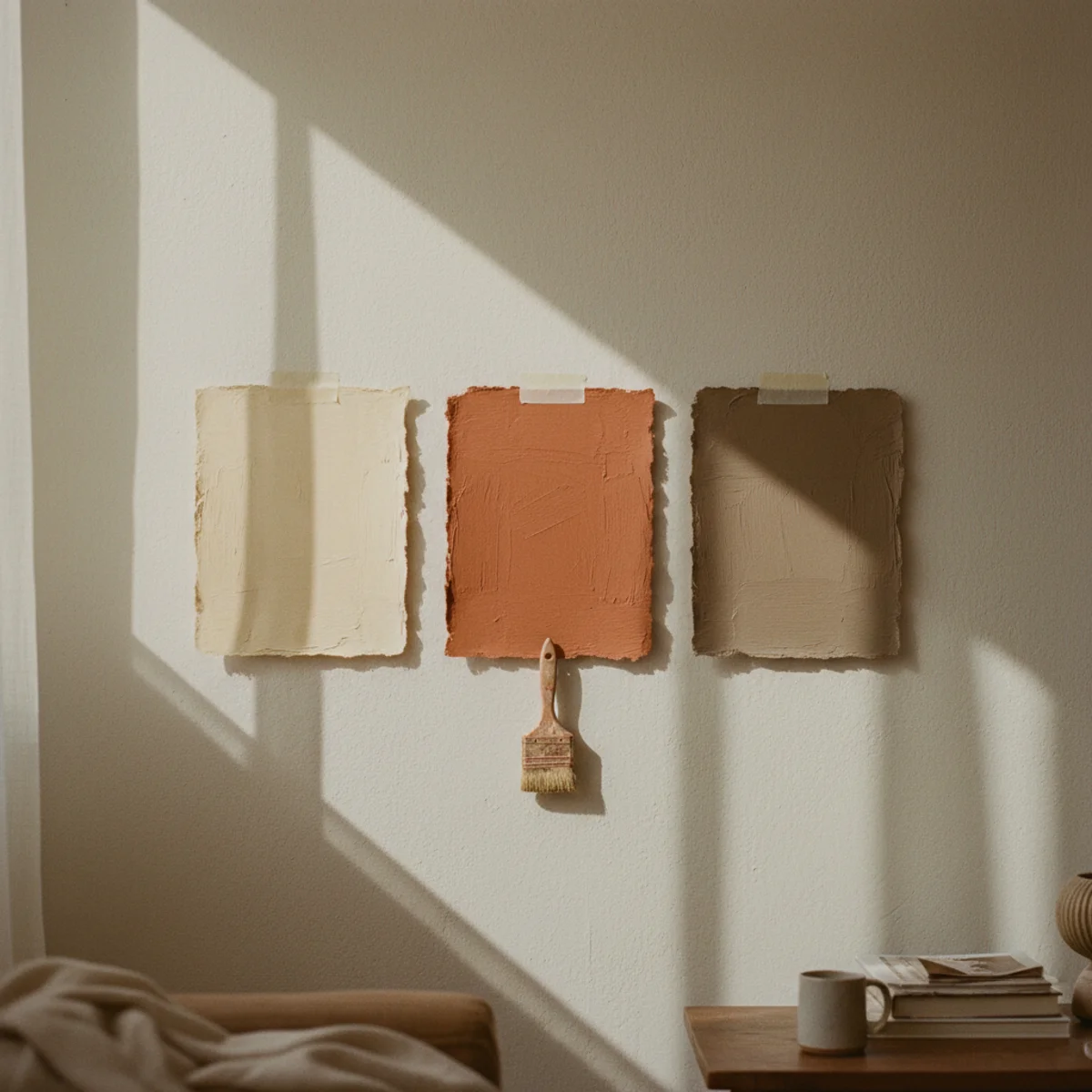
Pro tip — Test paint samples on multiple walls for at least 3 full days under both daylight and warm 2700K lamplight before committing — clay and terracotta colors can look dramatically different across morning, midday, evening, and lamp-lit conditions, especially in north-facing rooms where light shifts significantly across the day. Most paint disappointments come from rushed sample-test that doesn't capture the full lighting range.
F&B Red Earth 64 in north-facing dining room — warm earth pigment correcting cool light. See also: best-paint-for-warm-home
02Warm Off-Whites That Read as Cream
The most-misunderstood warm paint category: 'warm white.' Most paint marketed as warm white is actually cool-leaning (with blue or grey undertone) and reads as commercial-blue-white on the wall. Genuine warm off-whites have yellow, cream, or pinkish undertones and read as actual cream when applied. Best truly-warm off-whites: Farrow & Ball Pointing 2003, Benjamin Moore Soft Chamois OC-13, Sherwin Williams Alabaster SW 7008.
Genuine warm off-white specifications: FARROW & BALL POINTING 2003 — soft warm cream with slight yellow undertone, works in most rooms regardless of light direction. $115-130 per gallon. BENJAMIN MOORE SOFT CHAMOIS OC-13 — warm cream with pinkish undertone, especially good in north-facing rooms (subtle warmth even in cool light). $75-90 per gallon. SHERWIN WILLIAMS ALABASTER SW 7008 — warm white with slight yellow undertone, more saturated than pure white but cleaner than cream. $80-95 per gallon. BENJAMIN MOORE WHITE DOVE OC-17 — slightly more neutral but still reads warm in most lighting; the most-versatile warm off-white for whole-home application. $75-90 per gallon. BENJAMIN MOORE NAVAJO WHITE OC-95 — distinctly warm cream with yellow undertone, more saturated than most off-whites. ROOM APPLICATIONS — works in all rooms regardless of light direction, but performs best with consistent warm lighting (2700K LED, multiple sources). The off-white reads warmer in evening lamplight than in midday natural light. AVOID — Benjamin Moore Decorator's White (cool), Farrow & Ball All White (cool), Sherwin Williams Pure White (cool), most paint marketed as 'modern white' or 'crisp white' (commercial blue-white). TEST under your specific lighting before committing — the off-white that looks warm in showroom may look cool in your space.
AFFILIATE SLOTCOLORF&B Pointing 2003, BM Soft Chamois OC-13, BM White Dove OC-17, SW Alabaster SW 7008, BM Navajo White OC-95Add affiliate URL when configuredWhy it works
Because off-white is the most-commonly used paint color in homes (trim, ceilings, often walls), so getting the off-white wrong means the room's foundation color undermines every warm element added on top. A cool blue-white wall surrounded by warm wood furniture, terracotta cushions, and brass lamps reads as awkward mismatch where genuine warm cream wall in the same setting reads as unified composition. The off-white is also the most-noticed paint color (it's the dominant color in most rooms), so its temperature deviation has more impact than smaller accent color choices. Getting the off-white right is foundational; getting it wrong undermines everything else.
Pro tip — Compare paint samples directly against actual cream paper or cream linen napkin to verify true warmth — many 'warm white' paint samples that look acceptable beside other paint chips look cool beside genuine cream reference material. The cream-reference test reveals which off-whites are truly warm versus marketing-warm.
BM Soft Chamois OC-13 — reads as actual cream rather than commercial blue-white. See also: cream-decor-warm-white
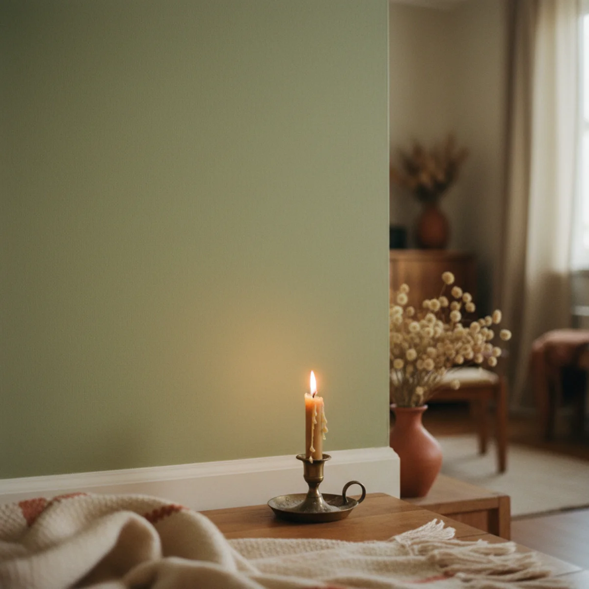
03Sage Green, Chosen Carefully
Sage green is one of the most-popular warm paint colors and one of the easiest to choose wrong. Generic sage greens often lean either too yellow (read as olive military) or too blue (read as cool seafoam). The right sage greens are muted, warm-leaning, and slightly grey-tinted. Best sage shades: Farrow & Ball Cromarty 285, Benjamin Moore Saybrook Sage HC-114, Sherwin Williams Sage SW 2860.
Sage green specifications: FARROW & BALL CROMARTY 285 — soft warm muted sage with slight grey-blue undertone, works in most lighting conditions, especially good in south-facing and east-facing rooms. The most-popular sage among interior designers for warm-home aesthetic. $115-130 per gallon. BENJAMIN MOORE SAYBROOK SAGE HC-114 — slightly warmer than Cromarty, with subtle yellow-grey undertone. Works in most rooms but particularly good in spaces with warm wood elements. $75-90 per gallon. SHERWIN WILLIAMS SAGE SW 2860 — warm-leaning sage with slight yellow undertone, more saturated than the F&B and BM options. $80-95 per gallon. BENJAMIN MOORE OLIVE MOSS 1543 — deeper olive-sage for darker rooms or accent walls. ROOM APPLICATIONS — best for: bedrooms (calming warm tone), home offices (low stimulation), bathrooms (spa-like warmth), accent walls in living rooms. AVOID for: small north-facing rooms (compresses visually), kitchens with cool fluorescent overhead lighting (reads dull). PAIRING — cream or warm white trim, warm wood floors (oak, walnut, warm pine), brass or aged-bronze hardware, terracotta or warm pink accent textiles, dried botanicals and live plants (the green palette ties together). LIGHTING — multiple warm 2700K sources critical; sage greens read dramatically duller under cool light. AVOID GENERIC 'SAGE' — many paint companies offer 'sage green' that lacks the warm muted character; the specific named colors above deliver the genuine warm sage where generic versions often disappoint.
AFFILIATE SLOTCOLORF&B Cromarty 285, BM Saybrook Sage HC-114, SW Sage SW 2860, BM Olive Moss 1543 - warm muted sage, NOT generic 'sage green'Add affiliate URL when configuredWhy it works
Because the difference between right sage and wrong sage is significant — wrong sage (too yellow or too blue or too saturated) reads as commercial color choice or as dated military olive, where right sage reads as calming sophisticated warm-natural. The same paint coverage produces dramatically different aesthetic results based on which specific sage you choose. The named F&B, BM, and SW colors above have been refined through actual design industry use across decades; generic 'sage' from less-design-focused paint lines often lacks the careful tone balancing. The investment is the same (paint cost, application time) regardless of which sage you choose; the result is dramatically different.
Pro tip — Test sage paint samples against existing wood floors or wood furniture in the room — sage reads very differently against warm oak versus cool grey-stained wood. The wood-sage relationship is significant; sage that looks right against warm wood may look wrong against cool wood, and vice versa.
F&B Cromarty 285 with cream trim and oak floors — careful sage that reads warm-natural rather than generic. See also: scandinavian-living-room
04Deep, Warm Charcoal for a Cocoon
Deep warm charcoal paint is the cocoon color — for rooms that want to feel enveloping, intimate, and visually quiet rather than bright and airy. Best applications: bedrooms (especially north-facing or basement), libraries, snug rooms, dining rooms used primarily in evening. Best shades: Farrow & Ball Down Pipe 26, Benjamin Moore Wrought Iron 2124-10, Sherwin Williams Iron Ore SW 7069.
Deep warm charcoal specifications: FARROW & BALL DOWN PIPE 26 — deep warm charcoal with slight blue-grey undertone, the iconic cocoon color, works in any room wanting cocoon effect. $115-130 per gallon. BENJAMIN MOORE WROUGHT IRON 2124-10 — deep warm charcoal with subtle warmth, slightly easier to work with than Down Pipe in lighter rooms. $75-90 per gallon. SHERWIN WILLIAMS IRON ORE SW 7069 — slightly warmer warm charcoal with brown undertone. $80-95 per gallon. BENJAMIN MOORE BLACK PEPPER CC-720 — even deeper for true cocoon spaces, very dark. ROOM APPLICATIONS — bedrooms (especially north-facing where the cool light becomes irrelevant when walls go dark), libraries (the deep walls support hours of reading without visual fatigue), snug rooms and TV rooms (the cocoon supports relaxation), dining rooms used primarily in evening (the dark walls become invisible at night, the candle and lamp light becomes the visual focal point), powder rooms (dramatic small-space color). AVOID for: small rooms under 100 sq ft (overwhelms), rooms with low ceilings under 8 feet (compresses), rooms requiring bright task lighting (compete with the dark walls). PAIRING — cream or warm white trim (the contrast adds drama), brass or warm metallic hardware, vintage gilded mirrors, warm wood floors, lots of warm lighting (5+ sources minimum), dark wood furniture or contrasting cream upholstery. TECHNICAL REQUIREMENTS — 2 to 3 coats over white primer for full depth, or tinted primer to reduce coat count. PROFESSIONAL APPLICATION often worth it for dark colors that show every imperfection.
AFFILIATE SLOTCOLORF&B Down Pipe 26, BM Wrought Iron 2124-10, SW Iron Ore SW 7069, BM Black Pepper CC-720 for cocoon bedrooms, libraries, dining roomsAdd affiliate URL when configuredWhy it works
Because dark walls absorb light rather than reflect it, creating intimate enveloping atmosphere that bright walls cannot match. The cocoon effect is psychological and physical — the room feels visually smaller and more enclosed, which produces a sense of safety and intimacy that brighter rooms specifically miss. Bedrooms and libraries benefit most because both rooms function best for activities (sleep, deep reading) that benefit from reduced visual stimulation. The 'warm' qualifier matters — pure black or cool grey-blue creates similar size effect but with cold institutional feeling, where warm charcoal creates intimate inviting feeling. The same architectural room transforms emotional register dramatically between warm charcoal and white walls.
Pro tip — Add multiple warm light sources (5+ at 2700K) before committing to dark walls — the dark walls absorb so much ambient light that under-lit rooms become uncomfortably dim. The lighting plan determines whether the cocoon feels cozy or cave-like; with proper lighting cozy, without proper lighting cave-like.
F&B Down Pipe 26 with cream trim and multiple warm lamps — intimate cocoon for bedroom or library. See also: master-bedroom-ideas
05Greige for a Forgiving Neutral
Greige (grey-beige hybrid) is the forgiving warm neutral — works in most lighting conditions, pairs with both warm and slightly-cool accents, doesn't demand commitment to specific warm palette family. Best for households wanting warm-neutral foundation without strong color statement. Best shades: Farrow & Ball Skimming Stone 241, Benjamin Moore Edgecomb Gray HC-173, Sherwin Williams Accessible Beige SW 7036.
Greige paint specifications: FARROW & BALL SKIMMING STONE 241 — soft warm grey-beige, works in north-facing through south-facing rooms, especially good in transitional spaces (hallways, entryways, kitchens flowing to dining). $115-130 per gallon. BENJAMIN MOORE EDGECOMB GRAY HC-173 — slightly warmer than Skimming Stone, with subtle yellow undertone. The most-popular greige in American homes for the right reason. $75-90 per gallon. SHERWIN WILLIAMS ACCESSIBLE BEIGE SW 7036 — warm greige with brown undertone, more saturated than the F&B and BM options. $80-95 per gallon. BENJAMIN MOORE PASHMINA AF-100 — slightly cooler greige with sophisticated mid-tone. ROOM APPLICATIONS — works across all rooms but best in: open-plan main floors (the neutral flow color through multiple rooms), transitional spaces (hallways, entryways, mudrooms), bathrooms (sophisticated warm neutral), bedrooms (calming neutral foundation). AVOID for: small rooms wanting saturated warmth (greige reads neutral rather than warm-saturated), high-drama rooms wanting bold color statement. PAIRING — cream or warm white trim, warm wood floors (varies more flexibly with wood tones than other colors), brass OR oiled bronze hardware (both work), textiles in any warm palette family (terracotta accents OR sage accents OR cream-only all work). THE FORGIVING ADVANTAGE — greige tolerates more variation in accents than other warm paint choices; you can mix terracotta cushions with sage throws in a greige-painted room where the same mix in pure terracotta walls would clash. This makes greige the right choice for households still developing their warm-home aesthetic or for transitional periods between color preferences.
AFFILIATE SLOTCOLORF&B Skimming Stone 241, BM Edgecomb Gray HC-173, SW Accessible Beige SW 7036 - flexible warm neutral for any room or transitional spacesAdd affiliate URL when configuredWhy it works
Because greige sits at the intersection of grey (cool) and beige (warm) — and the hybrid characteristic lets it support both warm and slightly-cool accents without clashing. The same greige walls accommodate terracotta cushions (warm) and sage green textiles (warm-but-different) and even subtle blue-grey accents (slightly cool), where dedicated warm colors like terracotta walls or saturated cream would fight some of these accents. The flexibility makes greige the right choice for households that prioritize ease of decoration over strong color statement, or that aren't yet certain which warm palette family they want to commit to.
Pro tip — Use greige on connecting spaces (hallways, entryways, kitchens flowing to dining) and stronger colors on bedrooms and snug rooms — the greige provides the flowing neutral between rooms that have their own committed colors. This whole-home strategy lets each room have its own personality while maintaining color flow through transitional spaces.
BM Edgecomb Gray HC-173 with terracotta and sage accents — forgiving greige tolerates varied warm accents. See also: warm-minimalism
06Ochre and Mustard for an Accent
Ochre and mustard yellows work as accent paint colors (single feature wall, small room, powder room) rather than as primary room colors. The saturated warm yellow tones add significant warmth and energy in small doses; full-room ochre or mustard tips into 1970s nostalgia or overwhelming brightness for most homes. Best as accent: Farrow & Ball India Yellow 66, Benjamin Moore Anjou Pear 408, Sherwin Williams Goldenrod SW 6677.
Ochre and mustard specifications: FARROW & BALL INDIA YELLOW 66 — rich muted ochre with brown undertone, slightly dustier than pure ochre, works for accent walls or small powder rooms. $115-130 per gallon. BENJAMIN MOORE ANJOU PEAR 408 — softer mustard-ochre with green undertone, slightly less saturated than India Yellow. $75-90 per gallon. SHERWIN WILLIAMS GOLDENROD SW 6677 — more saturated true mustard, dramatic in accent applications. $80-95 per gallon. FARROW & BALL OCHRE 6 — saturated true ochre, best in small applications like powder rooms or single feature walls. BEST USES — ACCENT WALL behind a bed or sofa (single wall in saturated warm color), POWDER ROOM full color (small bathroom with no windows handles bold color well), KITCHEN accent (single wall in kitchen with rest neutral), MUDROOM or LAUNDRY ROOM (small utility rooms benefit from energy injection), LIBRARY or STUDY where the warm energy supports reading focus. AVOID full-room application in: bedrooms (overstimulating for sleep), large rooms over 250 sq ft (overwhelming), open-plan flow rooms (creates jarring color statement). PAIRING — cream or warm white trim, warm wood floors, brass hardware, deep moss green or navy textile accents (the warm yellow plus deep accent creates classic warm palette), dried herbs or fresh foliage for visual continuity with the natural pigment origin of ochre.
AFFILIATE SLOTCOLORF&B India Yellow 66, BM Anjou Pear 408, SW Goldenrod SW 6677, F&B Ochre 6 - ACCENT only for feature walls or small bold roomsAdd affiliate URL when configuredWhy it works
Because the saturation and warmth of ochre and mustard are visually demanding — they energize spaces in small doses but overwhelm in large ones. A single accent wall in ochre adds significant warmth and visual interest to an otherwise-neutral room; ochre on all four walls becomes the room's dominant emotional register, which most households find too energetic for spaces meant to be calm. Accent application gives you the warmth benefit at appropriate dosage. The exception is small high-energy rooms (powder rooms, mudrooms, studies) where full saturation works because the small space accommodates the bold statement.
Pro tip — Pair ochre or mustard accent walls with extensive cream and oat throughout the rest of the room — the contrast between saturated warm yellow accent and surrounding cream maximizes the accent's impact while preventing the room from becoming overwhelming. Adding more competing accent colors (terracotta plus ochre plus sage) dilutes the impact of each.
F&B India Yellow 66 single accent wall behind bed — ochre at accent dosage with cream surrounding. See also: fall-decor-ideas
07Soft Plaster Pink
Soft plaster pink (warm pink with slight orange or peach undertone, NOT cool pink with blue undertone) is the surprise warm color — works particularly well in bedrooms, dining rooms, and bathrooms. The warm pink reads sophisticated rather than juvenile when chosen correctly. Best shades: Farrow & Ball Setting Plaster 231, Benjamin Moore Pink Damask OC-72, Sherwin Williams Rose Tan SW 0072.
Soft plaster pink specifications: FARROW & BALL SETTING PLASTER 231 — soft warm pink with subtle peach undertone, the iconic 'plaster pink' that designers reference. Works in most rooms wanting warm sophistication. $115-130 per gallon. BENJAMIN MOORE PINK DAMASK OC-72 — slightly warmer than Setting Plaster, more peach character. $75-90 per gallon. SHERWIN WILLIAMS ROSE TAN SW 0072 — muted warm pink with brown undertone. $80-95 per gallon. FARROW & BALL CALAMINE 230 — lighter plaster pink for more subtle effect. ROOM APPLICATIONS — bedrooms (especially master bedrooms wanting warm sophistication), dining rooms (works particularly well at night when the pink reads warm against dim lighting), bathrooms (spa-like warmth), powder rooms (small dramatic warm space), guest bedrooms (welcoming warmth). AVOID for: rooms wanting masculine or industrial aesthetic, rooms with cool natural light (north-facing) without strong warm artificial lighting, traditionally male-coded spaces if household has sensitivities about color coding (plaster pink is sophisticated but reads feminine to some viewers). PAIRING — cream or warm white trim, brass hardware (the brass-and-pink combination is iconic), warm wood floors, dark green or deep moss textile accents (the pink-plus-deep-green creates classic warm palette), vintage gilded mirrors. LIGHTING — multiple warm 2700K sources critical; the pink reads dramatically duller under cool light.
AFFILIATE SLOTCOLORF&B Setting Plaster 231, BM Pink Damask OC-72, SW Rose Tan SW 0072 - warm peach-pink for bedrooms, dining, bathrooms with brass hardwareAdd affiliate URL when configuredWhy it works
Because the orange-peach undertone of true plaster pink (versus blue-undertone cool pink) reads as a warm earth color related to terracotta and clay rather than as juvenile pink. The historical reference is real lime plaster walls in Mediterranean buildings, which weather to soft pink-peach tones over decades. Modern plaster pink paints reference this historical color with intentional warm character. The result is a color that feels sophisticated rather than commercial, calming rather than energetic, and warm-versus-cool in the same way terracotta walls would be — but at lower saturation that works for more rooms than full terracotta.
Pro tip — Test plaster pink samples specifically against existing brass hardware in the room — the brass-and-plaster-pink combination is iconic, but only works when both warm tones harmonize. Pink with cool silver hardware fights both colors; pink with warm brass amplifies both. The hardware-color relationship determines whether plaster pink reads sophisticated or off.
F&B Setting Plaster 231 with brass lamps and oak floors — sophisticated plaster pink with warm peach undertone. See also: master-bedroom-ideas
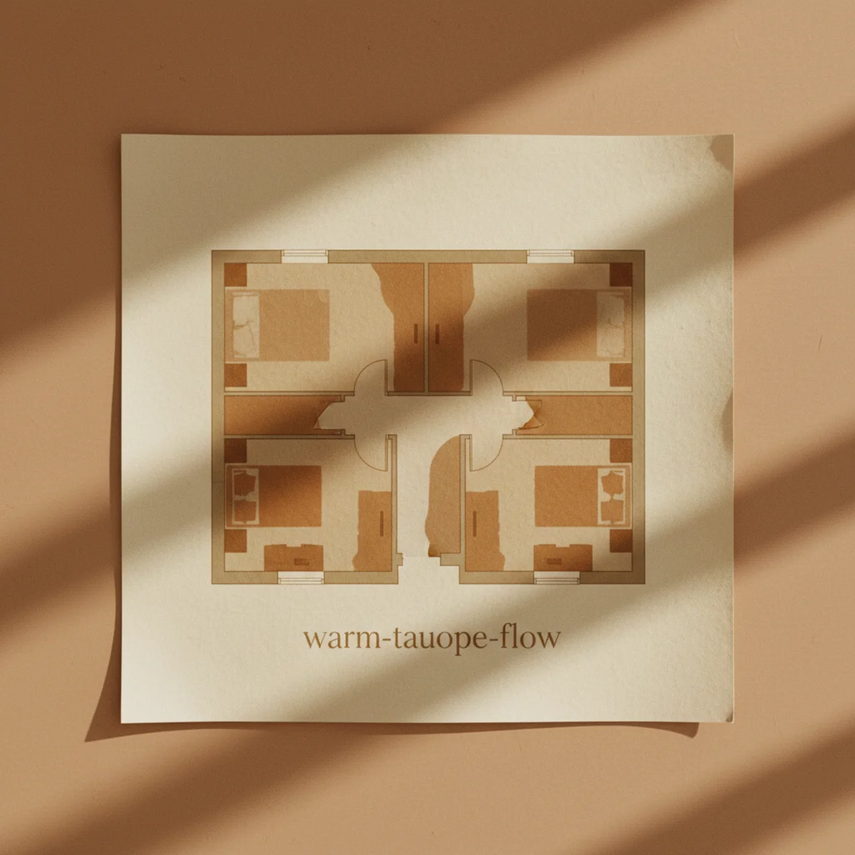
08Warm Taupe for Whole-Home Flow
Warm taupe is the connecting color for whole-home applications — works across multiple rooms with different light conditions, accommodates rooms with different individual color statements, provides cohesive flow through open-plan spaces. Best for households painting multiple rooms at once and wanting connected warm flow. Best shades: Farrow & Ball Joa's White 226, Benjamin Moore Manchester Tan HC-81, Sherwin Williams Kilim Beige SW 6106.
Warm taupe specifications: FARROW & BALL JOA'S WHITE 226 — soft warm taupe with subtle pinkish undertone, works in most lighting conditions, especially good for whole-home flow. $115-130 per gallon. BENJAMIN MOORE MANCHESTER TAN HC-81 — slightly warmer than Joa's White, with subtle yellow undertone. The popular whole-home taupe choice. $75-90 per gallon. SHERWIN WILLIAMS KILIM BEIGE SW 6106 — warm taupe with brown undertone, more saturated than F&B and BM options. $80-95 per gallon. BENJAMIN MOORE LITTLE GREENE FRENCH GRAY 113 — slightly cooler version for households wanting marginally more grey. ROOM APPLICATIONS — works in: open-plan main floors (kitchen + dining + living all in same taupe), hallways and stairs (transitional spaces), entryways and mudrooms (welcoming neutral), guest bedrooms (calming foundation), bathrooms (spa-like neutral). FLOW STRATEGY — apply same taupe across multiple connected rooms for visual continuity; bedrooms can deviate to individual colors while main floor stays unified. PAIRING — cream or warm white trim, warm wood floors, brass OR oiled bronze hardware, textiles in any warm palette family. Like greige (item 5), taupe accommodates multiple accent palette families flexibly. WHOLE-HOME PAINTING ECONOMY — painting 4-5 rooms in same color is significantly more efficient than 4-5 different colors: one paint mixing batch, no transition zones, simpler trim and ceiling coordination, simpler future touch-ups. The same room count painted in same taupe might take 1.5 weekends versus 3 weekends for 5 different colors.
AFFILIATE SLOTCOLORF&B Joa's White 226, BM Manchester Tan HC-81, SW Kilim Beige SW 6106 - whole-home flow for open-plan, hallways, transitional spacesAdd affiliate URL when configuredWhy it works
Because the slightly-darker tone of taupe (versus pure off-white) provides more visual weight and warmth in transitional spaces (hallways, stairs, entryways) that pure white would leave feeling unfinished. The warm character ties together rooms with different individual color statements (a bedroom in sage, a dining room in terracotta) through their shared connecting hallway and transitional spaces. The cohesion works because the eye registers consistent taupe across the home's transitional spaces as 'unified home environment' even when individual rooms have their own colors. Without the connecting taupe (and instead multiple different colors in different transitional spaces), the home reads as disjointed individual rooms rather than unified household.
Pro tip — Plan whole-home paint approach BEFORE starting individual room painting — choosing the warm taupe for connecting spaces first, then planning room-specific colors that flow with the taupe, produces dramatically better whole-home coherence than painting each room independently and trying to connect them later.
F&B Joa's White 226 across open-plan kitchen, dining, living — unified warm flow through multiple spaces. See also: small-apartment-decorating-ideas
09Olive and Drab Green for Studies
Olive and drab greens (deeper, more saturated than sage) work for studies, libraries, and home offices where the slightly-military traditional character supports focused work. Best as full-room treatment for small focused-work spaces. Best shades: Farrow & Ball Olive 13, Benjamin Moore Hunter Green 2041-10, Sherwin Williams Rosemary SW 6187.
Olive and drab green specifications: FARROW & BALL OLIVE 13 — saturated true olive with brown undertone, works for full-room treatment in studies or small focused-work spaces. $115-130 per gallon. BENJAMIN MOORE HUNTER GREEN 2041-10 — deep saturated forest green for very dramatic spaces, library-traditional. $75-90 per gallon. SHERWIN WILLIAMS ROSEMARY SW 6187 — slightly warmer warm-olive with brown undertone. $80-95 per gallon. FARROW & BALL TREVOSE GREEN 297 — slightly lighter saturated olive. ROOM APPLICATIONS — best for: home offices and studies (the deep warmth supports focused work without bright overstimulation), libraries (traditional library color that supports extended reading), small powder rooms (dramatic small-space treatment), den or snug rooms (cocoon-like warmth in saturated form). AVOID for: bedrooms wanting calm sleep (too energetic), kitchens with cool overhead lighting (reads dull and depressing), open-plan flow rooms (creates jarring color statement). PAIRING — cream or warm white trim (strong contrast adds drama), warm wood floors and shelving (the green-and-wood combination is library-traditional), brass hardware, leather furniture (worn leather pairs beautifully with deep olive), dried botanicals and vintage maps for traditional library aesthetic. THE LIBRARY TRADITION — deep saturated greens have been library and study colors for centuries; the choice connects to centuries of focused-work-space tradition rather than being a current trend. The historical depth makes deep olive feel timeless rather than trendy.
AFFILIATE SLOTCOLORF&B Olive 13, BM Hunter Green 2041-10, SW Rosemary SW 6187 for studies, libraries, small powder rooms, dens with brass and leatherAdd affiliate URL when configuredWhy it works
Because the deep saturated warmth creates focused work environment that bright airy rooms specifically don't support — the eye-resting darker walls reduce visual distraction, the warm character supports comfort during long work sessions, and the historical library tradition signals 'work happens here' to the household. The same architectural room transforms from generic 'spare room' to 'focused study' through paint color alone. Workspaces in pure white or pale neutral often feel institutional or impersonal; deep olive workspaces feel intentional and personally-claimed for focused work. The color directly affects the productive use of the room.
Pro tip — Add multiple warm light sources (5+ at 2700K) and a quality dedicated reading or work lamp to deep olive rooms — the dark walls absorb significant ambient light, so under-lit rooms become uncomfortable for actual work. The lighting plan determines whether the deep olive room functions for work or becomes purely decorative.
F&B Olive 13 with wood shelving and leather chair — saturated olive for focused work tradition. See also: home-office-ideas
10Cream for Trim and Ceilings
Trim and ceiling color matters as much as wall color for whole-room warmth. Cream trim (warm off-white with yellow or pinkish undertone) outperforms pure white trim significantly — the warm trim ties together warm walls and warm furniture where pure white trim creates cool punctuation that breaks the warm composition. Best trim colors: Benjamin Moore White Dove OC-17 for most homes, Farrow & Ball Pointing 2003 for premium application.
Trim and ceiling cream specifications: BENJAMIN MOORE WHITE DOVE OC-17 — slightly warm off-white that works as trim and ceiling color in most warm-home applications. The most-versatile warm trim color in American homes. $75-90 per gallon. FARROW & BALL POINTING 2003 — soft warm cream with slight yellow undertone, slightly warmer than White Dove. $115-130 per gallon. BENJAMIN MOORE SIMPLY WHITE OC-117 — very subtle warmth, the lightest end of warm off-white. SHERWIN WILLIAMS ALABASTER SW 7008 — warm white with slight yellow undertone. APPLICATION — trim color throughout most warm homes (door frames, window casings, baseboards), ceilings in most rooms (slightly more reflective than dark ceilings, supports warm atmospheric goals), occasional accent wall in lighter applications. AVOID pure white (BM Decorator's White, SW Pure White) for trim and ceilings in warm-home applications — pure white reads as commercial-blue-white against warm walls and breaks the warm composition. The trim color choice affects every room with trim and is foundational; getting trim wrong undermines wall color choices throughout the home. STRATEGY — choose your trim color first when planning whole-home paint, then choose wall colors that work with it. The trim consistency creates whole-home cohesion that varied trim cannot.
AFFILIATE SLOTTRIMBM White Dove OC-17, F&B Pointing 2003, BM Simply White OC-117, SW Alabaster SW 7008 - warm cream trim and ceilings throughout warm homeAdd affiliate URL when configuredWhy it works
Because trim and ceiling occupy significant visual area in every room — door and window casings, baseboards, ceiling are typically 15-20% of visible surface area in a typical room. Their color affects the room's overall temperature reading dramatically. Pure white trim against warm walls creates cool punctuation in every room that breaks the warm composition; warm cream trim against warm walls maintains the warm reading consistently. The compounding effect across the whole home is significant — 10+ rooms with trim creates 10+ instances where the trim color works for or against warm goals. Getting trim color right is foundational; many warm-home failures come from neglecting trim color while choosing wall colors carefully.
Pro tip — If you have existing pure white trim throughout your home, consider re-trimming with warm cream over a single weekend — using a small paint sprayer or careful brush technique, you can re-paint all trim in a typical home for $200-400 in paint and supplies plus 1-2 weekends of work. The whole-home transformation is significant for the moderate investment.
BM White Dove OC-17 trim and ceilings with warm walls — warm trim ties together the warm composition. See also: cream-decor-warm-white
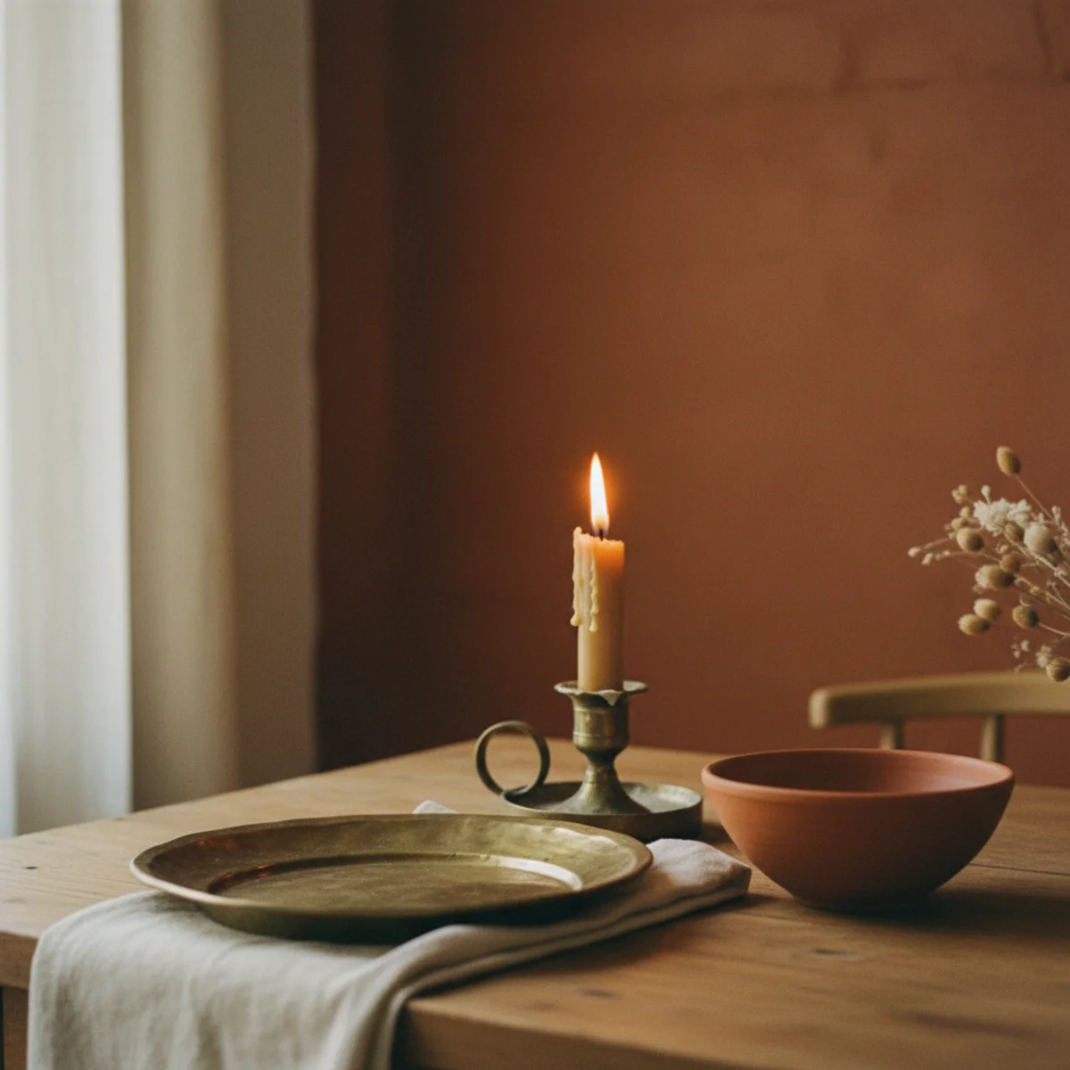
11Rust and Brick for a Dining Room
Rust and deep brick reds work particularly well for dining rooms — the deep saturated warm color reads dramatic at night under candle and lamp lighting (when dining rooms are most used), supports the warm food and conversation atmosphere, and creates the cocoon dining experience that bright dining rooms specifically miss. Best shades: Farrow & Ball Brinjal 222, Benjamin Moore Caliente AF-290, Sherwin Williams Rustic Red SW 7593.
Rust and brick specifications: FARROW & BALL BRINJAL 222 — deep aubergine-rust hybrid, dramatic dining room color. $115-130 per gallon. BENJAMIN MOORE CALIENTE AF-290 — saturated rust with brown undertone, slightly warmer than pure red. $75-90 per gallon. SHERWIN WILLIAMS RUSTIC RED SW 7593 — deep brick red with brown undertone. $80-95 per gallon. FARROW & BALL ETON RED 75 — saturated red-brick for very dramatic spaces. BENJAMIN MOORE BABCOCK MUSHROOM CC-516 — slightly lighter rust-mushroom for less dramatic effect. ROOM APPLICATIONS — dining rooms (the iconic application, especially north-facing or evening-use dining rooms), formal libraries or studies (saturated warm character), powder rooms or small bathrooms (dramatic small-space treatment). AVOID for: bedrooms wanting calm sleep (overstimulating), kitchens with cool overhead lighting (reads dull), small dining rooms under 100 sq ft (overwhelming), open-plan dining flowing to kitchens (jarring transition unless coordinated). PAIRING — cream or warm white trim (strong contrast adds drama), brass lighting and hardware throughout (the rust-and-brass combination is dining-room-classic), warm wood floors and dining table, vintage gilded mirrors, candle-only or warm-lamp-only evening lighting. LIGHTING STRATEGY for dining rooms — minimal overhead, maximum candle and warm table lamp throughout evening hours. The deep red walls become atmospheric backdrop rather than visually demanding presence under candle and lamp light.
AFFILIATE SLOTCOLORF&B Brinjal 222, BM Caliente AF-290, SW Rustic Red SW 7593 for dining rooms (especially evening use) with brass and candle lightingAdd affiliate URL when configuredWhy it works
Because dining rooms are used primarily in evening hours under candle and warm-lamp lighting — and deep rust reads dramatically different at night than during day. During daylight, deep rust dining rooms can feel heavy or overwhelming; at night under candlelight, the same walls become rich atmospheric backdrop that disappears slightly while supporting the warm food and conversation atmosphere. The night-reading is what matters most because that's when the room functions for its primary purpose. The color also references centuries of formal dining tradition (deep red dining rooms have been the standard for sophisticated dining since Victorian era through modern times), connecting your dining room to that tradition rather than to current generic trends.
Pro tip — Photograph your dining room at night with candles and warm lamps lit BEFORE committing to deep rust paint — bring rust paint samples to the room, place against the wall, and photograph in actual evening lighting conditions. The night-photo test reveals whether the rust reads as right-saturated dramatic versus too-overwhelming for your specific evening lighting setup.
F&B Brinjal 222 dining room with brass and candlelight — deep rust at night supports warm dining atmosphere. See also: cozy-tablescape-ideas
12Warm Beige Done Right
Warm beige is the most-misunderstood paint category — most paint marketed as 'beige' is actually cool or yellow-leaning, while genuine warm beige has subtle pink, peach, or cream undertone that reads as cozy rather than as commercial. Best truly-warm beige: Farrow & Ball Slipper Satin 2004, Benjamin Moore Bone White OC-15, Sherwin Williams Natural Linen SW 9109.
Warm beige specifications: FARROW & BALL SLIPPER SATIN 2004 — soft warm beige with subtle peach undertone, works in most rooms regardless of light direction. $115-130 per gallon. BENJAMIN MOORE BONE WHITE OC-15 — slightly cooler warm beige with subtle pink undertone, more versatile across light conditions. $75-90 per gallon. SHERWIN WILLIAMS NATURAL LINEN SW 9109 — warm beige with cream undertone, slightly more saturated than F&B and BM options. $80-95 per gallon. BENJAMIN MOORE LAMBSKIN OC-92 — warmer beige with yellow undertone, more saturated. ROOM APPLICATIONS — works in most rooms similarly to greige but with slightly more warm character — bedrooms, living rooms, dining rooms, hallways, bathrooms. Best for households wanting subtle warmth without strong color statement. PAIRING — cream or warm white trim, warm wood floors, brass or oiled bronze hardware, textiles in any warm palette family. The subtle warm beige character makes it more naturally warm than greige but less saturated than dedicated warm colors. THE COMMON FAILURES — most beige paint marketed in commercial retail is cool-leaning or yellow-saturated; checking actual undertone is critical. AVOID: any beige with grey undertone (cool-leaning), heavily yellow beiges that read jaundiced, beiges with green undertone (read olive). TEST samples for at least 3 days under multiple lighting conditions before committing — beige is the most-lighting-sensitive paint category.
AFFILIATE SLOTCOLORF&B Slipper Satin 2004, BM Bone White OC-15, SW Natural Linen SW 9109, BM Lambskin OC-92 - genuinely warm beige with peach/pink/cream undertoneAdd affiliate URL when configuredWhy it works
Because beige is one of the most-commonly chosen 'safe' paint colors (designed to please mass-market preferences) and one of the most-frequently wrong choices when warmth specifically matters. Commercial mass-market beige tends toward cool or yellow-saturated tones that read as either institutional or aging; genuine warm beige with peach or pink undertone reads as cozy. The same paint coverage produces dramatically different aesthetic results based on undertone alone. Most readers of this guide who say 'I painted my walls beige and they don't feel warm' chose mass-market beige with wrong undertone; the named F&B, BM, and SW colors above have careful undertone balancing that delivers genuine warmth where generic beige often fails.
Pro tip — Bring warm beige paint samples home and tape them beside the existing materials in your room (warm wood floor, warm wood furniture, cream trim) before committing — the relationship between paint and existing warm materials determines whether the beige reads as 'warm and cohesive' versus as 'mismatched undertone.' The 30-minute on-site test prevents the most-common warm-beige failures.
F&B Slipper Satin 2004 with cream trim and oak floors — warm beige with subtle peach undertone done right. See also: cozy-living-room-ideas
How to choose a warm paint color step by step
The only reliable way to pick paint is to test it where it'll live.
- 1Narrow to three candidates
Pull warm samples that lean the way you want — clay, sage, greige. Ignore the chip; you're choosing the direction, not the final color.
- 2Paint large swatches
Brush big patches — at least two feet square — on more than one wall, ideally near a window and in a dim corner.
- 3Watch them all day
Check the swatches in morning, midday, and 4pm light. Warm whites especially only show their true undertone at sunset.
- 4Test against your trim and floors
Hold the swatch beside your trim, flooring, and existing furniture. A color that works on the wall can clash with the oak floor.
Quick tips
- Test every warm white at 4pm; the undertone you'll live with only appears at sunset.
- Paint swatches on at least two walls — light hits each differently.
- Watch for lilac or pink flashes at dusk on greiges and beiges; the brown-leaning ones are safest.
- Match trim and ceiling warmth to the walls so nothing reads gray by contrast.
- North-facing rooms need a warmer color than you think to counteract cool light.
- Rooms used mostly at night can take deeper, moodier warm colors than daytime rooms.
Warm colors by room and light
Clay and warm plaster tones to counteract cool light; avoid anything with a gray undertone.
A deep, warm charcoal or olive to lean into the cozy-cocoon feeling rather than fighting the size.
A single warm taupe or greige across connected rooms to tie the flow together.
Rust, brick, or deep olive in dining rooms and studies, where saturated color glows under lamplight.
Test the swatch at 4pm before you commit. Every warm white has a secret undertone it only shows at sunset.
Frequently asked questions
What are the best warm paint colors for a living room?+
What paint color works best in a north-facing room?+
How do I choose between sage green, terracotta, and warm beige for my room?+
Should trim and ceiling be the same color as walls?+
What's the difference between warm white and pure white?+
How do I test paint colors before committing?+
Warm paint is the cheapest, highest-impact change in any room, and the only real rule is to test it where it'll live. Brush large swatches on more than one wall, watch them at 4pm, and check them against your trim and floors before you buy a full tin. We'd test every warm white at sunset before committing — the undertone you'll live with for years hides until then, and four samples up front beats living with the wrong color. Get the light right and the color takes care of itself.