These twelve terracotta color palette applications are tested across real rooms — north-facing rooms needing warmth correction, south-facing rooms wanting saturated warmth, small accent applications in otherwise neutral homes, and whole-home terracotta commitments that age beautifully across decades. Each application below names specific shades (F&B Red Earth 64, BM Pottery 1297, SW Terra Brun 6034), the rooms where terracotta succeeds, the materials it pairs with (cream, moss green, aged brass, warm wood), and the applications to avoid (small dark rooms, cool-painted adjacent spaces).
Terracotta's resurgence in contemporary interiors is justified: it's not a trend color but a permanent warm-home color that has appeared in human dwellings for thousands of years. The twelve applications below distinguish terracotta uses that are timeless (terracotta and cream as base palette, terracotta tile floors, terracotta pottery) from ones that require careful consideration (terracotta accent wall in rooms with cool light, terracotta sofa as primary furniture investment).
By the end of this guide, you'll know exactly where and how to use terracotta — as the base palette with cream, as a single accent wall, as upholstered furniture, with moss green, as cushions and throws, as pottery and ceramics, as tile, with brass, as deep rust for darker rooms, in kitchens, as a washed wall finish, and as the whole-home thread that ties a warm home together.
WHAT'S INSIDE
- Terracotta and cream as the base warm palette — timeless across every home style
- The terracotta-with-moss-green combination that references natural earth and foliage together
- Terracotta pottery as the universal low-commitment entry — a $5 pot earns its place anywhere
- The whole-home terracotta thread — how to run it through every room without overwhelming
Terracotta is the one warm color that works as both a whisper and a shout. A cushion or a whole room — it earns its place either way.
— Domino [citation needed — verify before publish]
What is the terracotta color palette?
Terracotta is a warm earth tone — a clay color blending orange, brown, and pink — and a terracotta palette builds a room around it with supporting neutrals and one or two complementary accents. The classic pairing is terracotta with cream, oat, and oak for warmth, plus a touch of moss or olive green for contrast.
It's the saturated moment in the warm-neutral palette — the one accent that keeps a cream-and-oat room from reading empty. Used small, as a cushion or a vase, it punctuates. Used large, on a wall or a sofa, it envelops. Either way it pairs best with other earth tones and natural materials; against cool grays or bright whites, terracotta can read brash, but against oat linen and oak it glows.
More in Color Stories you may love
See allWhy terracotta is everywhere in 2026
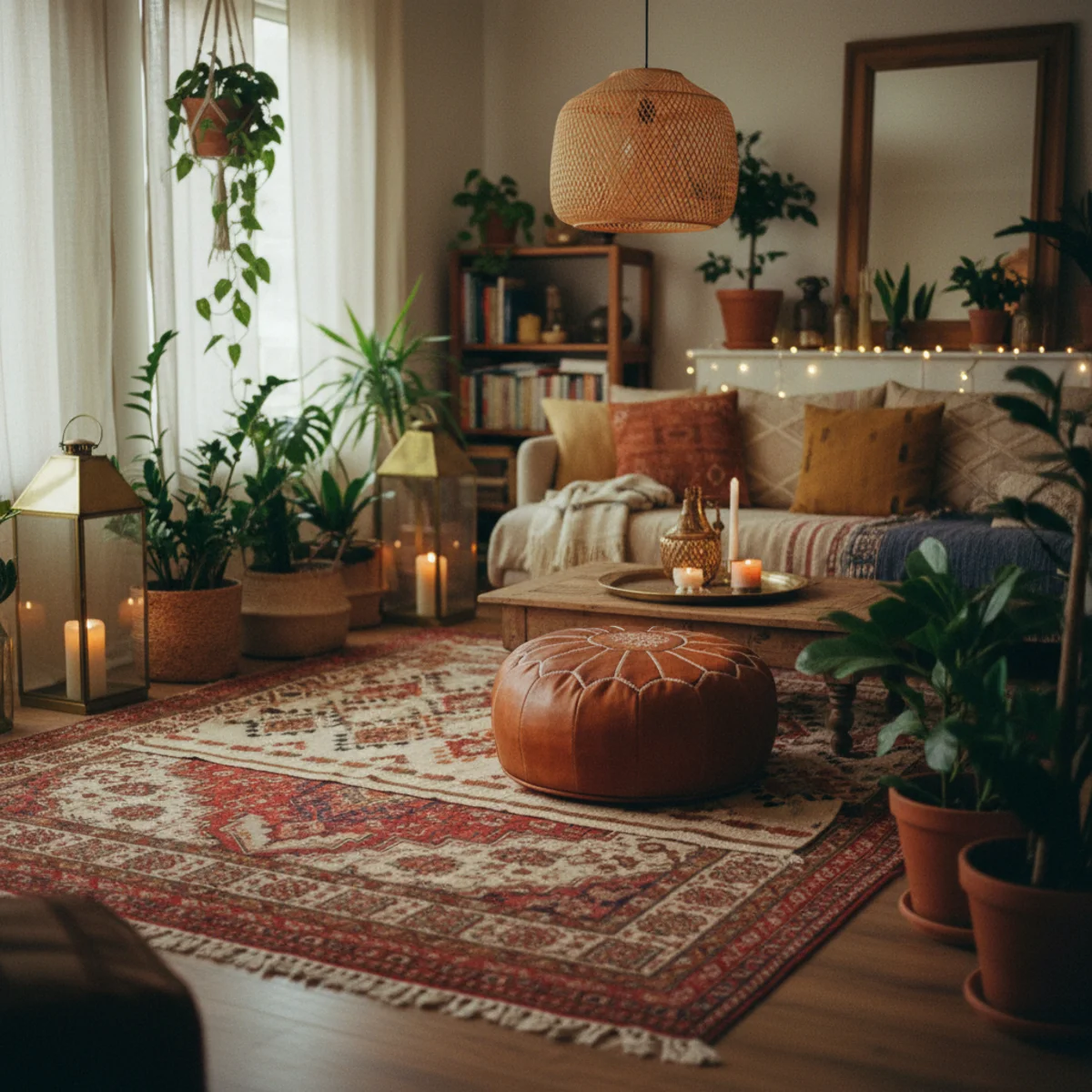
As the warm-earthy palette replaced cool grays, terracotta became the signature accent of the whole movement — it's in the cushions, the vases, the accent walls, and increasingly whole rooms. Pinterest's terracotta and warm earth tone searches climb steadily, and it anchors the cream-terracotta-moss palette that defines the cozy-home look.
The appeal is that it's warm without being twee. Terracotta reads as Mediterranean and grounded rather than cute, and it flatters warm skin tones and golden light. As warm minimalism asked for one saturated accent in an otherwise restrained room, terracotta became the default answer — earthy, confident, and endlessly pairable.
12 ways to use terracotta in your home
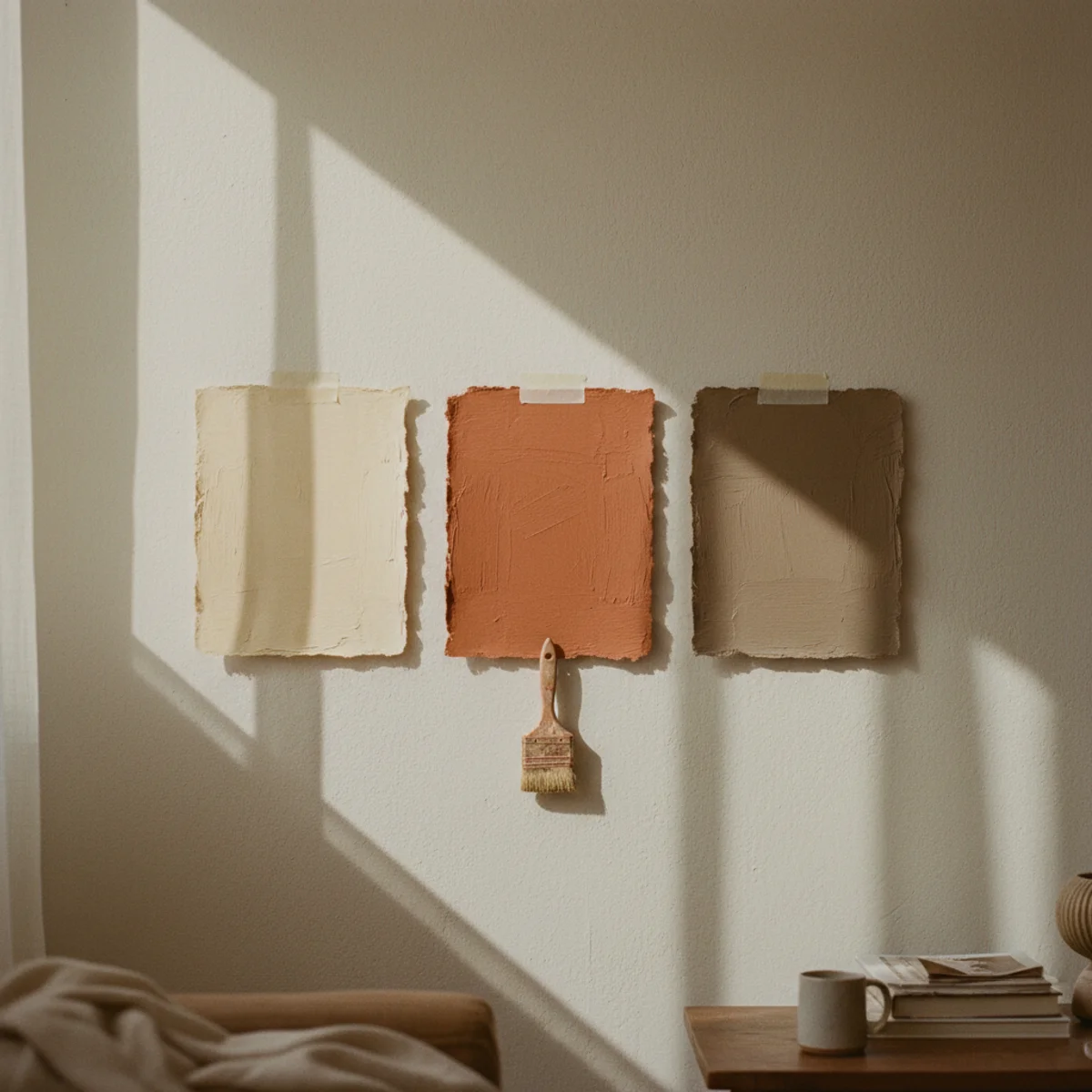
01Terracotta and Cream as a Base Palette
The most-reliable warm home base palette is terracotta and cream — terracotta provides the warm earth saturation, cream provides the light-reflective neutral that keeps the palette from becoming heavy. The combination appears in Mediterranean, Southwestern, Mexican, and Middle Eastern interior traditions because it works across all light conditions and all architectural scales.
Terracotta and cream palette implementation: WALL COLOR — cream walls (BM Soft Chamois OC-13, F&B Pointing 2003, or SW Alabaster SW 7008) as the primary wall color in most rooms, with terracotta as accent (cushions, textiles, one accent wall, pottery). OR terracotta walls (BM Pottery 1297, F&B Red Earth 64) as primary with cream trim and ceilings. TEXTILE SPLIT — majority cream and oat textiles (linen sofa, cream bedding, oat curtains) with terracotta accent textiles (one terracotta throw cushion, one terracotta pillow, terracotta table runner). CERAMIC BALANCE — cream or natural stoneware as primary dishware and vessels, terracotta pots as plant containers and accent vessels. FLOOR — warm wood (oak, walnut, warm pine) reads as natural extension of the terracotta-and-cream palette. TRIM — cream or warm white throughout. THE RELIABILITY PRINCIPLE — the terracotta-and-cream pairing works because both are warm earth pigments from the same natural spectrum (fired clay at different temperatures produces both terracotta orange-brown and the softer cream-beige tones). They don't compete because they're fundamentally related colors at different saturations. Budget implementation: swap one cushion and one plant pot to terracotta for instant palette shift at under $40.
AFFILIATE SLOTPALETTECream walls + terracotta accents (cushions, pots, one wall), OR terracotta walls + cream trim; warm wood floors as natural extensionAdd affiliate URL when configuredWhy it works
Because both colors are earth pigments that exist in natural landscapes — terracotta is the color of fired clay, sun-baked earth, and autumn foliage; cream is the color of natural stone, dried grass, and morning light. The brain reads the combination as 'natural environment' rather than as 'designed palette,' which produces the relaxed warm feeling that cozy home aesthetic targets. Neither color reads as trendy or specific to a historical moment; both read as permanent natural elements that have been present in human dwellings since the first fired pots.
Pro tip — Start implementing terracotta and cream through the three lowest-cost items: a terracotta plant pot ($5-15), a terracotta linen cushion cover ($20-40), and cream or warm-white paint on trim or ceilings if not already there ($40-80 for trim paint). Those three changes together establish the palette at minimal cost before any larger investments.
Cream walls, terracotta cushions, clay pots — the terracotta-and-cream palette that reads natural rather than designed. See also: cream-decor-warm-white
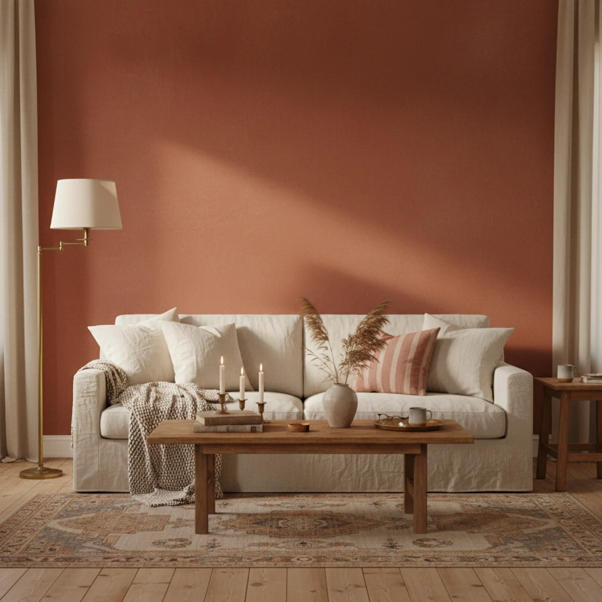
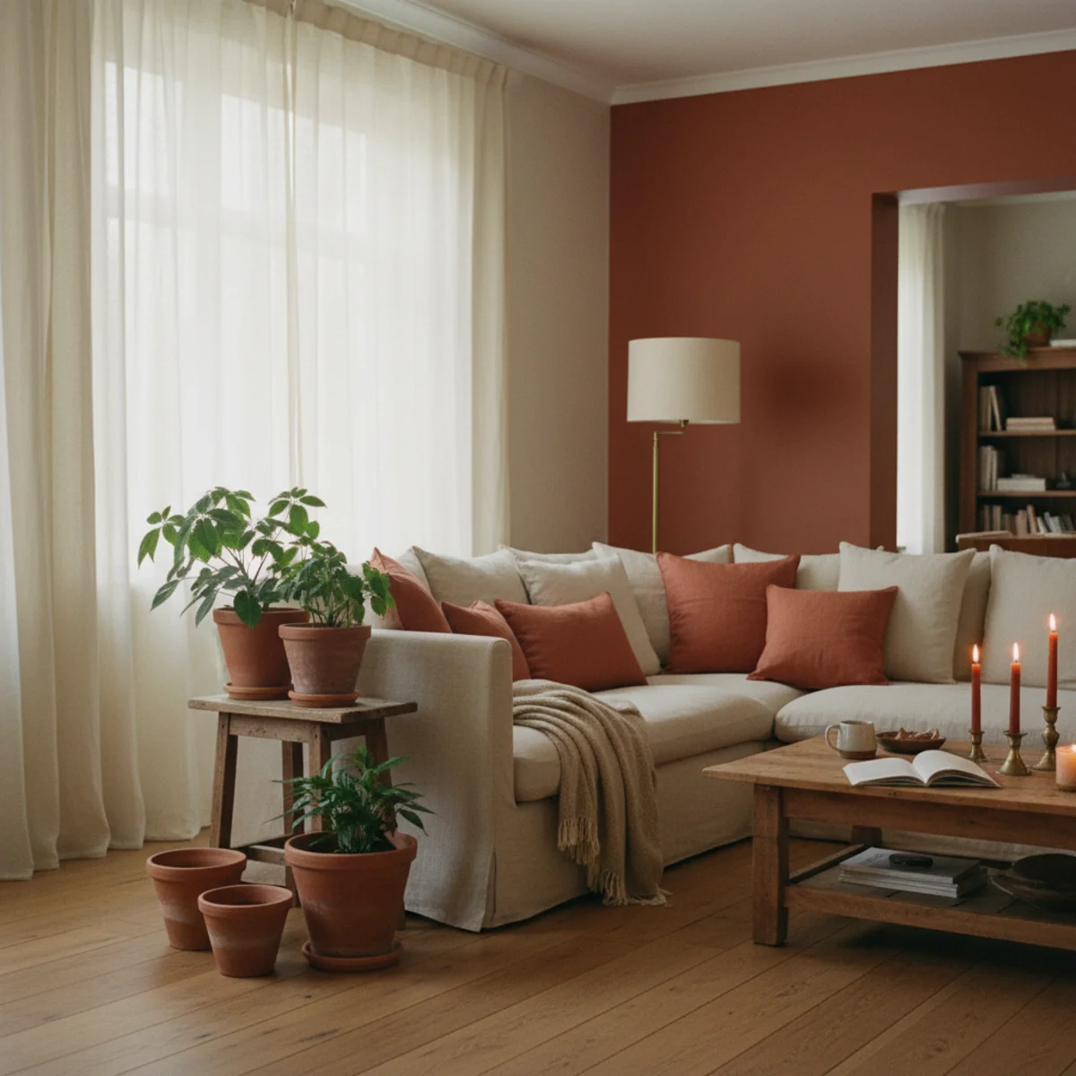
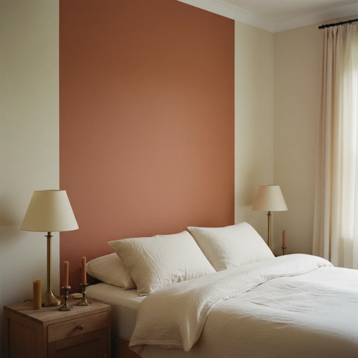
02One Terracotta Accent Wall
A single terracotta accent wall — behind the bed, behind the sofa, or at the dining room feature wall — delivers maximum terracotta warmth at minimum commitment. The accent wall reads significantly more impactful with surrounding cream or warm-white walls than full-room terracotta would. Best shades: Farrow & Ball Red Earth 64, Benjamin Moore Pottery 1297.
Terracotta accent wall specifications: SHADE — F&B RED EARTH 64 (soft muted terracotta with brown undertone, the most-versatile) at $115-130 per gallon, BM POTTERY 1297 (slightly lighter terracotta with rosy warmth) at $75-90 per gallon. ROOM SELECTION — behind the bed in bedrooms (the most-photographed wall, maximum visual impact), behind the sofa in living rooms, the dining room's primary wall (especially effective in rooms used primarily in evening where the terracotta glows against candlelight). SURROUNDING WALLS — warm cream (BM White Dove OC-17 or F&B Pointing 2003) — the contrast between terracotta and cream is what makes both read correctly. Do not pair terracotta accent wall with grey surrounding walls (cold contrast). WHAT WORKS ON THE TERRACOTTA WALL — warm-toned art (botanical prints, vintage oil paintings, warm-palette abstract), brass-framed pieces, vintage gilded mirrors (the terracotta-and-brass combination is especially strong). WHAT FIGHTS IT — cool-blue art, chrome or silver frames, cool-white gallery wall. LIGHTING — warm 2700K throughout; cool overhead light (4000K+) flattens terracotta to brown-orange without warmth. COST — $80-130 in paint for one accent wall in a standard room, one weekend of work.
AFFILIATE SLOTAPPLICATIONF&B Red Earth 64 or BM Pottery 1297; behind primary furniture on one wall; surrounding walls in warm cream; warm 2700K lightingAdd affiliate URL when configuredWhy it works
Because full-room terracotta in any room smaller than 200 square feet can feel cave-like or heavy without extensive warm lighting — the saturation requires architectural scale to breathe. One accent wall delivers the terracotta's warmth-correction effect on the primary wall (the most-viewed wall) without the other three walls' combined weight. The cream surrounding walls provide the light-reflective relief that prevents heaviness. Most homes benefit most from the accent approach; large-scale architectural spaces (restaurants, hotels, large open-plan interiors) can handle full-room terracotta.
Pro tip — Paint the terracotta accent wall one morning and assess in the afternoon and evening light before deciding whether to paint surrounding walls — the progressive test over 2-3 days reveals how the terracotta reads through the day's full light range and whether the accent is satisfying or needs to extend to additional walls.
F&B Red Earth 64 accent wall behind bed with cream surrounds — terracotta warmth concentrated where it matters most. See also: warm-paint-colors
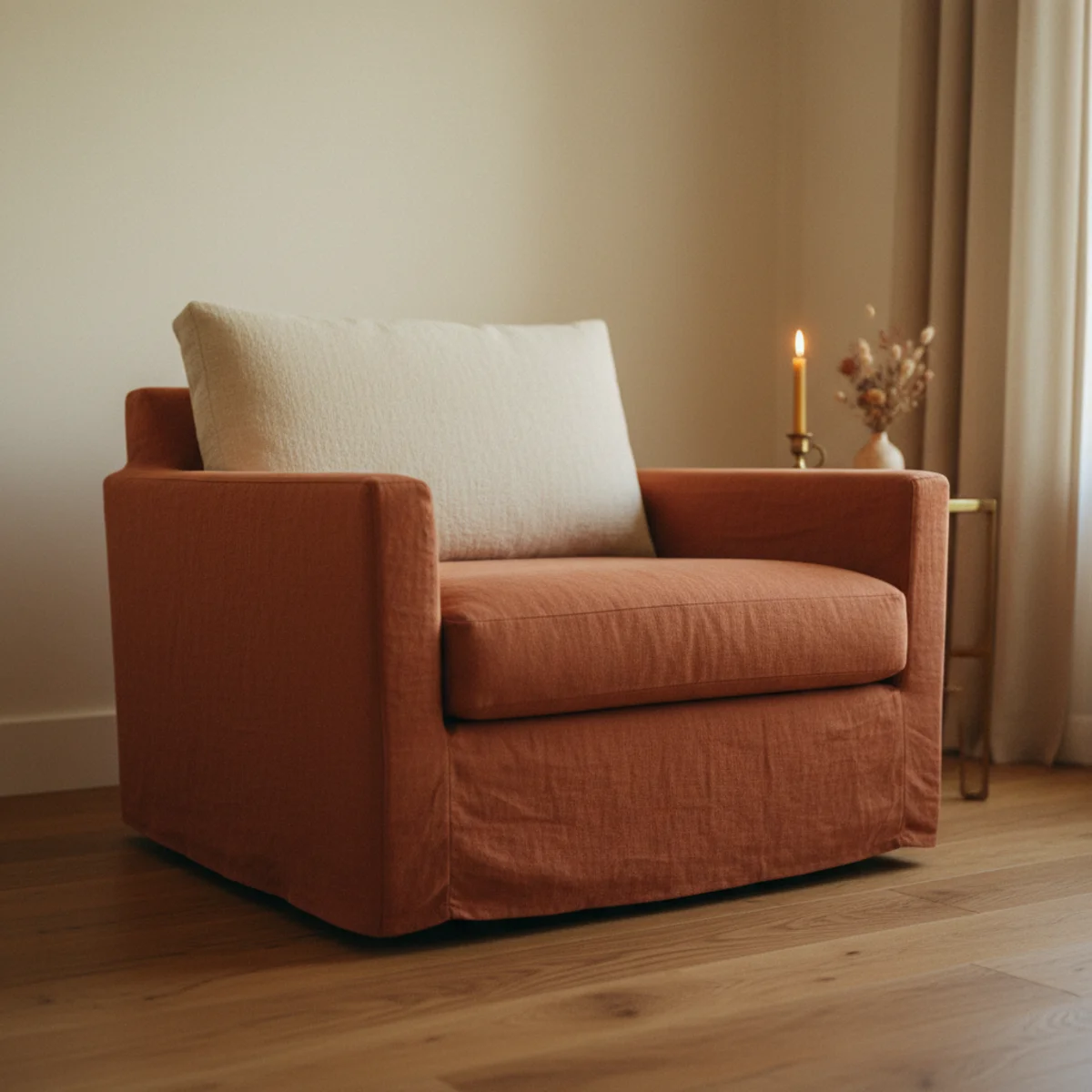
03A Terracotta Sofa or Chair
Terracotta upholstered furniture — a terracotta linen sofa, terracotta velvet armchair, or terracotta boucle accent chair — is the highest-commitment terracotta textile application and the most-visual-impact single piece. A terracotta sofa dominates the room's color register and requires careful surrounding palette discipline to support rather than fight it.
Terracotta furniture specifications: SOFA OPTIONS — ARTICLE BURRARD in terracotta linen at $1,200-1,600, WAYFAIR terracotta sectionals from various makers at $800-2,000, WEST ELM Hamilton sofa in terracotta fabric at $1,500-2,200. ACCENT CHAIR OPTIONS — terracotta velvet armchair ($300-800 from CB2, West Elm, or vintage), terracotta boucle accent chair ($400-1,000), vintage reupholstered armchair in terracotta linen or velvet ($200-600 for frame + $80-200 for fabric if DIY reupholstery). PALETTE REQUIREMENTS for terracotta sofa — cream or oat walls (NOT white which fights, NOT grey which is too cool), warm wood floors, neutral cream cushions on the sofa itself (3-4 cream cushions balancing the terracotta base), aged brass lamps and accessories. WHAT TO AVOID — pairing terracotta furniture with terracotta walls (too much same-color saturation), pairing with cool metals (chrome fights), pairing with blue or purple accent cushions (cool contrast overrides warm palette). MAINTENANCE — terracotta linen and velvet both attract dust and pet hair visibly. Washable slipcover versions are practical for households with children or pets.
AFFILIATE SLOTFURNITURETerracotta linen sofa (Article, Wayfair, West Elm at $800-2,200) or terracotta velvet/boucle chair ($300-1,000); cream cushions on topAdd affiliate URL when configuredWhy it works
Because the sofa is typically the largest single colored object in a living room — and its color dominates the room's visual register more than walls do at typical viewing distances from the primary seating position. A terracotta sofa surrounded by cream walls and warm wood reads as the room's warm heart; a grey sofa in the same setting reads as the room's visual weight without the warmth. The furniture color investment is the single most-impactful color decision in any room with significant furniture.
Pro tip — Order fabric swatches of any terracotta sofa fabric before committing to the full purchase — terracotta textiles photograph in saturated orange that looks dramatically different in real-life natural and artificial light. The swatch test in your actual room's lighting conditions prevents the color-disappointment that online sofa purchases frequently produce.
Terracotta linen sofa with cream cushions — the sofa as the room's warm heart against cream and wood. See also: cozy-living-room-ideas
04Terracotta With Moss Green
The terracotta-and-moss-green combination is the most-natural two-color warm palette — terracotta references fired earth, moss green references the foliage growing from that earth. The combination appears in Mediterranean gardens, desert landscapes, and autumn forest floors because it's literally a natural landscape palette. Best application: terracotta walls or cushions with sage or moss green textile accents.
Terracotta and moss green pairing applications: PALETTE BALANCE — terracotta as dominant warm (walls, primary textile, primary pottery) with moss green as accent (one green cushion, trailing plant, single green throw, botanical prints). Approximately 70% terracotta warm, 30% moss green. PAINT PAIRING — terracotta wall (F&B Red Earth 64 or BM Pottery 1297) with moss green textiles (sage linen cushions, F&B Cromarty 285-painted bookcase) in the same room. OR sage-green room (F&B Cromarty 285) with terracotta ceramic and textile accents. TEXTILE PAIRING — terracotta sofa with sage green lumbar cushion, OR cream sofa with both terracotta and sage cushions in the pillow arrangement. PLANT CONNECTION — living indoor plants (particularly those with bronze, copper, or warm-toned foliage) create living terracotta-and-green connection within the room. CERAMIC PAIRING — terracotta pots with green-glazed vases, or green-glazed ceramic vessels beside natural terracotta pots. HISTORICAL REFERENCE — terracotta and green appears in Provençal farmhouses, Moroccan riads, and Spanish haciendas as a regional natural palette. The combination reads as geographically warm rather than as stylistically current.
AFFILIATE SLOTPAIRINGTerracotta dominant (70%) + moss or sage green accent (30%): sage cushions, trailing plants, green-glazed ceramics, botanical printsAdd affiliate URL when configuredWhy it works
Because the two colors exist in literal complementary relationship in the natural landscape — fired clay earth is terracotta, plants growing from that earth are the green. The brain processes the combination as 'natural environment' rather than as 'designed color scheme.' The complementary relationship also works in technical color theory: warm orange-red (terracotta) and muted green occupy opposite positions in the warm color wheel, creating visual balance without clash. The combination reads as whole-and-complete in a way that neither color alone achieves.
Pro tip — Use the plant itself as the moss-green element in a terracotta-primary room — living plants in terracotta pots create the most authentic terracotta-and-green application at the lowest cost. The natural variation of plant foliage (some lighter green, some darker, some with bronze tones) also provides more interesting green variation than any single textile could.
Terracotta walls + sage cushion + living plant — the natural landscape palette of earth and foliage. See also: sage-green-decor
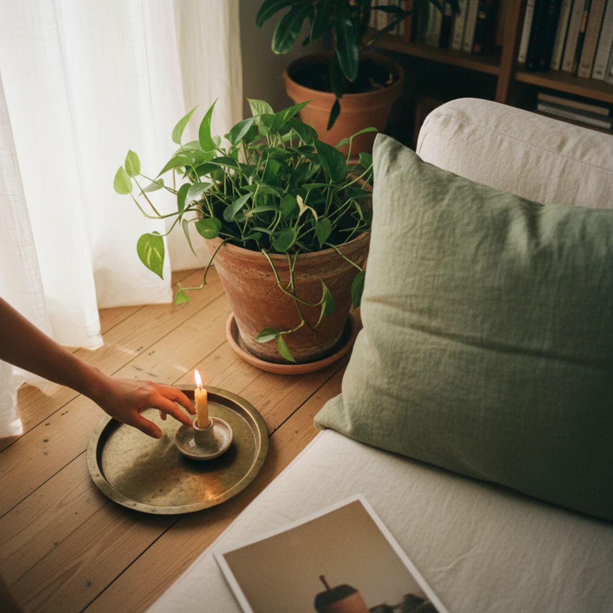
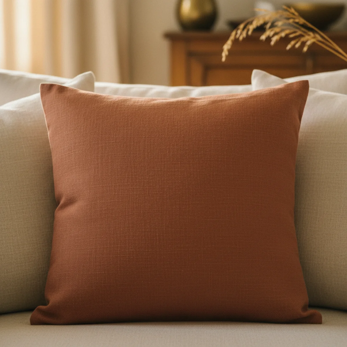
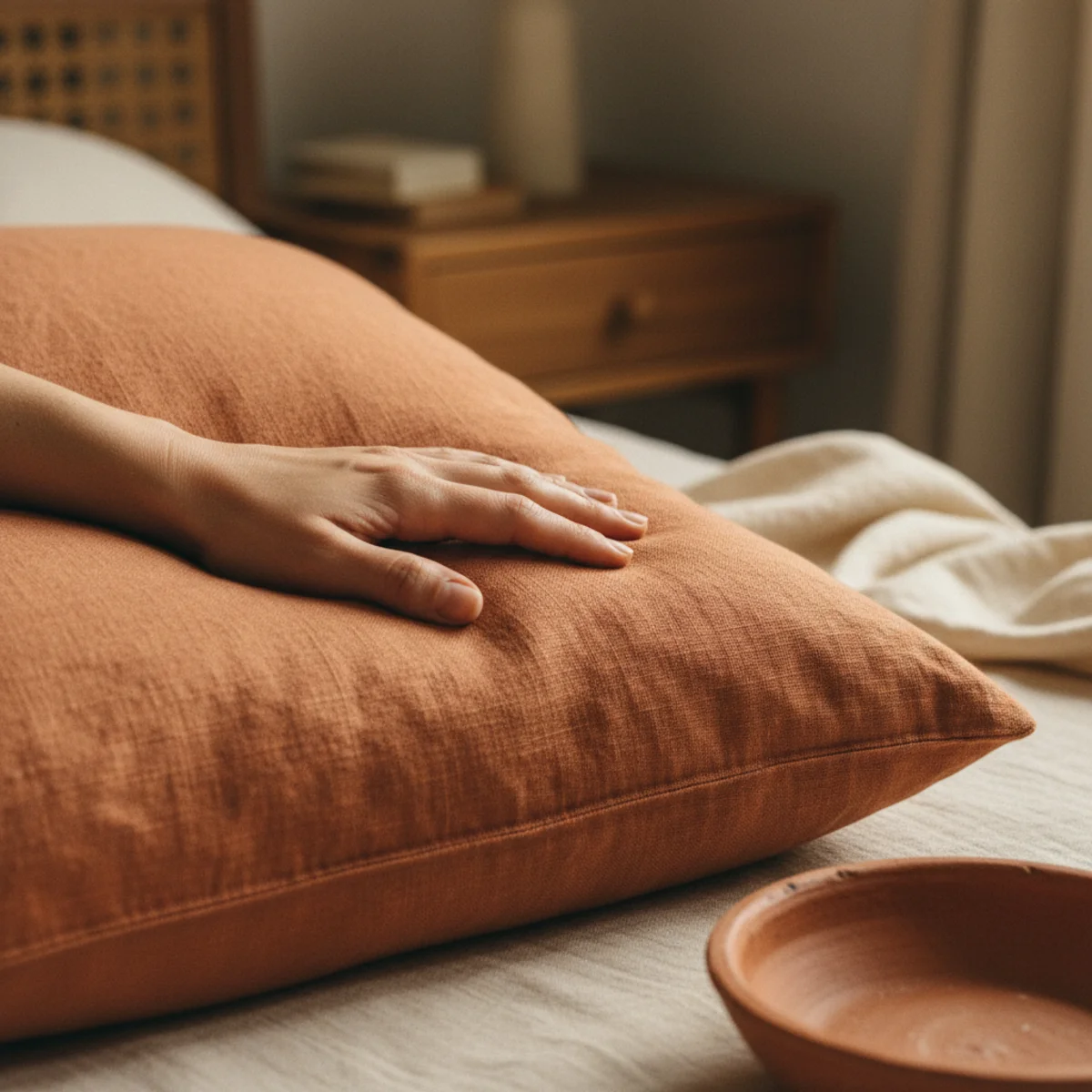
05Terracotta Cushions and Throws
Terracotta cushions and throws are the lowest-commitment, most-flexible terracotta application — add one terracotta linen cushion to a cream sofa, drape a terracotta wool throw over a reading chair. The textile accent establishes the terracotta palette without paint or permanent change. Cost: $20-80 per cushion, $60-150 per throw.
Terracotta textile accent specifications: CUSHION OPTIONS — terracotta linen cushion cover ($25-50 from Quince, Magic Linen, or Etsy artisans), terracotta velvet cushion ($30-70 from Anthropologie, CB2, or H&M HOME), terracotta boucle cushion ($40-80). THROW OPTIONS — terracotta wool or merino throw ($80-150 from Pendleton or West Elm), terracotta cotton throw ($40-80 from Brooklinen or similar). PLACEMENT PRINCIPLES — one terracotta cushion among 3-4 cream or oat cushions on a sofa (the exception-among-neutrals principle), OR one terracotta throw draped over one reading chair as the room's single warm color note. AVOID — more than 2-3 terracotta textile pieces in the same room (diminishing return; one or two is warm accent, three or more becomes dominant color that requires full palette commitment). PAIRING WITH OTHER TERRACOTTA — terracotta cushion + terracotta plant pot in the same view creates a composed terracotta accent even at small scale. The repetition reads as intentional palette rather than as single random piece. SEASONAL ROTATION — terracotta reads especially warm in autumn and winter; swap to sage or cream alternatives in summer if the palette feels seasonally heavy.
AFFILIATE SLOTTEXTILESOne terracotta linen cushion ($25-50) among cream cushions, OR terracotta wool throw ($80-150) draped over reading chair; reversible entry pointAdd affiliate URL when configuredWhy it works
Because they're fully reversible — a $30 cushion cover and a $80 throw can establish the terracotta palette in a room for $110 total, and can be swapped out in 10 minutes if the palette doesn't work. The low commitment allows household members who are uncertain about terracotta to test it for a season before investing in paint or furniture. Most households that add one terracotta cushion find it reads correctly and add more; the reversibility is what makes the trial possible.
Pro tip — Wash terracotta linen cushion covers 2-3 times before first use to develop the soft slightly-faded aesthetic that terracotta specifically benefits from — fresh-from-package terracotta linen can look slightly orange-bright, but after washing it develops the muted earthy tone that reads as genuinely terracotta rather than as merely orange.
Single terracotta cushion and draped throw among cream — the reversible entry establishing palette without commitment. See also: throw-blanket-layering
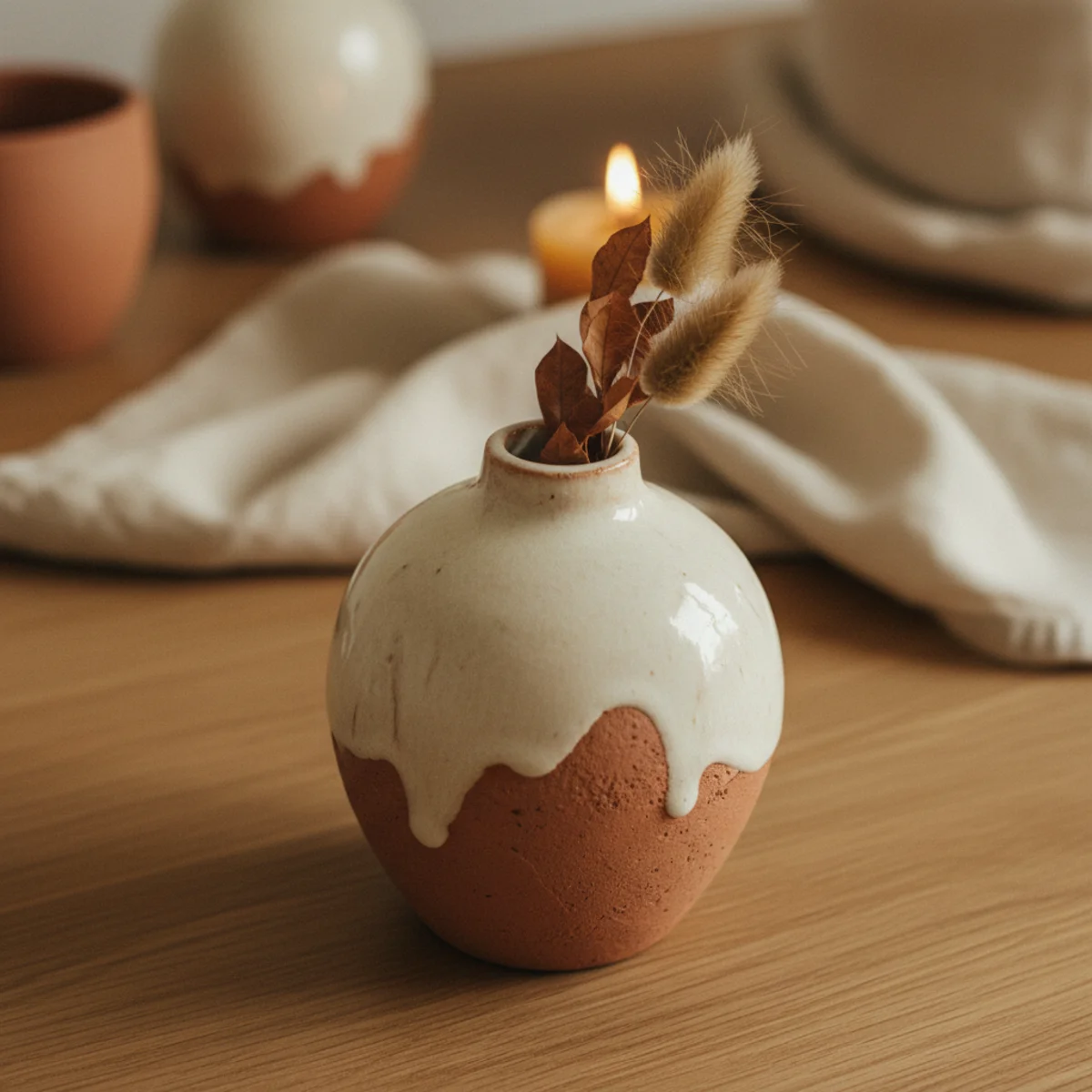
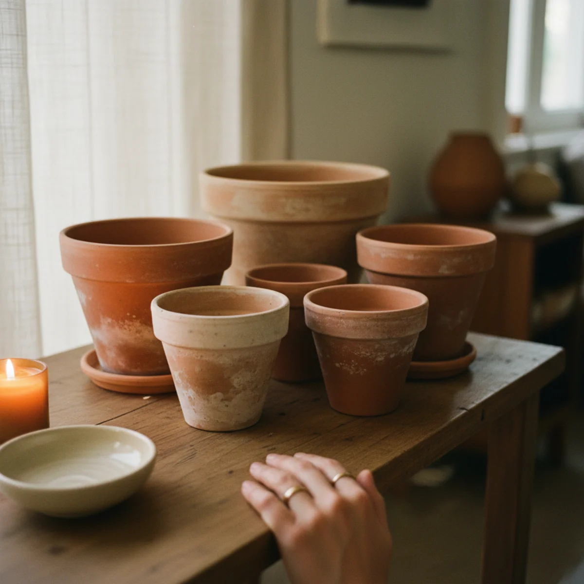
06Clay and Terracotta Pottery
Terracotta and clay pottery — unglazed terracotta pots, clay pitchers, ceramic vessels in earth tones — is the most-universal, lowest-cost terracotta application. A $5 terracotta pot from a garden center earns its place on any shelf, window sill, or plant corner. The natural material signals warm-collected character that glazed commercial alternatives cannot.
Terracotta and clay pottery applications: TERRACOTTA PLANT POTS — standard unglazed terracotta from garden centers and hardware stores at $3-25 per pot depending on size. The most-authentic terracotta material (literally fired clay, the original terracotta). Ages beautifully — develops white mineral deposits and green-grey moss at the base across months of watering. HAND-THROWN TERRACOTTA VESSELS — ceramic pitchers, vases, and bowls with terracotta-tone glaze from Etsy artisans ($20-80 each), local pottery studios ($25-100 each), or at estate sales and thrift stores ($5-30 for vintage pieces). KITCHEN TERRACOTTA — terracotta pitchers for water service ($15-40 from kitchen retailers or handmade), terracotta oil cruet ($20-60), terracotta bread baker ($40-80). MATTE GLAZED ALTERNATIVES — terracotta-colored matte-glazed ceramic vessels from Anthropologie ($25-70), West Elm ($20-60), or CB2 ($25-80) when unglazed terracotta doesn't suit the aesthetic. GROUPING — cluster of 3-5 terracotta pots of varying sizes reads as composed arrangement; single pots scattered without relationship read as incidental. GROUP POTS at the base of a floor plant, in a window corner, or on an open shelf for the composed-cluster effect.
AFFILIATE SLOTPOTTERYUnglazed terracotta pots ($3-25 from garden centers) + hand-thrown clay vessels from Etsy ($20-80) + kitchen terracotta; grouped in clustersAdd affiliate URL when configuredWhy it works
Because unglazed terracotta is literally the same material as the earth — fired clay at low temperature, porous, warm-colored, aging naturally with use and water. It's one of the oldest human-made materials (terracotta pottery dates to 7000+ BCE) and carries all of that accumulated cultural meaning as a natural material. A glazed ceramic pot represents a manufacturing process; an unglazed terracotta pot represents the earth itself. The wabi-sabi character of natural terracotta (aging, mineral deposits, slight imperfections) is exactly what cottagecore, Japandi, and warm-home aesthetics value.
Pro tip — Seal the interior of terracotta pots with a thin coat of craft sealer ($5-10) before planting directly in them — unsealed terracotta wicks moisture from soil rapidly in dry climates, requiring daily watering. Interior-sealed pots retain moisture 2-3x longer while the exterior still ages naturally. Alternatively, use a plastic liner inside the terracotta pot.
Cluster of terracotta pots with natural aging — the original warm material from the earth itself. See also: cottagecore-decor
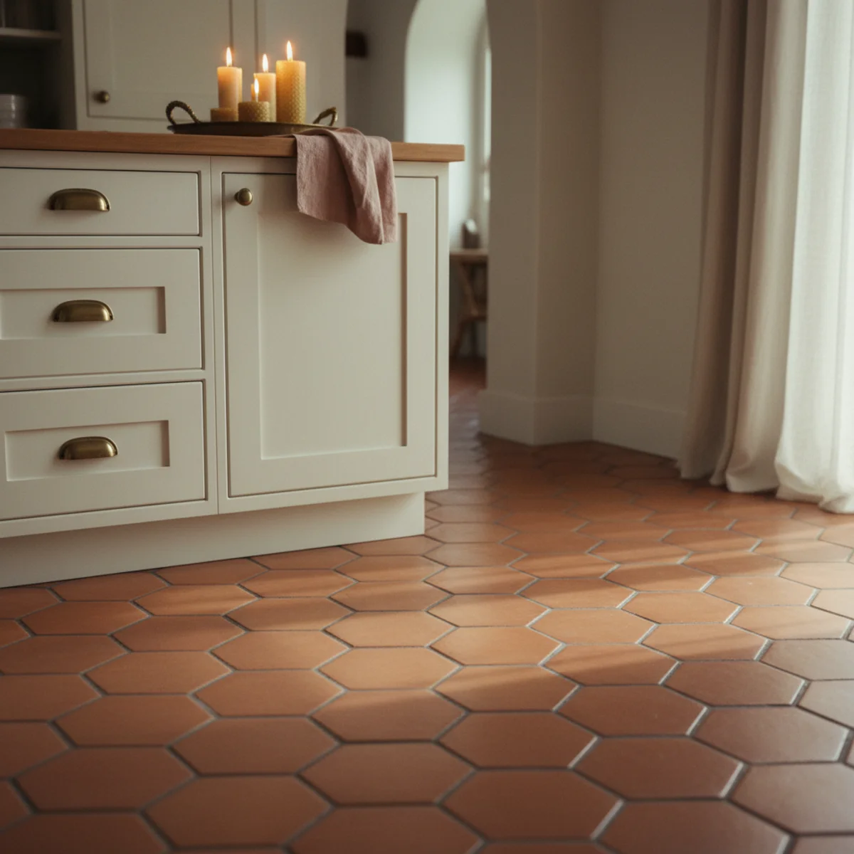
07A Terracotta Tile Floor
Terracotta tile floors — glazed or unglazed terracotta pavers, Saltillo tiles, handmade terracotta floor tiles — are the most-permanent and most-transformative terracotta application. A terracotta tile floor establishes the entire room's warm palette from the ground up; every other element in the room reads against the terracotta base. Cost: $3-15 per square foot for standard terracotta tile, $15-40 for handmade or Saltillo.
Terracotta floor tile specifications: UNGLAZED SALTILLO TILE — Mexican handmade tiles with irregular surface and warm terracotta color ($4-10 per sq ft, installation $6-15 per sq ft). Ages beautifully with proper sealing. Available in 12x12, 16x16, and 12x18-inch sizes. GLAZED TERRACOTTA TILE — terracotta-colored glazed ceramic tile with more consistent surface ($3-8 per sq ft, installation $5-12 per sq ft). More durable and water resistant than unglazed. HANDMADE TERRACOTTA PAVERS — individual handmade tiles with visible maker marks, slight size variation, and authentic terracotta character ($15-40 per sq ft from specialty importers). The most-authentic but most-expensive option. SEALING REQUIREMENT — all unglazed terracotta tile requires sealing before use and re-sealing annually. Penetrating sealer ($15-30 per quart, covers 100+ sq ft) protects from stains while preserving the natural porous character. ROOM APPLICATIONS — kitchens (the Mediterranean-farmhouse kitchen floor), bathrooms, entryways, sunrooms, covered patios. WHAT GOES WITH TERRACOTTA TILE — cream or warm white walls and cabinetry (the tile is the color; walls stay neutral), aged brass or bronze hardware and fixtures, warm wood furniture, plants in terracotta pots. AVOID — cool grey walls or cabinetry with terracotta tile (the cold-warm contrast is jarring), chrome fixtures.
AFFILIATE SLOTFLOORINGSaltillo tile ($4-10/sq ft), glazed terracotta ($3-8/sq ft), or handmade terracotta pavers ($15-40/sq ft); seal annually; cream walls aboveAdd affiliate URL when configuredWhy it works
Because floor color is seen at a low angle from standing position and spreads across the entire room's base plane — it's visually larger than any wall at typical viewing angles, and its warm-earth pigment reflects warm tones upward into the room regardless of other color choices. White or grey tile floors reflect cool light upward; terracotta floors reflect warm light upward, which means every element above the floor (walls, furniture, people) reads in warm ambient light rather than cool ambient light. The floor color is the foundational lighting instrument in the room.
Pro tip — Sample terracotta tile in the actual room before purchasing full quantity — tile showroom lighting (typically cool white commercial) makes terracotta look much more orange than it will appear in your home's warm 2700K lighting. Bring 2-3 sample tiles home and place on the floor under your actual lighting for 2-3 days before ordering the full project quantity.
Saltillo floor with cream cabinets and brass hardware — terracotta from the ground up warming everything above it. See also: cozy-kitchen-ideas
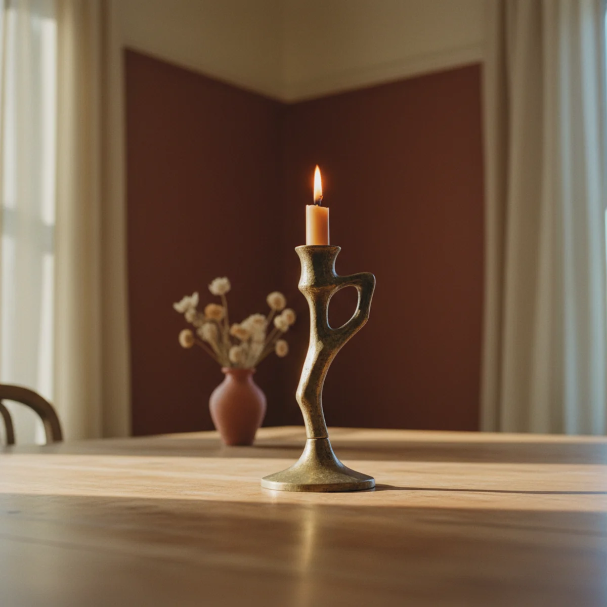
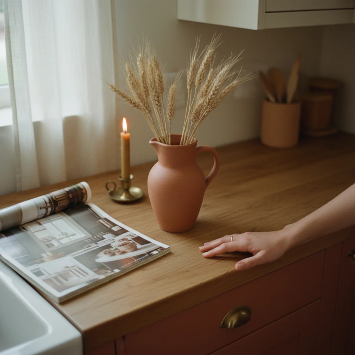
08Terracotta With Brass
Terracotta and aged brass is the signature warm palette pairing — the warm orange-brown of terracotta and the oxidized gold of aged brass are both warm earth tones that reinforce each other rather than competing. The combination appears in traditional Mediterranean, Middle Eastern, and Southwestern interiors where both materials are native. Every terracotta room benefits from brass hardware, brass lamps, or brass candlesticks.
Terracotta and brass pairing applications: LAMP BASES in aged brass on terracotta or near-terracotta walls — vintage brass table lamps $20-80 thrifted, $80-200 retail. CANDLESTICKS in aged brass on mantel, dining table, or open shelving — vintage brass cluster per candle-styling principles at $5-30 per candlestick from estate sales. KITCHEN HARDWARE on terracotta-adjacent cabinets or drawers — aged brass knobs and pulls at $4-15 per piece from Rejuvenation, House of Antique Hardware, or Schoolhouse. PICTURE FRAMES in aged brass or gilded brass around art on terracotta walls. SMALL BRASS OBJECTS — brass bookends, brass trays, brass bowls, small brass animals as shelf objects in terracotta-palette rooms. BRASS TYPE — always aged, unlacquered, or antique brass. Bright polished brass and chrome fight terracotta; aged brass deepens it. THE PAIRING PRINCIPLE — both terracotta and aged brass are oxidized warm earth tones. Terracotta is oxidized iron clay; brass is oxidized copper-zinc alloy. Both materials carry the same warm-earth character from different material traditions.
AFFILIATE SLOTPAIRINGAged or unlacquered brass lamps, candlesticks, hardware, frames, and small objects in terracotta rooms — NOT bright polished or chromeAdd affiliate URL when configuredWhy it works
Because aged brass adds depth to the terracotta palette without adding saturation — the warm gold tones in aged brass pull the terracotta's warm-brown character forward while the brass's slight darkness counterbalances the terracotta's brightness. The combination reads as 'warm-collected depth' rather than as 'orange room.' The material contrast (matte clay versus metallic patina) also adds visual texture that single-material terracotta rooms lack. Every terracotta application improves with the addition of aged brass somewhere in the same visual field.
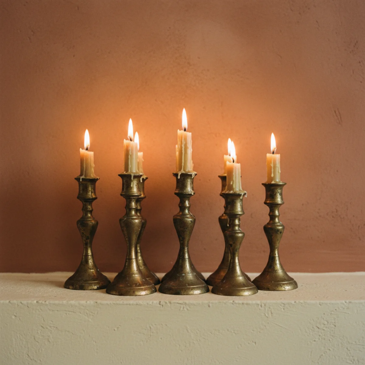
Pro tip — If you don't have aged brass accessories already, start with vintage brass candlesticks from one estate sale visit — 3-5 vintage brass candlesticks at $5-20 each provide an immediate terracotta-and-brass vignette on any shelf or mantel for under $60 total. The candlestick cluster is the fastest terracotta-and-brass implementation.
Terracotta wall with brass lamp, frame, and candlesticks — oxidized earth tones deepening each other. See also: candle-styling
09A Muted Rust for Deeper Rooms
For rooms wanting deeper terracotta commitment — libraries, dining rooms, bedrooms used primarily in evening — muted rust and brick red variants of terracotta produce cocoon warmth similar to deep charcoal but with earth-pigment warmth. Best shades: Farrow & Ball Eating Room Red 59, Benjamin Moore Caliente AF-290, Sherwin Williams Rustic Red SW 7593.
Muted rust paint specifications: FARROW & BALL EATING ROOM RED 59 — deep warm rust with brown undertone, the classic F&B dramatic-room color at $115-130 per gallon. BENJAMIN MOORE CALIENTE AF-290 — saturated rust with subtle brown character at $75-90 per gallon. SHERWIN WILLIAMS RUSTIC RED SW 7593 — deep brick-rust with warm brown undertone at $80-95 per gallon. ROOM APPLICATIONS — dining rooms used in evening (the deep rust reads especially warm under candlelight, per cozy-tablescape principles), bedrooms wanting warm cocoon (different from grey-charcoal cocoon; rust-cocoon reads more earth-warm), home libraries and studies where warm character supports focused work, powder rooms for dramatic small-space statement. LIGHTING REQUIREMENT — more demanding than lighter terracotta applications. Minimum 5-7 warm light sources at 2700K per room; deep rust under cool light reads as dried blood rather than as warm earth. CONTRAST — cream or warm white trim and ceiling (strong contrast adds drama and lifts the room). PAIRED MATERIALS — antique and aged brass throughout, warm walnut or mahogany furniture, vintage gilded mirrors, candlelight as primary evening light source.
AFFILIATE SLOTAPPLICATIONF&B Eating Room Red 59, BM Caliente AF-290, or SW Rustic Red SW 7593 for dining rooms, libraries, bedrooms; strong cream trim; 5-7 warm sourcesAdd affiliate URL when configuredWhy it works
Because the depth of color absorbs light and creates the cocoon effect that dining rooms and libraries benefit from — but with the warm-earth-pigment character that cooler dark colors (charcoal, navy) lack. A deep rust dining room under candlelight reads as a warm cave around the table; the same room in charcoal under candlelight reads as dramatic but colder. The warm earth pigment of rust specifically benefits from the warm candlelight's orange-toned light in a way that cool dark colors don't — the candlelight and the wall color enhance each other rather than fighting.
Pro tip — Paint muted rust rooms during daylight and assess in the evening with candlelight before deciding whether the depth is right — muted rust reads dramatically different in daytime (can look heavy or overwhelming) versus evening candlelight (can read as perfect warm cocoon). The evening-candlelight assessment is the one that matters for rooms used primarily in evening.
F&B Eating Room Red 59 with cream trim and brass — warm cocoon for rooms used primarily in evening. See also: warm-paint-colors
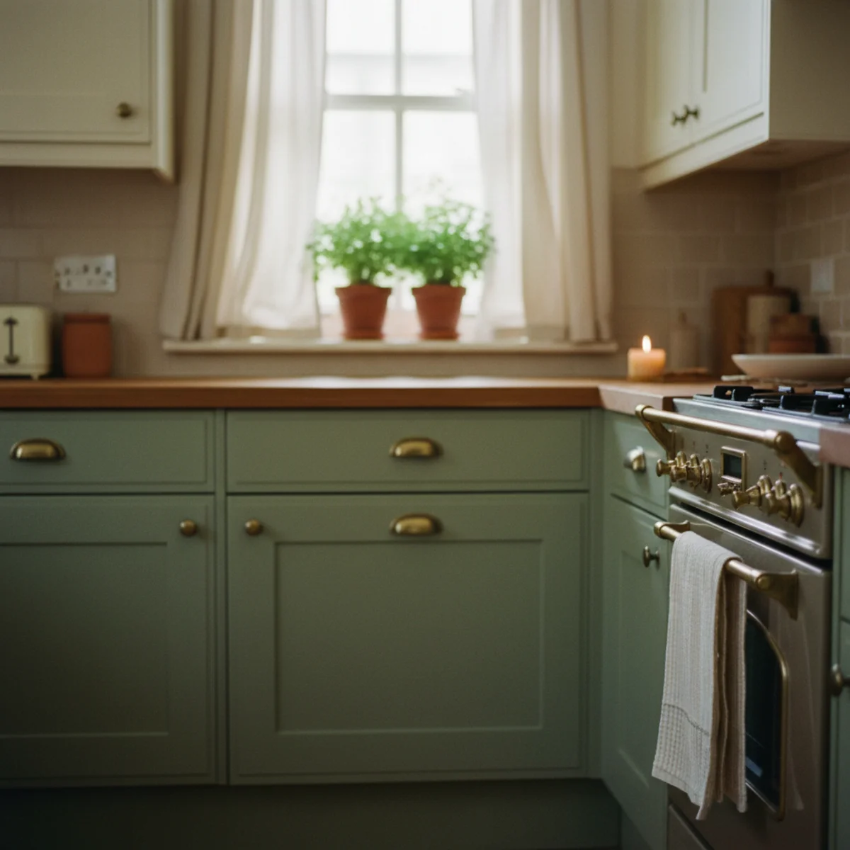
10Terracotta in the Kitchen
Terracotta in the kitchen works across multiple scales — terracotta floor tile (per item 7), terracotta-painted lower cabinets (complementing cream upper cabinets), terracotta pottery and ceramics on open shelving, or even terracotta-toned linens and accessories. The kitchen is the room where terracotta's connection to food, earth, and warmth reads most naturally.
Kitchen terracotta applications: TERRACOTTA TILE FLOOR — Saltillo or glazed terracotta tile (per item 7 above). TERRACOTTA LOWER CABINETS — BM Pottery 1297 or F&B Red Earth 64 on lower cabinets with cream (BM White Dove OC-17) upper cabinets, aged brass hardware. The terracotta-and-cream two-tone kitchen is the classic warm farmhouse kitchen configuration. OPEN SHELVING WITH TERRACOTTA CERAMICS — white ironstone and terracotta pottery mixed on open shelves (per cottagecore-decor open shelving principles), terracotta bean pots and pitchers displayed on working shelves. KITCHEN ACCESSORIES IN TERRACOTTA — terracotta salt pig for counter storage ($15-40), terracotta olive oil pitcher ($20-60), terracotta herb planters on windowsill ($5-15 each). KITCHEN LINENS in terracotta — terracotta dish towels ($8-20 each from specialty kitchen retailers), terracotta apron ($25-60). LIGHT OVER THE KITCHEN — terracotta floors and cabinets especially require warm 2700K overhead in kitchens (where tasks lighting must also function). Pendant lights in aged brass or warm ceramic at 2700K produce both task illumination and warm palette support.
AFFILIATE SLOTAPPLICATIONTerracotta tile floor + terracotta lower cabinets with cream upper + terracotta ceramics on shelving + kitchen accessories in terracottaAdd affiliate URL when configuredWhy it works
Because the kitchen is the room most directly connected to food, fire, and earth — all of which terracotta naturally references. Terracotta cooking vessels have been used in kitchens since the earliest recorded history; the material appears in traditional kitchens across the Mediterranean, Middle East, Mexico, and Asia. The kitchen is also where the earthy warmth of terracotta's agricultural associations (fired clay, earthenware, harvest) reads most coherently. Terracotta in a kitchen reads as traditional and functional; terracotta in an office or bathroom requires more intentional application.
Pro tip — Start with a terracotta pitcher or ceramic pot on the kitchen windowsill before investing in cabinet painting or tile work — the single terracotta object beside the kitchen window establishes the palette at $10-30 cost and reveals how terracotta reads in your kitchen's specific light before any larger commitment.
Saltillo floor, terracotta lower cabinets, cream uppers, brass hardware — the warm farmhouse kitchen palette. See also: cozy-kitchen-ideas
11A Terracotta-Washed Wall
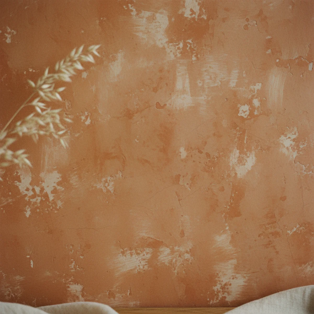
A terracotta color-washed wall (applying diluted terracotta paint in thin layers over a cream or white base to produce a soft mottled aged-plaster effect) creates more warmth and character than solid terracotta paint at the same color density. The color wash technique produces visible variation — deeper color in recesses, lighter over raised plaster — that reads as authentic aged Mediterranean wall rather than as applied paint.
Terracotta wall wash technique: MATERIALS — terracotta paint (BM Pottery 1297 or similar), white or cream base already on the wall (or applied first), wide 4-inch brush or sea sponge or cloth, water for diluting paint. PAINT MIXTURE — 1 part terracotta paint to 3-4 parts water for first wash, 1 part to 2 parts water for second wash if more depth desired. TECHNIQUE — dip brush or sponge in diluted paint, remove excess, apply in broad overlapping sweeping strokes across the wall, working in 2x2 foot sections. The irregular application is intentional — you want variation, not even coverage. Work wet edges into previous sections to prevent hard lines. Let dry 2 hours. Apply second wash for more depth, maintaining the irregular overlapping technique. ALTERNATIVE TECHNIQUE — apply with crumpled-up plastic bag or bunched rag for different texture effect. SEALING — apply a matte clear sealer ($15-30 per quart) after the final wash for durability. RESULT — varied terracotta coverage over cream base, reading as aged plaster or limewash rather than as painted wall. Lighter areas visible through the wash. MORE NATURAL ALTERNATIVE — actual limewash paint (Portola or Glimmer paint at $35-55 per quart) applied in terracotta tone produces the closest-to-authentic Mediterranean plaster wall effect with minimal technique required.
AFFILIATE SLOTTECHNIQUEDiluted terracotta paint (1:3-4 ratio) applied in irregular overlapping sweeps over cream base; or actual limewash paint in terracotta from PortolaAdd affiliate URL when configuredWhy it works
Because actual aged Mediterranean plaster walls are not uniform — they have color variation from hand-application, slight texture from the plaster substrate showing through, lighter areas over raised sections, deeper tones in recesses. Solid terracotta paint produces uniform coverage that reads as commercial painted wall; color-washed terracotta produces the variation that reads as authentically-aged material. The technique adds 2-3 hours of work but produces a fundamentally different (and more valuable-looking) result.
Pro tip — Test the color-wash technique on a large piece of cardboard or drywall offcut before applying to the actual wall — the technique looks different in practice than in description, and the test reveals whether your dilution ratio, brush technique, and resulting variation reads correctly before committing to the wall.
Terracotta color-washed wall with visible variation — aged plaster character that solid paint cannot produce. See also: best-paint-for-warm-home
12Terracotta as the Whole-Home Thread
Terracotta works as a whole-home connecting thread — not every room in full terracotta, but terracotta appearing in every room at some scale (a plant pot in the bathroom, a cushion in the bedroom, the floor tile in the kitchen, painted lower cabinets in one room) creating visual continuity throughout the home. The repeated material at varied scales reads as unified palette throughout the house.
Whole-home terracotta thread implementation: KITCHEN — terracotta tile floor or terracotta lower cabinets (primary terracotta statement in the kitchen). LIVING ROOM — one terracotta accent wall OR one terracotta cushion among cream cushions + terracotta pottery + terracotta-glazed ceramics on shelving. DINING ROOM — terracotta-adjacent wall color (deep rust or terracotta) OR terracotta ceramics in table styling + terracotta linen napkins. BEDROOM — terracotta linen bedding accent (terracotta duvet or pillowcases) + terracotta plant pots + terracotta lamp or small brass lamp nearby. BATHROOM — terracotta tile (even small floor or accent tile), or terracotta pottery beside sink, or terracotta-adjacent wall color. ENTRYWAY — terracotta tile floor OR terracotta-painted console table OR terracotta accent wall. THE THREAD PRINCIPLE — each room's terracotta element should be a different scale from adjacent rooms' versions. The kitchen has terracotta tile (floor-scale), the living room has one terracotta cushion (object-scale), the bedroom has terracotta linen (textile-scale). The varied scales prevent the thread from becoming overwhelming repetition while maintaining visual continuity. RESULT — walking through the house, the terracotta thread connects all spaces into a unified warm palette without any single room being dominated by it.
AFFILIATE SLOTSTRATEGYVaried terracotta scale across all rooms: tile in kitchen, accent wall in living room, linen in bedroom, pottery in bathroom, entryway console or tileAdd affiliate URL when configuredWhy it works
Because homes are experienced as continuous sequences of connected spaces — walking from kitchen to living room to bedroom, the eye registers continuity or discontinuity between rooms. Isolated terracotta rooms (terracotta kitchen, then completely different palette in the living room) read as separate apartments within the same house; terracotta thread throughout reads as unified home with consistent warm character. The visual continuity also makes the total terracotta presence feel more substantial than it is — a little terracotta in each room adds up to significant whole-home warmth.
Pro tip — Map the whole-home terracotta thread on paper before starting — note which rooms get which scale of terracotta (floor tile, wall paint, textile, pottery) and confirm the variation principle (no two adjacent rooms with the same scale of terracotta application). The planning prevents both overwhelming repetition and accidental over-commitment to one room.
Terracotta at varied scales across rooms — floor tile, cushion, bedding, pottery creating whole-home visual continuity. See also: warm-minimalism
How to build a terracotta palette step by step
Decide accent or envelope first, then build the supporting palette around it.
- 1Choose accent or whole-room
Decide whether terracotta is a punctuation (cushions, vases, one wall) or the envelope (a sofa, full walls). This sets the whole approach.
- 2Set the neutral base
Build the supporting palette in cream, oat, and oak — warm neutrals that let terracotta glow rather than compete.
- 3Add one complementary accent
Introduce a muted moss or olive green as the contrast. Keep it muted so the pairing reads earthy, not kitsch.
- 4Repeat the terracotta once or twice
Echo the color across the room — a cushion, a vase, a frame — so it reads intentional rather than placed once and forgotten.
Quick tips
- Pair terracotta with cream, oat, and oak rather than cool grays or stark white.
- Add one muted moss or olive accent for earthy complementary contrast; keep both muted.
- Use brass, not chrome, with terracotta — warm metal deepens the glow.
- Repeat the terracotta two or three times around a room so it reads intentional.
- Choose deeper, browner rust-terracotta for rooms used mostly at night.
- Limewash suits terracotta especially well; the mottled finish mimics real clay.
Terracotta for different uses
Cushions, throws, pottery, and one repeated frame or vase among warm neutrals — the lowest-risk start.
Terracotta walls or a terracotta sofa, with the rest of the room kept cream and oak so it glows.
Terracotta lower cabinets or a tiled backsplash with oak shelving and brass hardware.
A deeper rust-terracotta in dining rooms and studies, where it glows under lamplight.
Terracotta is the saturated moment a warm-neutral room needs — one clay accent and the whole space lifts.
Frequently asked questions
How do I use terracotta in home decor?+
What colors go well with terracotta?+
What's the best terracotta paint color?+
Is terracotta a good color for a bedroom?+
How is terracotta different from orange or rust?+
Does terracotta work in small rooms?+
Terracotta is the warm accent that lifts a whole neutral room, whether you use it as a single cushion or a full envelope. Decide accent or whole-room first, build the supporting palette in cream and oak, and add one muted green for contrast. We'd start with a single terracotta velvet cushion against oat linen — it's the lowest-risk way in, and if it glows the way terracotta tends to, the wall and the pottery will follow on their own.