These eight paint recommendations are organized by room and light condition — what works in a north-facing living room won't work in a south-facing bedroom. Each color names the exact paint codes from Benjamin Moore, Farrow & Ball, and Sherwin-Williams that consistently deliver warmth across light conditions, with notes on which rooms and orientations they're suited to. Every color was tested in real homes, not just on paint chips.
Paint behaves differently in every room based on natural light, artificial light, and what's reflecting off the surrounding floor and ceiling. The same Benjamin Moore color can read warm cream in one room and cool gray in the next, which is why test swatches matter more than catalog photos. The recommendations below tell you not just which paint to buy but where it will and won't work.
By the end of this guide, you'll know exactly which warm white to choose for living spaces, which clay tone rescues north-facing rooms, the brown-leaning greige that ties together open floor plans, and the deep cocoon colors that work in studies and bedrooms.
WHAT'S INSIDE
- Three warm whites (BM, F&B, SW) that never read blue under 2700K lighting
- The single clay tone that fixes north-facing rooms most other paints can't warm up
- Why warm charcoal makes small rooms feel larger, not smaller
- The plaster pink shade that's quietly become the bedroom paint of 2026
There's no universally best white. There's only the right white for your light, and you only know it once it's on the wall.
— Architectural Digest [citation needed — verify before publish]
What makes paint read as warm?
Warm paint has yellow, red, or brown undertones, which is what makes a room feel enveloping rather than cool and clinical. Warm whites read as cream or oat; warm neutrals lean greige rather than true gray; and saturated warm colors run toward clay, terracotta, and earthy green. The opposite — blue and gray undertones — reads cool no matter how light the color.
The catch is that undertones only fully reveal themselves in your room's light. Farrow & Ball's Setting Plaster works in north-facing rooms precisely because its warm clay undertone counteracts cool north light, but it reads pinker in bright south light. This is why there's no single best warm paint — only the right one for your exposure, which you confirm by testing a large swatch at different times of day.
More in Color Stories you may love
See allWhy the warm-paint question matters in 2026
The cold gray-and-white palette of the 2010s gave way to a hard swing toward warmth, and 'what's the best paint for a warm home' became one of the most-asked questions in decorating. The major brands responded with whole warm-leaning collections, and Pinterest's warm paint and warm white searches climb every year.
People keep asking because the honest answer resists a one-line reply. There's no universal best warm white — Pointing, Setting Plaster, a warm greige, and a clay all work in different rooms and lights. The reliable advice is about method: choose a warm undertone, test it large, watch it at 4pm, and match your trim. Get the process right and almost any warm color works.
8 reliable warm paints and where they work
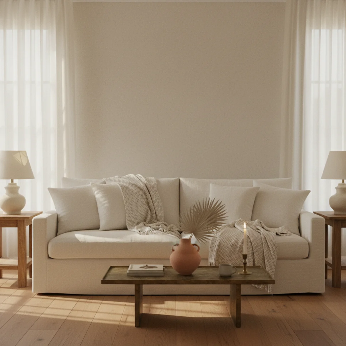
01A Warm Off-White for Living Spaces
The foundation of any warm home is a reliably warm off-white in the main living spaces — living room, hallway, open kitchen-dining combos. The three reliably warm off-whites that work across most light conditions: Benjamin Moore White Dove OC-17, Farrow & Ball Pointing 2003, and Sherwin-Williams Alabaster SW7008. All three have documented yellow undertones (never blue or gray), and all three pair beautifully with warm wood and 2700K lighting without fighting either.
Benjamin Moore White Dove OC-17 (LRV 85.38): the most versatile, slight warm yellow undertone, works in most rooms. Farrow & Ball Pointing 2003 (LRV 85): warmest of the three, best for north-facing rooms or rooms with cool natural light. Sherwin-Williams Alabaster SW7008 (LRV 82): slightly creamier, best for rooms with lots of natural light that needs softening. All three work with 2700K lighting and natural wood. Test all three with 12x12-inch swatches on multiple walls before committing — undertones reveal themselves only at scale.
AFFILIATE SLOTPAINTBM White Dove OC-17, F&B Pointing 2003, or SW Alabaster SW7008Add affiliate URL when configuredWhy it works
Because all three have documented yellow undertones (never blue, gray, or green), and all three test consistently warm across various light conditions in real homes. Whites like Decorator's White, Chantilly Lace, and Snowfall White read cool under 2700K bulbs because their undertones lean blue or gray — but their names don't tell you that. The three above are the safe defaults; you can deviate from them with reason, but starting here avoids the most common warm-home paint mistakes.
Pro tip — Order 12-by-12-inch peel-and-stick swatches from Samplize ($5 each) for all three before committing — never test paint on a small paint-chip card; the undertones don't read at small scale. Apply each swatch on a different wall and view at three times of day before deciding which works in your specific room.
BM White Dove on the walls, 2700K lamps on at dusk — the warm off-white that works in 90% of living rooms. See also: 12x12-inch swatches
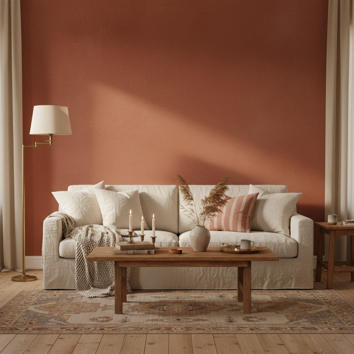
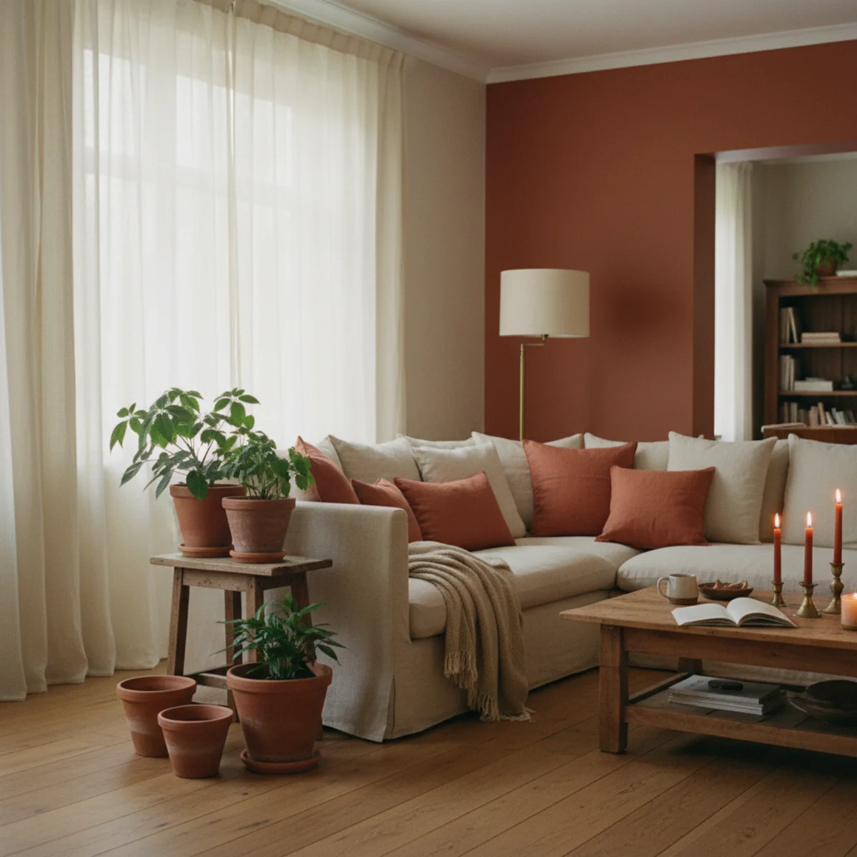
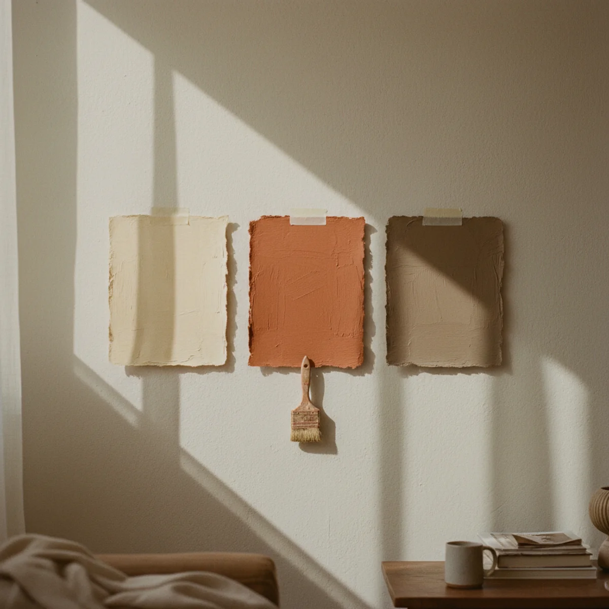
02Clay for North-Facing Rooms That Won't Warm Up
North-facing rooms have a quiet challenge that no off-white can solve: the natural light is cooler and bluer than south-facing light, so even the warmest off-white tends to read slightly gray. The fix is a clay-toned paint with stronger pink, orange, or red undertones — Farrow & Ball Setting Plaster 231, Benjamin Moore Cinnamon Slate, or Backdrop's Adobe Lawn. These pull warmth from the bluer northern light and turn it warm instead of fighting it.
Best picks: Farrow & Ball Setting Plaster 231 (LRV 56, soft pink-clay with strong warm undertones), Benjamin Moore Cinnamon Slate AF-575 (LRV 30, deeper terracotta-brown), Backdrop Adobe Lawn (warm dusty clay tone). Apply to the main wall surface and pair with off-white trim in the warmest cream (F&B Pointing) for contrast. These colors work best on at least one full wall, not just an accent — small clay patches read as confused color choices, but full clay walls read as a deliberate warm-light correction. Test in your actual room before committing; clay tones shift considerably between light conditions.
AFFILIATE SLOTPAINTF&B Setting Plaster 231, BM Cinnamon Slate, or Backdrop Adobe LawnAdd affiliate URL when configuredWhy it works
Because clay tones contain enough warm pigment (red, orange, pink, yellow) to compensate for the cool blue cast of northern light. A clay wall in north light reads warm and soft; the same wall in south light reads even warmer (almost terracotta). Off-whites in north light have too little warm pigment to overcome the blue cast, so they read gray. The clay color is the only family of paints that reliably warms north-facing rooms without fighting them.
Pro tip — Look at your north-facing room in late afternoon when the light is at its bluest — that's when paint colors reveal their true tendency. If your candidate off-white looks even slightly cool at 4pm, switch to a clay tone. Northern light at 4pm is the toughest test for any warm paint; passing it means the room will read warm all day.
Setting Plaster clay on a north-facing wall — the only color family that beats cool northern light. See also: F&B Pointing
03A Brown-Leaning Greige to Tie Open Floor Plans Together
Open floor plans need one continuous wall color that works across living, dining, and kitchen zones without becoming monotonous. The answer in 2026 warm-home design is a brown-leaning greige — warmer than traditional cool greiges, more architectural than cream. Benjamin Moore Edgecomb Gray HC-173, Sherwin-Williams Accessible Beige SW7036, and Farrow & Ball Skimming Stone 241 all deliver. The undertones lean warm brown rather than warm gray, which makes the difference.
Benjamin Moore Edgecomb Gray HC-173 (LRV 63): warmest of the three, slightly creamy. Sherwin-Williams Accessible Beige SW7036 (LRV 58): mid-range, neutral enough to pair with any wood. Farrow & Ball Skimming Stone 241 (LRV 64): softest, almost translucent, beautiful in older homes. All work in open floor plans because the warm brown undertone reads as a thermal anchor across multiple zones — the kitchen, dining, and living all read connected without using starkly different paints. Pair with off-white trim in BM White Dove for contrast.
AFFILIATE SLOTPAINTBM Edgecomb Gray HC-173, SW Accessible Beige SW7036, or F&B Skimming Stone 241Add affiliate URL when configuredWhy it works
Because cool grays in open floor plans read clinical across long sight lines — the room becomes hospital corridor rather than warm home. Brown-leaning greiges keep the visual continuity (one color across the whole space) while reading as warm clay or sun-bleached stone rather than office paint. The thermal anchor of brown undertones is what makes these greiges work in cozy homes; traditional cool greiges fight the warm aesthetic at every turn.
Pro tip — If your open floor plan has both south-facing and north-facing exposures (rare but possible), test the greige in both extremes — the warmest greige reads about the same in both, where a cooler greige can shift from warm in south light to cold in north light within the same continuous wall. Edgecomb Gray and Skimming Stone are most consistent across mixed light.
One warm greige across living, dining, and kitchen — visual continuity without the chill of cool gray. See also: BM White Dove
04Muted Sage for a Calm Quiet Room
For bedrooms, guest rooms, and small reading rooms that need to read quiet without being cold, a muted sage green delivers the calmest result of any color family. Farrow & Ball Mizzle 266, Benjamin Moore Saybrook Sage HC-114, and Sherwin-Williams Evergreen Fog SW9130 are the three sages that consistently work. All three have enough gray to read sophisticated, enough warm yellow undertone to read living-room cozy rather than mid-century kitchen.
Farrow & Ball Mizzle 266 (LRV 47): softest sage, almost gray-green, beautiful in low-light bedrooms. Benjamin Moore Saybrook Sage HC-114 (LRV 55): mid-range, slightly more saturated. Sherwin-Williams Evergreen Fog SW9130 (LRV 30, named 2022 Color of the Year): deepest, best for accent walls or cocoon-style bedrooms. Pair with off-white trim and warm-wood furniture; avoid pairing with cool grays or stark whites. Sage works on all four walls or just one — both approaches are valid for warm-home design.
AFFILIATE SLOTPAINTF&B Mizzle 266, BM Saybrook Sage HC-114, or SW Evergreen Fog SW9130Add affiliate URL when configuredWhy it works
Because sage greens contain a balance of yellow and blue pigments that read as sun-bleached olive rather than vibrant grass or mint. The yellow keeps the green warm; the blue keeps it from reading too vivid. The result is a color that reads as a natural neutral (like clay or oak) rather than a saturated accent — which is exactly what bedrooms and quiet rooms need: warmth without intensity.
Pro tip — Photograph sage swatches under both daylight and your bedroom 2700K bedside lamp — sage greens shift more between light conditions than warm whites or clays, and the color you fall in love with by daylight may look entirely different by lamp light. The wrong sage at bedtime reads dingy; the right one reads serene.
Mizzle on bedroom walls, linen, and oiled oak — the muted sage that reads serene rather than saturated. See also: off-white trim
05Warm Charcoal for a Cocoon Room
Small rooms benefit from going darker, not lighter — counterintuitive but consistently true. A warm charcoal on all four walls of a small den, powder room, or study creates a cocoon effect that reads larger and more intentional than a small white room would. Benjamin Moore Kendall Charcoal HC-166, Farrow & Ball Down Pipe 26, and Sherwin-Williams Iron Ore SW7069 are the three warm charcoals that work; all have brown or warm-gray undertones rather than blue.
Benjamin Moore Kendall Charcoal HC-166 (LRV 11): warmest of the three, slight brown undertone. Farrow & Ball Down Pipe 26 (LRV 9): classic British dark gray with warm undertones. Sherwin-Williams Iron Ore SW7069 (LRV 6): deepest, dramatic in small rooms. Apply to all four walls plus ceiling for true cocoon effect (skip the white ceiling instinct). Pair with warm-cream trim (BM White Dove), warm wood furniture, and 2700K lighting at multiple low heights. The combination reads moody and warm rather than cold and dark.
AFFILIATE SLOTPAINTBM Kendall Charcoal HC-166, F&B Down Pipe 26, or SW Iron Ore SW7069Add affiliate URL when configuredWhy it works
Because dark walls absorb the visual edges of the room rather than highlighting them — the eye loses the corners and reads the space as continuous, like a candle-lit cave. Light walls in small rooms create high contrast at every edge (wall meets ceiling meets floor meets trim), which actually makes the room feel smaller by emphasizing its boundaries. The warm charcoal cocoon trick was used in 18th-century snug rooms for exactly this reason — small spaces become more intimate, not smaller.
Pro tip — Paint the ceiling in the same warm charcoal as the walls — most homeowners instinctively leave the ceiling white to make small rooms feel taller, but the white ceiling in a charcoal room actually does the opposite: it creates a hard horizontal break that emphasizes the room's smallness. Painting ceiling and walls together blurs the boundary and makes the cocoon effect work.
Charcoal on every surface, warm lamps below — small rooms feel bigger when painted dark and warm. See also: 2700K lighting
06Warm Cream for Trim and Ceilings
Standard practice paints trim and ceilings in bright white, but warm homes use warm cream instead — slightly softer, slightly yellower, blending into warm wall colors rather than contrasting with them. The trim should be 5 to 10 percent warmer than the walls (or the same color in a different sheen). Benjamin Moore White Dove OC-17 in eggshell on trim, walls in flat, ceiling in matte — same color, three sheens, fully cohesive room.
For trim: use the same warm off-white as your walls (or one shade warmer) in eggshell or satin sheen. For ceilings: same color as walls in flat or matte (never use bright white ceiling paint in warm homes). The trick is matching the color and varying the sheen rather than introducing a different paint entirely. If your walls are F&B Pointing matte, use Pointing eggshell on trim and Pointing matte on ceiling — fully cohesive. Avoid Decorator's White, Snowfall White, Chantilly Lace, and any high-LRV pure white on trim against warm walls.
AFFILIATE SLOTPAINTMatch trim to walls (same color, varied sheen) instead of bright whiteAdd affiliate URL when configuredWhy it works
Because bright white trim against warm walls creates hard contrast lines that fragment the room — the eye registers wall, then trim, then ceiling as three separate planes. Matched warm trim blurs those boundaries, letting the room read as one continuous warm envelope rather than a wall color framed by white edges. Cohesive trim is one of the most distinctive markers of warm-home design — it reads as careful and architectural where contrasting trim reads as default builder-grade.
Pro tip — If your existing trim is bright white and you're not ready to repaint everything, paint just the baseboards in matched warm white as a starter — most rooms have 30 to 50 linear feet of baseboard, and the project takes two to three hours with a 2.5-inch brush. The change is visible even before doing window and door trim, which can wait for a later weekend.
Walls matte, trim eggshell, same warm cream — the matched-trim trick that makes warm rooms cohere. See also: warm cream
07Soft Plaster Pink for a Bedroom
The quietest paint trend of 2026 is soft plaster pink in bedrooms — not nursery pink, not millennial pink, but the dusty, slightly clay-leaning pink of weathered Italian plaster. Farrow & Ball Setting Plaster 231, Benjamin Moore Wenge AF-180 (deeper), and Backdrop's Dusty Pink all deliver. The color reads warm-neutral by daylight and turns golden-pink under 2700K lamps — bedrooms that read like a museum interior at night.
Farrow & Ball Setting Plaster 231 (LRV 56): the canonical soft plaster pink, also useful for north-facing rooms (see #2). Benjamin Moore Wenge AF-180 (LRV 35): deeper, more pink-clay than pink-white. Backdrop Dusty Pink: matte finish, slightly warmer than Setting Plaster. Pair with warm cream trim, oiled oak or walnut bed frame, white or oatmeal linen bedding, and aged brass lamp bases. Avoid pairing plaster pink with cool grays, stark whites, or modern chrome accents — they break the soft-warm spell. The room should read as if it has been quietly aging well for fifty years.
AFFILIATE SLOTPAINTF&B Setting Plaster 231, BM Wenge AF-180, or Backdrop Dusty PinkAdd affiliate URL when configuredWhy it works
Because plaster pink contains enough orange and clay pigment to read as a natural earth tone rather than a saturated pink — closer to weathered terracotta plaster than to bubblegum or millennial fashion pink. The earth-tone quality means it pairs with warm woods and brass like any other neutral, while the soft pink quality keeps the bedroom feeling restful and human-scale rather than sterile. It reads less like a color choice and more like a quietly aging architectural surface.
Pro tip — Look at your plaster pink swatch under bedside lamp light at 2700K — the color should shift slightly more golden under warm lighting, which is the night-time reading you want. If the color looks gray or muddy under 2700K, the undertone is wrong; if it warms and softens, the pink is right.
Setting Plaster on the walls, 2700K bedside lamp, oat linen sheets — the bedroom paint of 2026. See also: aged brass
08Deep Olive for a Cozy Study or Library
Studies, libraries, and home offices benefit from deeper saturated colors than the rest of the home — the slightly more intense color creates focus and ownership of a small space. Deep olive green is the canonical warm-home choice. Farrow & Ball Bancha 298, Benjamin Moore Tate Olive HC-112, and Sherwin-Williams Rosemary SW6187 all deliver. The deep olive reads serious and warm at the same time, exactly what a thinking room needs.
Farrow & Ball Bancha 298 (LRV 14): rich deep olive with warm undertones. Benjamin Moore Tate Olive HC-112 (LRV 18): slightly lighter, brown-leaning olive. Sherwin-Williams Rosemary SW6187 (LRV 13): deepest, dramatic in a small study. Paint all four walls plus the ceiling for the full cocoon effect (same principle as the warm charcoal). Pair with bookshelves in oiled walnut or oak, brass desk lamp, leather chair, and warm 2700K task lighting. The room reads like a 19th-century library or a contemporary writer's study — focused, dim, intentional.
AFFILIATE SLOTPAINTF&B Bancha 298, BM Tate Olive HC-112, or SW Rosemary SW6187Add affiliate URL when configuredWhy it works
Because olive green sits in the most restful color band for human vision (the same wavelength as natural foliage), and the depth provides the visual containment that focused work spaces need. Olive doesn't compete for attention the way deep blues or burgundies might; it recedes into the background while still creating the cocoon effect. The brain registers olive walls as a calm, focused environment — perfect for the cognitive load a study has to support.
Pro tip — Hang one large piece of warm-toned art (an oil painting in golds and reds, a vintage map, a large botanical) on the deep olive wall — the color contrast against the olive background reads as a deliberate focal point and prevents the room from feeling like a uniform dark cave. One bright piece of art on a dark olive wall is the move.
Bancha olive on every surface, brass lamp on the desk, walnut shelves — the study paint that reads serious and warm. See also: brass desk lamp
How to choose the best paint for your warm home
There's no universal answer — only the right test. Four steps.
- 1Choose a warm undertone
Pick colors that lean yellow, red, or brown — warm whites, clay, greige, earthy green — and ignore anything with a blue or gray cast.
- 2Paint large swatches
Brush patches at least two feet square on more than one wall, ideally near a window and in a dim corner.
- 3Watch them all day
Check at morning, midday, and 4pm. Warm whites especially only reveal their true undertone at sunset.
- 4Test against trim and floors
Hold the swatch beside your trim, flooring, and furniture. A color that works on the wall can clash with the oak floor.
Quick tips
- Test every warm white at 4pm; the undertone you'll live with only appears at sunset.
- North-facing rooms need a warmer color than you'd expect to counteract cool light.
- Choose brown-leaning greiges; pink and lilac ones read cold at dusk.
- Match trim and ceiling warmth to the walls so nothing reads gray by contrast.
- Paint swatches on at least two walls — light hits each differently.
- Rooms used mostly at night can take deeper, moodier warm colors.
Best warm paint by situation
Clay and warm plaster tones to counteract cool light; avoid any gray undertone.
A single warm greige or taupe across connected rooms to tie the plan together.
A deep warm charcoal or olive to lean into the cozy-cocoon feeling.
Soft plaster pink or a muted warm neutral for a calm, restful palette.
There's no best warm white — only the right one for your light. Test the swatch at 4pm before you commit.
Frequently asked questions
What's the best warm white paint for a living room?+
What paint color works in a north-facing room?+
Should I paint trim white or the same color as the walls?+
Does dark paint make a small room feel smaller?+
What's the best paint color for a bedroom?+
How do I test paint colors before committing?+
The best paint for a warm home isn't a color you can name from a list — it's the right warm undertone for your specific light, confirmed on the wall. Choose something that leans yellow, red, or brown, test it large on more than one wall, and watch it at 4pm against your trim and floors. We'd test four warm whites before committing; the chip lies and the wall tells the truth, and ten minutes of testing beats years of a room that went gray when you wanted gold.