These twelve navy decor applications are tested across real warm homes — navy accent walls in south-facing rooms with abundant warm light, navy kitchen cabinetry with aged brass hardware, navy sofas against cream walls, navy library walls paired with warm wood and leather. Each application names the specific warm navy shade that works (F&B Hague Blue 30, BM Van Deusen Blue HC-156), the warm materials it pairs with (aged brass, warm wood, cream, terracotta), and the conditions where navy transitions from warm to cold (cool lighting, cool-toned accompanying materials, wrong undertone selection.
Navy's position in warm home decor is specific: it functions as the darkest cool-adjacent element in otherwise-warm palettes, providing visual depth and contrast that purely warm palettes can sometimes miss. Used correctly, a single navy element (one accent wall, one sofa, one painted cabinet) anchors the warm palette and makes the surrounding warm tones read richer. Used incorrectly (too much navy, wrong undertone, cool paired metals), navy makes a warm home read cold.
By the end of this guide, you'll know exactly where and how to use warm navy — the accent wall with warm wood, the kitchen cabinetry with brass, the navy sofa as deep neutral, navy and cream together, the navy study or library, navy with terracotta, navy and aged brass lighting, the front door or built-in, navy linen or velvet textiles, navy with warm wood floors, the navy ceiling for cocoon rooms, and navy as a whole-home thread.
WHAT'S INSIDE
- Why warm navy (with brown/green undertone) reads warm while cool navy reads cold
- The specific navy-and-brass pairing that's the color's most reliable warm application
- Navy with terracotta — the complementary color relationship that makes both read richer
- The navy study or library — the room type that most benefits from navy's cocoon quality
Navy is a neutral, not an accent — the deepest, most grounding one there is. Pair it with warm wood and brass and it envelops rather than chills.
— House Beautiful [citation needed — verify before publish]
What makes navy work in a warm home?
Navy works as a warm-home color when it's a deep, slightly warm-leaning blue paired with warm materials — oak and walnut wood, brass and aged-bronze metal, and cream or oat textiles. Treated this way, navy functions as a deep neutral, the darkest and most grounding one in the palette, rather than as a cool corporate accent.
The key is the undertone and the pairing. A navy that leans warm or even slightly inky-black reads enveloping; a bright, cool, primary-leaning navy reads cold and corporate. And what surrounds it matters as much as the blue itself: navy against chrome and cool grey reads like an office, while the same navy against warm oak, brass, and lamplight reads like a cozy study at dusk. Used on a wall, cabinetry, or a sofa, warm-paired navy envelops a room the way a deep charcoal does, with more depth and character.
More in Color Stories you may love
See allWhy navy is everywhere in 2026
Navy became a go-to deep color as people moved away from cold grey toward richer, more grounding tones — Pinterest's navy decor and navy walls searches climb steadily, increasingly paired with 'warm' and 'cozy' to distinguish it from the corporate version.
The honest appeal is that navy delivers drama and depth while functioning as a neutral, which suits the warm, layered home perfectly when it's paired right. As deep, enveloping color replaced timid grey, navy offered a sophisticated dark option that — set against warm wood and brass rather than cool metal — reads cozy and characterful rather than cold. It's the deep neutral for people who want more depth than charcoal and more warmth than the cool blues of the past.
12 ways to use navy in a warm home
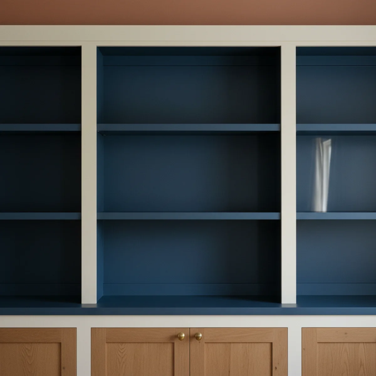
01A Navy Accent Wall With Warm Wood
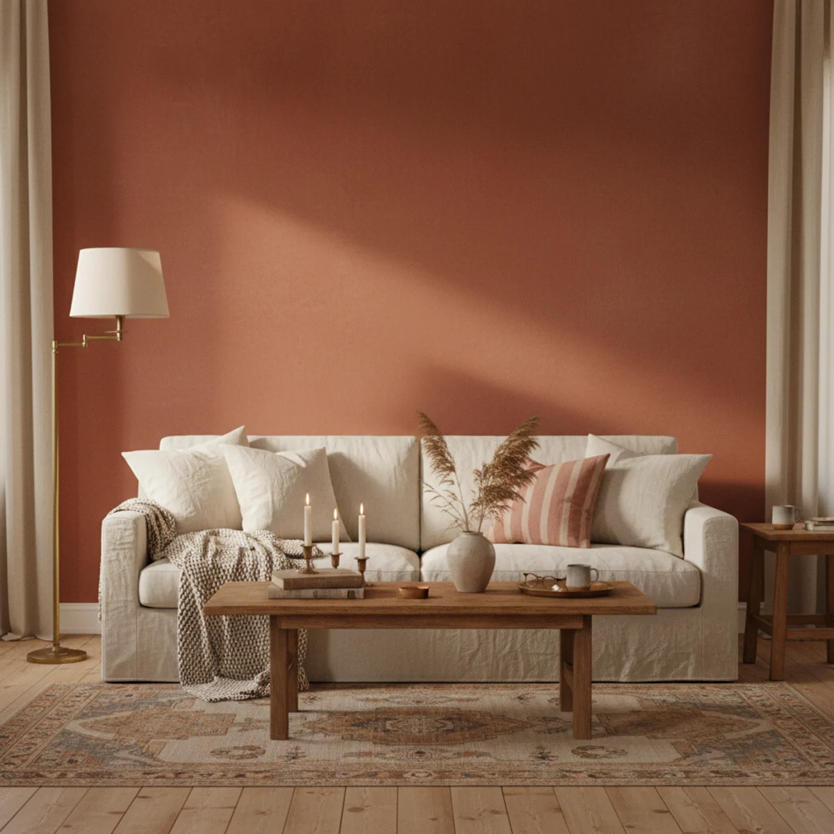
The most-accessible navy application: one navy accent wall (behind the bed, behind the sofa, or at the dining room feature wall) against warm wood floors and cream surrounding walls. The navy-warm-wood combination specifically prevents navy from reading cold — the warm amber-honey of oak or walnut against navy produces the warm-grounded effect that navy on its own cannot achieve.
Navy accent wall specifications: SHADE — F&B HAGUE BLUE 30 (the warmest navy in the F&B range, with slight green undertone preventing cold-blue reading, $115-130 per gallon), BM VAN DEUSEN BLUE HC-156 (warm navy with slight grey-green undertone, $75-90 per gallon), SW NAVAL SW 6244 (warm navy with brown undertone, $80-95 per gallon). AVOID — bright primary navy, cool pure blue-black, grey-blue that reads as slate rather than navy. SURROUNDING WALLS — warm cream (BM White Dove OC-17 or F&B Pointing 2003) — the cream-navy contrast is what makes both read correctly. Warm wood floors at any shade (light oak, warm walnut, warm teak) all work with navy; cool grey-stained floors fight it. ART ON THE NAVY WALL — warm-toned pieces only: vintage oil paintings with warm palette, botanical prints, brass-framed pieces. Cool-toned or bright art against navy creates jarring contrast. LIGHTING — warm 2700K throughout; cool overhead lighting turns warm navy cold. COST — $80-130 in paint for one accent wall.
AFFILIATE SLOTAPPLICATIONF&B Hague Blue 30, BM Van Deusen Blue HC-156, or SW Naval SW 6244; behind primary furniture; warm wood floors + cream surrounding walls + 2700K lightingAdd affiliate URL when configuredWhy it works
Because warm wood's amber-honey tones are on the opposite end of the warm-cool spectrum from navy's blue-based character — but the warm end, creating thermal contrast rather than tonal competition. The warmth of oak or walnut literally warms the navy by visual adjacency; the eye reads the two colors together as warm-and-cool balanced rather than as cold. The same navy wall against grey-stained wood reads cold because grey adds to navy's inherent coolness rather than counterbalancing it.
Pro tip — Test navy paint samples specifically next to your actual floor material — bring paint chips home and place on the floor where the accent wall would be, then assess the paint-floor relationship in both natural and 2700K artificial light. The floor-wall relationship determines whether the navy reads warm or cold more than almost any other factor.
F&B Hague Blue 30 accent wall with warm oak floors and cream surrounds — the warm-wood adjacency that prevents navy from reading cold. See also: warm-paint-colors
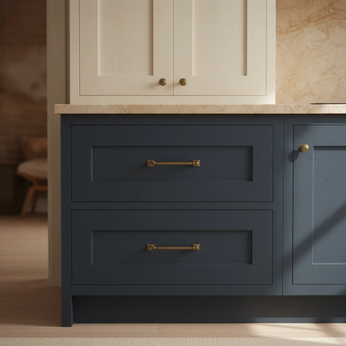
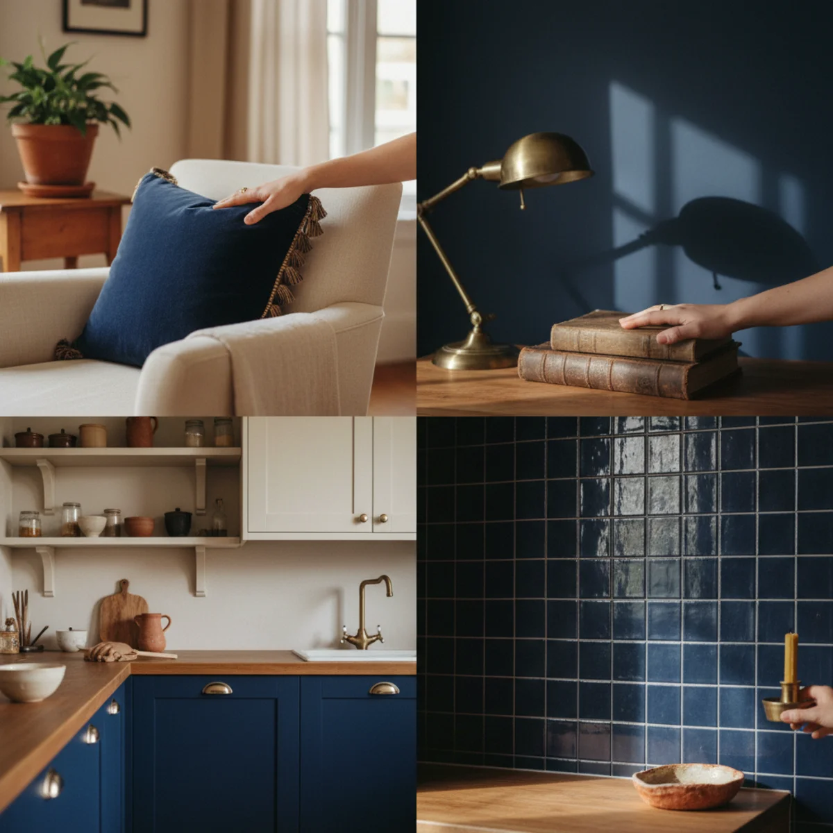
02Navy Cabinetry With Brass
Navy-painted kitchen or bathroom cabinetry with aged brass hardware is the most-reliably-warm large-scale navy application — the aged-brass hardware pulls warmth from the navy's warm undertone and the two materials together create the signature warm-and-cool balance that makes the combination work across kitchen and bathroom applications. Best shades: F&B Hague Blue 30, BM Van Deusen Blue HC-156.
Navy cabinetry with brass: CABINET PREP AND PAINT — same process as sage cabinet painting (per sage-green-decor item 1): clean with TSP, sand lightly, bond primer, 2 coats semi-gloss. SHADE — same warm navy shades as above. Semi-gloss or satin finish for cabinetry. HARDWARE — aged or unlacquered brass knobs and pulls at $4-15 per knob, $8-25 per pull from House of Antique Hardware, Rejuvenation, or Schoolhouse. NOT bright polished brass, NOT chrome, NOT nickel — only aged/patinated/unlacquered brass. COUNTERTOP PAIRING — warm stone (butcher block, warm marble, warm quartzite) reads best with navy; cool white quartz reads cold with navy and brass. UPPER CABINETS — option: navy lower cabinets with cream upper cabinets (BM White Dove OC-17) for the two-tone approach that lightens the kitchen. OR full navy throughout for more committed cocoon kitchen. WALLS ABOVE CABINET LINE — warm cream or warm white. FLOOR — warm wood, warm terracotta tile, or warm grey tile (NOT cool grey). KITCHEN BACKSPLASH — warm cream subway tile or warm-toned stone tile.
AFFILIATE SLOTAPPLICATIONNavy lower cabinets + aged/unlacquered brass hardware + warm stone countertop + cream upper cabinets optional; semi-gloss finish; warm wood or terracotta floorAdd affiliate URL when configuredWhy it works
Because the kitchen is where both materials have historical authenticity — navy was a common Victorian kitchen and pantry color (it was visually clean-looking and dignified), and brass hardware was standard before the mid-20th century shift to chrome. Both materials belong in kitchen contexts historically, and their combination references this tradition rather than reading as a current trend. The historical grounding makes the navy-and-brass kitchen feel timeless rather than timed.
Pro tip — Convert existing hardware to aged brass before purchasing new — Rust-Oleum Aged Brass spray paint at $10-12 per can converts chrome or nickel hardware to aged-brass appearance in 20 minutes. Test on one cabinet door's hardware before committing. The conversion provides a preview of the navy-and-brass combination at $12 cost before the $200-400 full-hardware-replacement investment.
Navy lower cabinets, brass pulls, butcher block countertop — the historically-grounded kitchen combination that reads warm. See also: cozy-kitchen-ideas
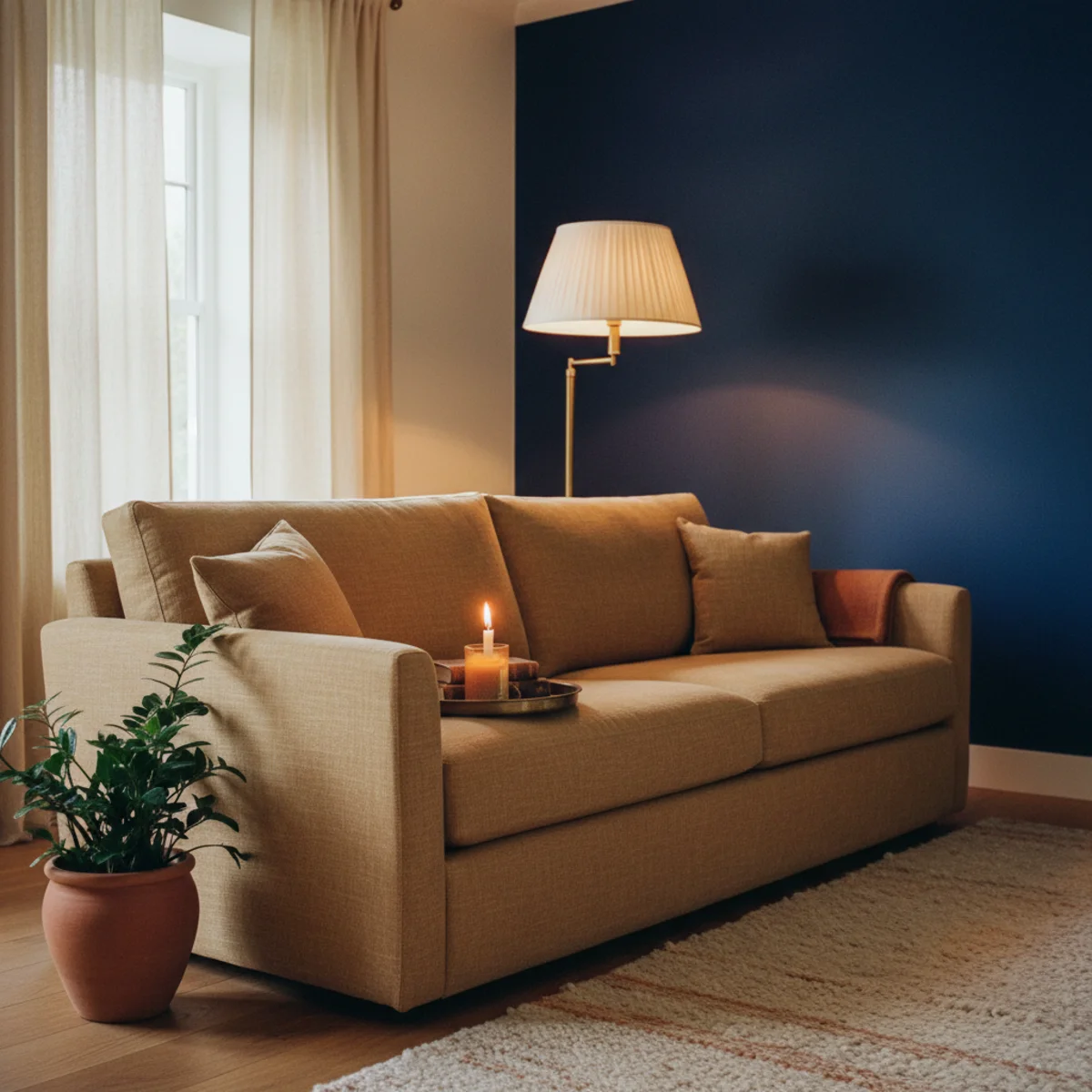
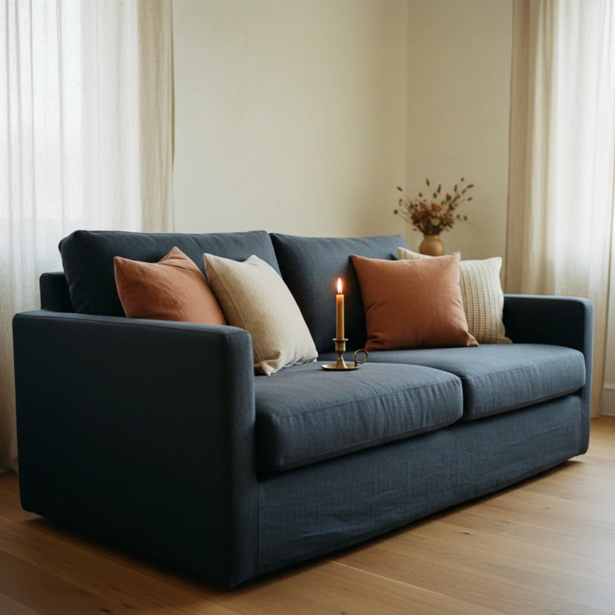
03A Navy Sofa as a Deep Neutral
A navy sofa functions as a 'deep neutral' in warm rooms — anchoring the room's visual weight without being as demanding as a terracotta or rich-colored sofa. Navy reads dark enough to provide visual grounding without the specific warm-color assertiveness of terracotta or rust. Best against cream walls with warm wood floors and terracotta or warm-yellow accent cushions.
Navy sofa specifications: FABRIC CHOICES — NAVY LINEN: casual warm texture at $1,200-2,500 (Article, West Elm), NAVY VELVET: rich surface that makes navy read warmer ($1,200-3,000 from CB2, West Elm, or vintage reupholstery), NAVY COTTON or COTTON-LINEN BLEND: practical mid-ground at $1,000-2,500. AVOID: navy polyester or synthetic fabric (reads commercial and cold). CUSHION STRATEGY for navy sofa — warm accent cushions on navy are essential: terracotta ($25-60 each), warm rust ($25-60), cream or oat (2-3 neutral cushions), warm yellow ($25-60). The warm cushion accents are what prevent the navy sofa from reading as a cold anchor. WALL PAIRING — cream or warm white walls (the most important pairing for navy sofa). Navy sofa against grey walls reads very cold. Navy sofa against warm cream reads grounded and rich. ROOM BALANCE — a navy sofa is the room's dominant element; everything else should be warm to compensate. Too much navy in the room around a navy sofa (navy cushions, navy rug, navy accent wall) amplifies the cold risk significantly.
AFFILIATE SLOTFURNITURENavy linen, velvet, or cotton sofa against cream walls; warm accent cushions (terracotta, rust, warm yellow) required; warm wood floors; avoid grey wallsAdd affiliate URL when configuredWhy it works
Because navy's darkness (relative to cream, sage, terracotta accents) makes it read as a grounding element rather than as a competing color in the warm palette. The same way dark wood furniture anchors a warm room without fighting the warm tones, a navy sofa anchors the room's visual weight without fighting the warm accents. The navy sofa creates the visual 'bottom' of the room's tonal range; the cream walls create the 'top'; the terracotta and rust accents create the middle warmth. This three-level tonal structure reads as composed.
Pro tip — Start with navy cushion covers on an existing cream or neutral sofa before committing to a navy sofa purchase — the navy-accent-on-neutral approach previews whether navy works in your room's specific light and with your specific warm accents. If the navy cushion reads cold or wrong, the navy sofa will be worse. If it reads warm and grounded, the sofa conversion is justified.
Navy linen sofa with terracotta cushions against cream walls — navy as the room's warm grounding depth. See also: cozy-living-room-ideas
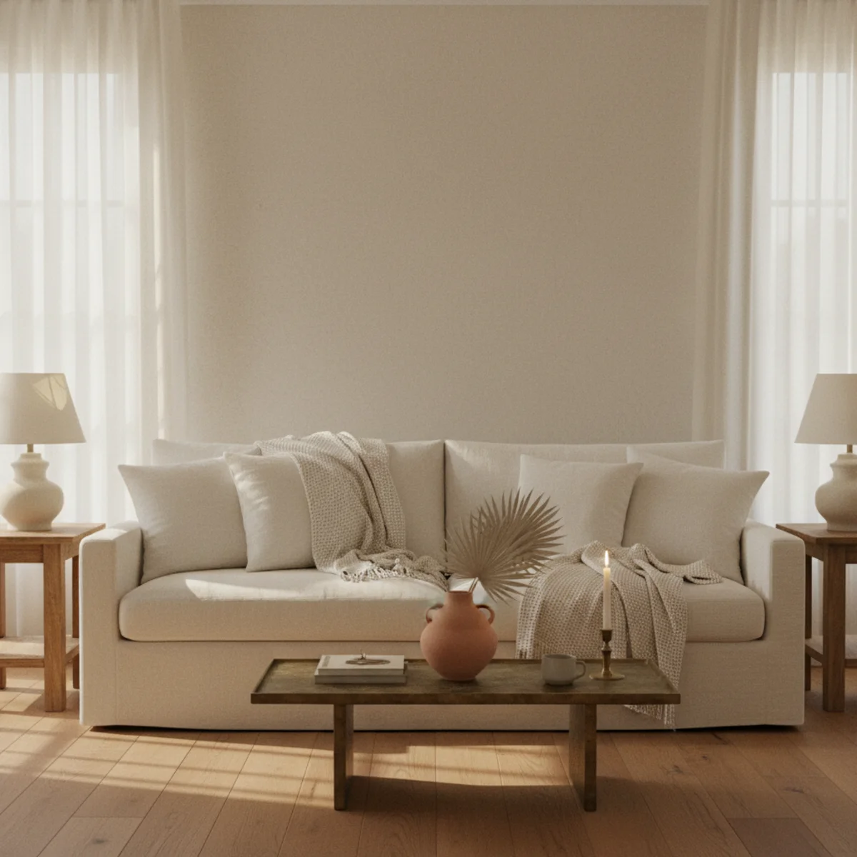
04Navy and Cream Together
The most-reliable navy color pairing is navy and cream — the dark-warm and light-warm combination that achieves maximum contrast without temperature clash. Navy provides the visual depth; cream provides the light reflectance. Every navy application in warm homes benefits from cream as the primary accompanying neutral.
Navy-and-cream application principles: RATIO — approximately 30-40% navy (the grounding element) to 60-70% cream (the light reflective element). Navy should be the accent, not the dominant. APPLICATIONS — navy accent wall behind cream-walled room, navy sofa in cream-walled room, navy cabinetry with cream upper cabinets and walls, navy cushions on cream sofa, navy linen throw on cream chair. CREAM PALETTE — warm cream specifically (per warm-paint-colors Item 2: BM Soft Chamois OC-13, F&B Pointing 2003, BM White Dove OC-17). Cool white fights navy; warm cream supports it. TEXTURE VARIATION WITHIN THE PAIRING — smooth navy velvet against cream textured linen, navy flat-weave rug against cream pile cushions, navy lacquered cabinet against cream cotton curtains. The texture variation within the navy-cream combination adds richness. ACCENT WITHIN THE PAIR — terracotta, aged brass, or warm rust as accents within the navy-cream primary pairing. The three-element combination (cream-navy-terracotta or cream-navy-brass) is more interesting than the two-element combination alone.
AFFILIATE SLOTPAIRING30-40% warm navy against 60-70% warm cream; warm cream specifically (BM Soft Chamois, F&B Pointing, BM White Dove); add terracotta or brass as third accentAdd affiliate URL when configuredWhy it works
Because cool white and navy are both on the cool side of the temperature spectrum — their combination reads cold and commercial (think commercial nautical decor). Warm cream and navy create the thermal contrast that the combination needs: the warmth of cream counterbalances the coolness of navy. The same contrast principle that makes aged brass warm against navy works at larger scale with cream walls or cream textiles.
Pro tip — Paint a large piece of craft paper (24x36 inches) in your navy shade and hold it against the cream-painted wall or drape it over the cream sofa before purchasing navy pieces — the full-scale test at room conditions reveals the navy-cream relationship in your specific light much more accurately than any paint chip comparison.
Navy accent wall, cream on three sides, brass lamp, terracotta cushions — the three-element combination richer than any pair alone. See also: cream-decor-warm-white
05A Navy Study or Library
The room type that most benefits from navy's cocoon quality is the study or library — a small or medium room whose function (reading, writing, focused work) benefits from the visual depth and envelopment that dark walls provide. A navy study with floor-to-ceiling bookcases, warm wood desk, aged brass lamp, and warm leather chair is among the most-satisfying warm home rooms possible.
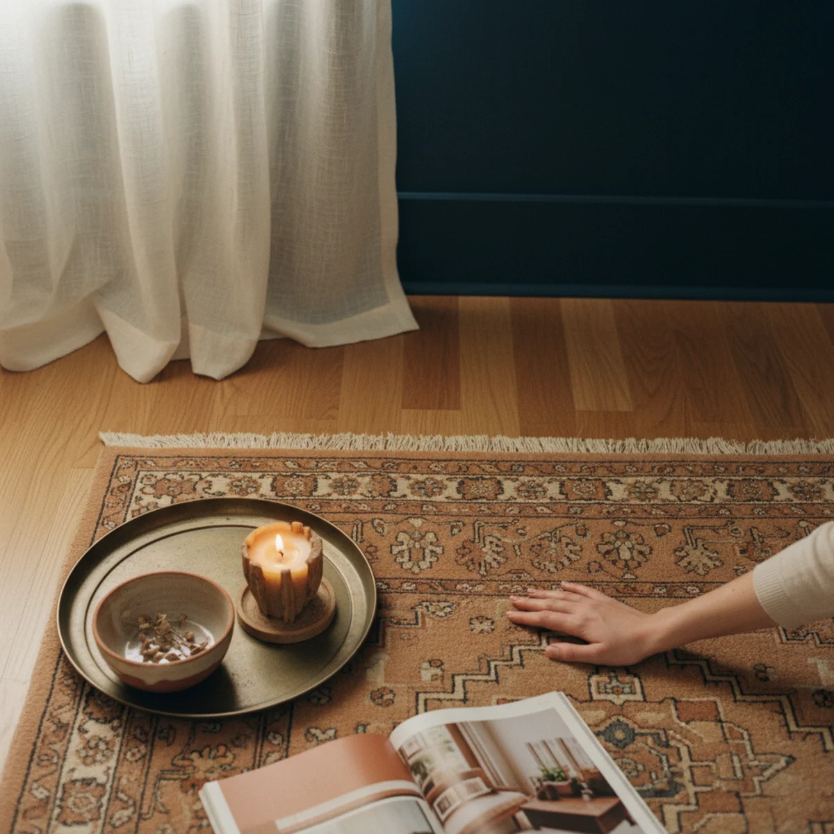
Navy study or library specifications: PAINT — all four walls in warm navy (F&B Hague Blue 30 or BM Van Deusen Blue HC-156) for full cocoon effect. Ceiling in same navy or in warm cream. TRIM — cream or warm white trim provides the contrast that makes the dark walls read as intentional rather than as forgotten-to-paint. BOOKCASES — floor-to-ceiling preferred (per english-country-decor principles). Books provide warm color variation against navy walls — creams, terracottas, golds, and deep reds on spines create beautiful color composition against the navy backdrop. DESK — warm wood (walnut, warm oak, teak) with aged brass lamp. The warm wood surface and brass lamp create the work surface warm zone against the navy walls. SEATING — worn leather club chair or warm upholstered reading chair. LIGHTING — multiple warm 2700K sources essential in navy rooms. Minimum 4-5 sources: desk lamp, one floor lamp, one or two table lamps, potentially wall sconces. Without proper warm lighting, navy study reads as a dim uninviting cave. RUGS — warm Persian or Turkish rug in terracotta-warm palette against the navy walls. The rug anchors the room in warmth while the walls provide the navy depth above.
AFFILIATE SLOTAPPLICATIONAll four walls navy (F&B Hague Blue 30); cream trim; floor-to-ceiling bookcases; warm wood desk + aged brass lamp; worn leather chair; warm Persian rug; 4-5 2700K sourcesAdd affiliate URL when configuredWhy it works
Because the focused work and reading that happens in studies benefits from visual depth and reduced visual distraction — the dark enveloping walls reduce the eye's tendency to wander to visual stimuli, helping maintain focus on the work or reading. This is the same principle that makes dark-walled restaurants feel more intimate and conversation-focused (less visual noise to process), applied to a work space. The navy study is both more aesthetically beautiful and functionally more conducive to focus than an equivalent room in lighter colors.
Pro tip — Add a reading lamp specifically with an adjustable arm for the navy study — the adjustable arm positions warm light precisely over the book or document regardless of reading position. A $60-120 adjustable brass reading lamp provides both warm visual character and precise functional lighting that fixed-position lamps can't match.
All-navy study with walnut desk, brass lamp, and leather chair — the room where navy's cocoon quality most justifies itself. See also: home-office-ideas
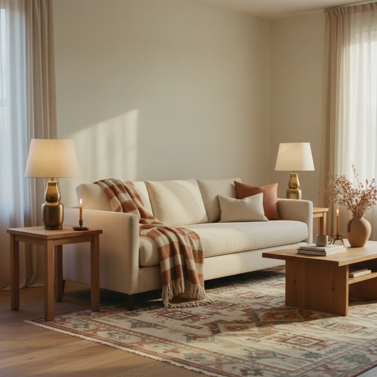
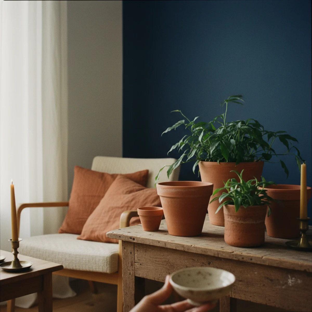
06Navy With Terracotta or Rust
The most-dramatically warm navy pairing: navy with terracotta or warm rust. The complementary color relationship between blue (navy) and orange (terracotta/rust) creates maximum visual temperature contrast — the warmth of terracotta reads warmer against navy than against cream, and the navy reads warmer against terracotta than against white. The two colors amplify each other's qualities.
Navy and terracotta/rust application: CUSHION APPROACH — navy sofa or navy accent chair with terracotta linen cushions ($25-60 each). The classic pairing. TEXTILE APPROACH — navy throw with terracotta cushions on cream sofa. Or navy rug with terracotta walls (both the rug and the walls read richer together). PAINT APPROACH — navy accent wall with terracotta-adjacent decorative objects (terracotta plant pots, rust-toned ceramics, terracotta cushions in front of navy wall). SPECIFIC COLOR RATIOS — the complementary contrast works best at unequal ratios: 70% one color and 30% the other. Equal parts navy and terracotta is visually overwhelming. Either navy-dominant with terracotta accent OR terracotta-dominant with navy accent. BRIDGING COLOR — cream is essential as the bridge between navy and terracotta. Without cream, the direct navy-terracotta contrast is too high. Cream walls, cream textiles, or cream trim mediates the contrast to the warm-and-rich level rather than the jarring level. THE VISUAL EFFECT — navy-terracotta-cream is the three-element palette that most rooms in the warm home achieve: the deep cool (navy), the warm earth (terracotta/rust), and the light bridge (cream).
AFFILIATE SLOTPAIRINGNavy dominant + terracotta/rust accent (70:30); OR terracotta dominant + navy accent; cream as essential bridge; never equal ratio; avoid without cream mediationAdd affiliate URL when configuredWhy it works
Because blue and orange are directly complementary on the color wheel — their combination produces the maximum visual vibration between warm and cool, which the eye processes as 'rich and interesting' rather than as 'discordant' when the specific tones are warm-navy and muted-terracotta (rather than saturated primary blue and bright orange, which would be discordant). The muted, warm versions of both colors produce the most-satisfying version of the complement relationship.
Pro tip — Start with one terracotta cushion on a navy sofa or one navy cushion on a terracotta-themed room — the single-element test reveals whether the navy-terracotta complement works in your specific space before committing to full applications. Most rooms find the combination works immediately and the first accent element produces a dramatically more interesting room than before.
Navy accent wall with terracotta pots and rust cushions — complementary contrast amplifying both colors' warmth. See also: terracotta-color-palette
07Navy and Aged Brass Lighting
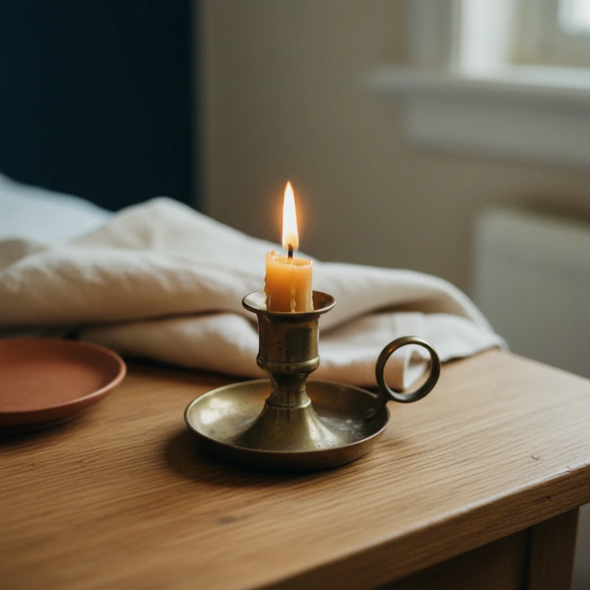
Aged brass lighting in navy rooms — table lamps, floor lamps, pendant lights, sconces, all in warm aged brass — is the navy room's most-transformative atmospheric element. The warm gold glow of aged brass against navy produces the warm cave effect that is navy's best quality: deep and enveloping but warm rather than cold.
Aged brass lighting in navy rooms: TABLE LAMPS — ceramic bases in warm tones with aged brass details, or solid aged brass lamp bases with linen shades. Position 3-4 in a navy room for distributed warm warmth at 2700K. $60-250 each new, $20-80 vintage. FLOOR LAMPS — 55-65 inches tall aged brass floor lamp with white or cream shade. One to two per navy room. $80-300 new, $30-100 vintage. PENDANT OR CHANDELIER — aged brass pendant over dining table in navy dining room, or aged brass chandelier in navy study. $150-800. WALL SCONCES — aged brass plug-in sconces on navy walls at 60-65 inch height, flanking a mirror or artwork, or flanking the headboard in a navy bedroom. $60-200 each. THE LAMP COUNT RULE — navy rooms require 30-50% more warm light sources than equivalent lighter rooms because navy absorbs rather than reflects ambient light. A cream room is adequately lit with 2-3 table lamps; the same room painted navy needs 4-6 warm lamps to reach the same ambient warmth level. VINTAGE BRASS SOURCING — estate sales are the best source for warm vintage brass lamp bases at $20-60 each. The warm aged patina of vintage brass outperforms new reproduction brass for navy rooms specifically.
AFFILIATE SLOTLIGHTINGAged brass table lamps, floor lamps, pendants, and sconces throughout navy rooms; 4-6 sources minimum at 2700K; vintage brass from estate sales at $20-60 eachAdd affiliate URL when configuredWhy it works
Because the warm gold of aged brass is visually near the warm end of the spectrum — and placed against navy's cool end, it creates the most-dramatic warm-against-cool visual contrast available in warm home lighting. The warm lamp glow also specifically warms the navy walls through reflected and incident light: a 2700K bulb in an aged brass lamp creates warm amber light that falls on the navy wall and warms its tone dramatically. The same navy wall under 4000K cool light reads cold; under 2700K warm brass lamp light, it reads rich and enveloping.
Pro tip — Use smart plugs on all navy room lamps and set a 'warm evening' scene that turns on all lamps simultaneously at a consistent warm level — the coordinated warm light from all sources at once produces the intended navy room atmosphere more reliably than individual manual lamp-switching throughout the evening.
Four aged brass lamps at 2700K against navy walls — the warm-against-cool contrast that makes navy rooms enveloping rather than cold. See also: best-lamps-warm-light
08A Navy Front Door or Built-In
A navy-painted front door or navy-painted built-in (bookcase, cabinet wall, window seat surround) delivers navy's dramatic quality in a defined architectural form that doesn't dominate the overall room. Best exterior navy: F&B Hague Blue 30, BM Newburyport Blue HC-155. Best built-in navy: same interior shades as accent walls.
Navy front door and built-in specifications: FRONT DOOR NAVY — slightly deeper navy than interior accent walls for exterior UV resistance and curb impact. F&B HAGUE BLUE 30 works well exterior; BM NEWBURYPORT BLUE HC-155 or SW NAVAL SW 6244 for exterior use. 100% acrylic exterior semi-gloss or gloss finish. Hardware: aged brass door handle, aged brass house numbers, aged brass knocker (all matching warm family). BUILT-IN BOOKCASE NAVY — paint built-in shelving units, bookcases, or flanking fireplace built-ins in warm navy. The architectural boundary of the built-in contains the navy application and prevents it from overwhelming the room. WINDOW SEAT SURROUND — navy-painted surround with cream cushion creates a striking reading nook. CABINET WALL — entire wall of upper and lower cabinetry painted navy (home office, study, or dining room serving cabinet wall). FINISH — eggshell for built-in interior surfaces; semi-gloss for doors and cabinet fronts. TRIM — cream or warm white trim creates the contrast that makes the built-in read as intentional architectural feature rather than just dark paint.
AFFILIATE SLOTAPPLICATIONF&B Hague Blue 30 or SW Naval SW 6244 on front door (exterior semi-gloss) or built-in bookcases/cabinetry; cream trim contrast; aged brass hardware throughoutAdd affiliate URL when configuredWhy it works
Because front doors and built-ins are defined architectural forms with clear visual boundaries — the door is the door, the bookcase is the bookcase. The navy applies within these defined forms rather than spreading across the room's continuous surfaces. This architectural containment makes navy's impact more dramatic (concentrated in one focal element) and less risky (contained, not room-dominating). The most-striking navy applications are architectural applications: the one dark door against cream facade, the one dark bookcase in a cream room.
Pro tip — Paint the interior reveals (the sides and top of a doorway or built-in opening) in the same navy as the cabinet or door face — the deeper depth-of-color on the reveal sides adds architectural dimensionality that painting only the face surface lacks. The reveal painting takes an additional 30 minutes and produces significantly more architectural quality.
Navy built-in with cream trim and brass lamp — navy's architectural boundary containing the drama without room domination. See also: shelf-styling-ideas
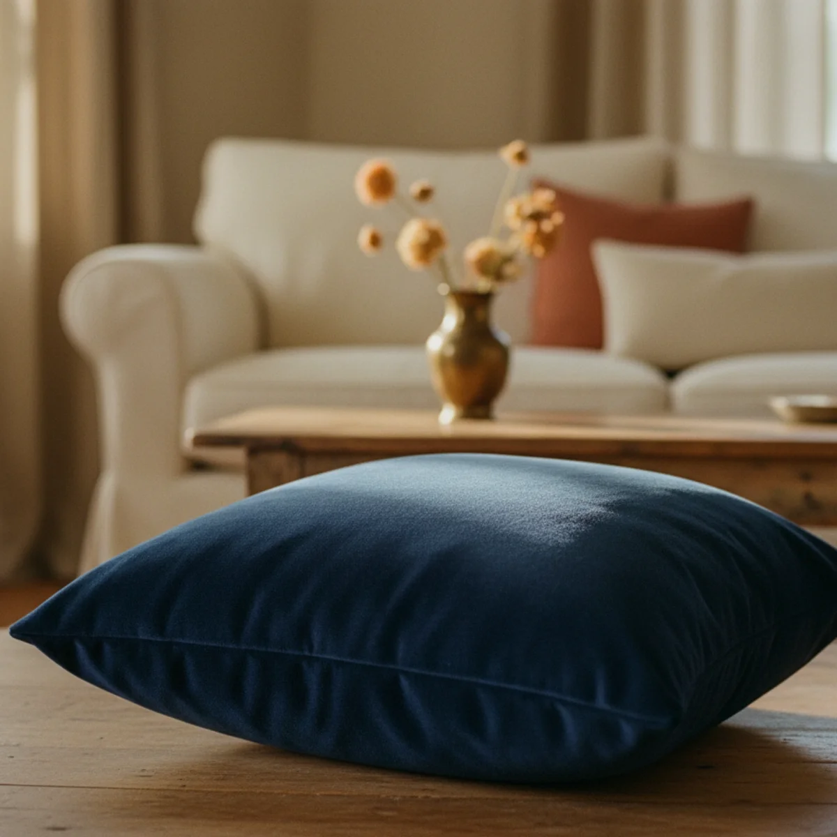
09Navy Linen or Velvet Textiles
Navy linen cushions or navy velvet throw cushions as accent textiles — 1 to 2 navy pieces among warm cream and oat primary textiles — bring navy into the room at object-scale without paint commitment. The textile approach is the lowest-commitment navy application and the first step before deciding on larger-scale navy investments.
Navy textile specifications: NAVY LINEN CUSHION COVERS — 18x18 or 20x20 inches in washed linen, muted deep navy rather than bright primary navy. $25-50 from H&M HOME, Quince, or Etsy artisan makers. NAVY VELVET CUSHION — 18x18 in muted navy velvet for richer warm effect. $40-70 from Anthropologie, CB2, or H&M HOME. NAVY THROW — merino or cotton blend throw in warm navy for the accent throw on a cream sofa or reading chair. $60-150 from Pendleton, West Elm. DISTRIBUTION — 1-2 navy textile pieces among 3-4 warm cream/oat pieces. The 30% navy to 70% warm-neutral ratio at textile scale. PAIRING WITH TERRACOTTA — a navy velvet cushion beside a terracotta linen cushion on a cream sofa produces the three-element navy-terracotta-cream palette at the most-accessible scale. VELVET SPECIFICALLY — navy velvet reads warmer than navy linen or cotton because velvet's pile absorbs and reflects light in a way that adds visual warmth to cool-toned colors. Navy velvet is the warmest-reading navy textile; navy cotton is the coolest-reading.
AFFILIATE SLOTTEXTILES1-2 navy linen ($25-50) or navy velvet ($40-70) cushions among warm cream/oat primary cushions; 30% navy to 70% warm-neutral ratioAdd affiliate URL when configuredWhy it works
Because navy is the most-room-specific color in warm home applications — it works well in some rooms and in specific lighting conditions, and requires careful testing before investment in paint or furniture. The navy cushion at $30 tests whether navy reads warm or cold in your specific room under your specific lighting before the $2,000 navy sofa or $150 paint project. Most households discover that navy works well and commit to larger applications after the textile-scale test; a few discover it reads cold and are glad they tested at cushion-cover rather than sofa scale.
Pro tip — Buy one navy velvet cushion and one navy linen cushion to test which navy textile reads warmer in your specific room — the velvet will typically read warmer (pile depth adds visual warmth) but some rooms and some lighting conditions favor the linen. The two-cushion test at $70-100 total reveals which navy textile expression works for your space.
One navy velvet cushion beside terracotta among cream — three-element palette at textile scale, lowest commitment entry. See also: throw-blanket-layering
10Navy With Warm Wood Floors
Navy and warm wood floors is the combination that appears in the most-successful warm navy rooms — the warm honey-amber of natural oak or walnut at floor level visually warms the entire room, compensating for navy's inherent coolness at wall or furniture level. Any navy application benefits from warm wood floors; cool grey-stained floors make any navy application read colder.
Navy-warm-wood-floor interaction: BEST WOOD FLOOR TONES FOR NAVY — light to medium honey oak (the warmest-reading complement to navy), warm walnut (deeper warm tone, equally effective), warm teak (golden-brown, excellent), golden-stained pine (warm and effective). FLOOR TONES TO AVOID WITH NAVY — grey-washed or grey-stained wood floors, dark ebonized floors (too cool), cool-toned light wood (ash or maple without warm stain). RUGS ON WARM WOOD WITH NAVY — warm Persian or Turkish rug in terracotta-warm palette between the navy element and the warm wood floor creates double warmth. The rug-and-floor combination provides a warm zone that the eye reads as counterbalancing the navy above. TRANSITION RULE — in homes with navy accent walls, the warm wood floor should extend throughout the room (not change to different material at the room boundary). The consistent warm floor is the foundation that makes the navy work; interrupting it with cooler flooring materials undermines the effect. FURNITURE FEET — in navy rooms, furniture with warm wood legs (visible feet in oak or walnut) reinforces the warm-wood-floor language at furniture level.
AFFILIATE SLOTPAIRINGHoney oak, warm walnut, or golden pine floors with any navy application; avoid grey-washed floors with navy; warm Persian rug if cool floors can't be changedAdd affiliate URL when configuredWhy it works
Because floors are the largest continuous surface in any room and reflect upward-angled light onto walls and furniture. Warm wood floors reflect warm amber-golden light upward into the navy walls; cool grey floors reflect cool grey-blue light upward into the navy walls. The same navy wall reads significantly different above warm oak flooring versus above grey-stained flooring because the floor's reflected light determines the navy's apparent warmth. Floor color is the room's ambient-light modifier that affects every vertical surface in the room.
Pro tip — If your existing floors are cool grey-stained and you want to add navy, use warm-toned area rugs to create warm floor zones rather than refinishing — a warm Persian or Turkish rug in the primary seating area or under the navy element creates the warm-floor visual foundation at $200-500 without the $2,000-5,000 cost of refinishing wood floors.
Navy walls above warm honey oak floors and Persian rug — warm-floor foundation making every navy application read richer. See also: warm-paint-colors
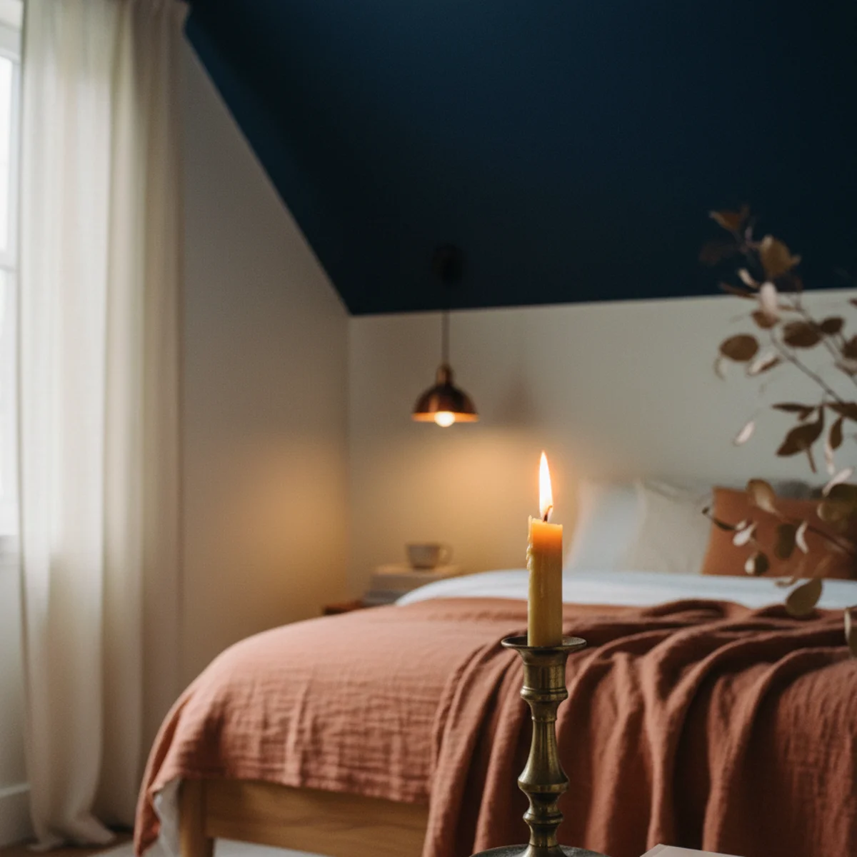
11A Navy Ceiling for a Cocoon
A navy-painted ceiling in an otherwise-cream room produces the most-intimate cocoon effect of any single navy application — the overhead navy lowers the visual height, envelops the room, and makes the cream walls read even warmer by contrast. Best for bedrooms, dining rooms, and library-style rooms where the cocoon quality suits the room's function.
Navy ceiling application: EFFECT — navy ceiling in cream-walled room makes the room feel lower, more intimate, more enveloped. The ceiling reads as sky-at-night rather than as sky-by-day (which cream and white ceilings emulate). Appropriate for rooms where intimacy and enclosure are wanted rather than openness and height. SHADE — same warm navy as other applications (F&B Hague Blue 30, BM Van Deusen Blue HC-156). A ceiling-specific formulation from most paint brands adds slightly more coverage to compensate for overhead application direction. TRIM — keep wall trim in cream or warm white even with navy ceiling; the trim creates the visual boundary between cream walls and navy ceiling that prevents the navy from appearing to creep down the walls. WHEN IT WORKS — bedrooms (bedroom ceilings are the walls seen when lying down; navy overhead is sky-like and enveloping), dining rooms (especially for evening-use rooms where the navy ceiling recedes to dark sky during candle-lit dinners), studies and libraries (the four-wall-and-ceiling navy cocoon). WHEN TO AVOID — rooms with ceilings below 8 feet (the lowering effect can be uncomfortable), rooms needing maximum light (kitchens, studios, task-heavy spaces), rooms used during the day as primary activities (living rooms where natural light is valued).
AFFILIATE SLOTAPPLICATIONNavy ceiling in bedroom, dining room, or library; cream walls with warm trim; downward-directed warm lighting; avoid rooms below 8 feet or needing maximum lightAdd affiliate URL when configuredWhy it works
Because the ceiling is the horizontal surface overhead — the one that, when painted navy, literally encloses the space above the occupants' heads. Where navy walls enclose the sides, a navy ceiling encloses from above, completing the enclosure and creating the full cocoon that partial navy applications only suggest. The overhead blue also references night sky rather than architecture, which triggers the deep-shelter response that enclosed dark overhead spaces produce in the human nervous system — the same reason canopy beds feel intimate, tent interiors feel protected, and low dark caves feel safe.
Pro tip — Pair the navy ceiling with pendant or chandelier lighting that directs warm light downward rather than upward — upward-directed light (torchiere floor lamps, uplighting) illuminates the navy ceiling and draws attention to it, which can feel oppressive. Downward-directed pendants, chandeliers, or table lamps keep attention in the lower warm space and let the navy ceiling recede into the visual periphery.
Navy ceiling with cream walls and downward warm lamps — the overhead enclosure completing the cocoon. See also: master-bedroom-ideas
12Navy as the Whole-Home Thread
Like terracotta, navy can function as a whole-home thread — appearing in every room at different scales (navy door in the bedroom, navy built-in in the study, navy cushion in the living room, navy tile accent in the bathroom, navy front door) creating visual continuity throughout the home without any single room being dominated by it.
Whole-home navy thread implementation: LIVING ROOM — one navy velvet cushion among warm cream cushions (textile scale). STUDY/HOME OFFICE — all-navy walls or navy built-in bookcase (full-room or architectural scale). BEDROOM — navy accent wall behind bed or navy ceiling (accent or overhead scale). KITCHEN — navy lower cabinets with cream upper (furniture scale). BATHROOM — navy accent tile in shower or navy vanity cabinet (accent or furniture scale). FRONT DOOR — navy exterior door (architectural scale). DINING ROOM — navy ceiling or one navy accent wall (overhead or accent scale). THE VARIETY PRINCIPLE — each room should have a different scale of navy application from adjacent rooms: bedroom accent wall versus living room cushion accent versus study full-room versus kitchen cabinet. The varied scales prevent the thread from becoming overwhelming repetition while creating visual continuity. THE WARM MAINTENANCE — in every room, navy is accompanied by warm elements (cream walls, warm wood, aged brass, terracotta accents). The warm elements in each room anchor the navy to the whole-home warm character.
AFFILIATE SLOTSTRATEGYVaried navy scale across rooms: cushion in living room, full walls in study, accent wall in bedroom, cabinets in kitchen, tile in bathroom, exterior front doorAdd affiliate URL when configuredWhy it works
Because the repeated navy element at different scales creates visual continuity that makes the home feel unified — walking from the living room (navy cushion) through the study (navy walls) to the bedroom (navy accent wall) to the kitchen (navy cabinets), the navy thread connects all spaces into one aesthetic narrative. Without the thread, each room could be well-styled in isolation but the home would read as a collection of separate decorated rooms rather than as a unified warm household. The thread is what makes a home feel composed rather than assembled.
Pro tip — Map the navy applications before painting or purchasing — note which rooms get which navy scale and confirm that the variety principle holds (no two adjacent rooms with the same scale), that warm accompaniment is present in every room, and that the thread feels continuous without being overwhelming. The planning prevents the 'too much navy everywhere' failure that over-enthusiastic whole-home thread application can produce.
Navy at varied scales across all rooms — thread connecting household through depth without any single room dominated. See also: warm-minimalism
How to use navy in a warm home step by step
Choose a warm-leaning navy and surround it with heat. Work in this order.
- 1Choose a warm-leaning navy
Pick a deep navy that leans warm or inky rather than a bright, cool, primary blue. The undertone decides whether it reads cozy or corporate.
- 2Pair it with warm materials
Set the navy against warm wood — oak or walnut — and warm metal — brass or aged bronze — rather than chrome and cool grey.
- 3Add warm neutrals and one earth accent
Soften the navy with cream and oat textiles, and add a terracotta or rust accent for rich, warm contrast.
- 4Light it warm
Use brass lamps with 2700K bulbs against the navy; warm light is what makes deep blue glow rather than chill at night.
Quick tips
- Choose a warm- or inky-leaning navy, never a bright primary blue, for a warm home.
- Pair navy with warm wood and brass; skip chrome and cool grey beside it.
- Soften it with cream and oat rather than bright white.
- Add a terracotta or rust accent for rich, warm contrast against the deep blue.
- Light navy with brass lamps and warm 2700K bulbs so it glows at night.
- The more warm wood in the room, the cozier the navy reads.
Navy by room
Navy walls with oak shelving, brass lighting, and warm bulbs — the cozy-cocoon study.
Navy cabinetry with brass hardware and warm wood open shelving.
A navy velvet sofa as a deep neutral, with cream textiles and a terracotta accent.
A navy accent wall behind the bed, paired with oat linen and warm bedside lamps.
Navy is the deepest neutral there is. Pair it with warm wood, brass, and lamplight and it reads as a refuge, not an office.
Frequently asked questions
How do I use navy in a warm home?+
What's the best warm navy paint color?+
Does navy look good with warm wood floors?+
What colors go with navy for a warm home?+
Is navy too dark for a small room?+
How do I make navy decor look warm not cold?+
Navy is unfairly typecast as cold — paired right, it's one of the most grounding, enveloping deep neutrals there is. Choose a warm- or inky-leaning navy and surround it with heat: oak, brass, cream, and warm lamplight, with a terracotta accent for contrast. We'd light it with a brass lamp and a warm bulb before judging it; navy with chrome is an office, but navy with brass at dusk is a refuge. Treat the deep blue as a neutral and surround it with warmth, and it envelops a room rather than chilling it.